
The Ultimate Guide to Power BI Visualizations
Analytics Vidhya
DECEMBER 8, 2023
Developed by Microsoft, Power BI Visualizations empower users to visually represent their data and disseminate insights seamlessly across organizational echelons.

Analytics Vidhya
DECEMBER 8, 2023
Developed by Microsoft, Power BI Visualizations empower users to visually represent their data and disseminate insights seamlessly across organizational echelons.
Analytics Vidhya
NOVEMBER 2, 2023
Introduction Generative AI enhances data analytics by creating new data and simplifying tasks like coding and analysis. empower this by understanding and generating SQL, Python, text summarization, and visualizations from data. Large language models (LLMs) such as GPT-3.5
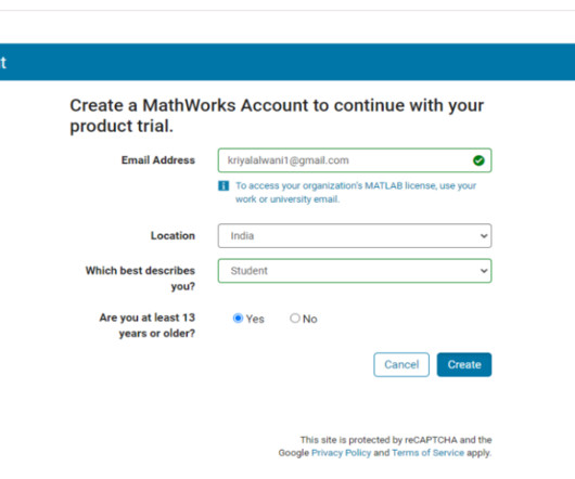
This site is protected by reCAPTCHA and the Google Privacy Policy and Terms of Service apply.
Analytics Vidhya
SEPTEMBER 5, 2023
The foundational data management, analysis, and visualization tool, Microsoft Excel, has taken a significant step forward in its analytical capabilities by incorporating Python functionality.

Analytics Vidhya
MAY 21, 2023
This is precisely what happens in data analytics. People equipped with the […] The post 10 Best Data Analytics Projects appeared first on Analytics Vidhya. With something so profound in daily life, there should be an entire domain handling and utilizing it.

Advertisement
Logi Symphony offers a powerful and user-friendly solution, allowing you to seamlessly embed self-service analytics, generative AI, data visualization, and pixel-perfect reporting directly into your applications. Traditional BI tools can be cumbersome and difficult to integrate - but it doesn't have to be this way.

Analytics Vidhya
APRIL 27, 2022
Introduction Data visualization is crucial in Data Analytics. With exploratory data analysis (EDA), we gain insights into the hidden trends and patterns in a dataset that are useful for decision-making. The post Interactive Data Visualization Using Bqplot appeared first on Analytics Vidhya.
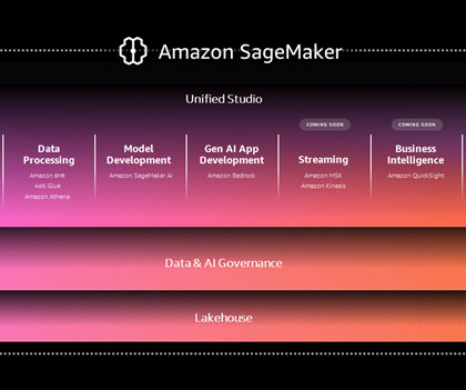
AWS Big Data
DECEMBER 4, 2024
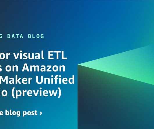
This experience includes visual ETL, a new visual interface that makes it simple for data engineers to author, run, and monitor extract, transform, load (ETL) data integration flow. You can use a simple visual interface to compose flows that move and transform data and run them on serverless compute.

Advertisement
The complexity of financial data, the need for real-time insight, and the demand for user-friendly visualizations can seem daunting when it comes to analytics - but there is an easier way. With Logi Symphony, we aim to turn these challenges into opportunities.

Advertisement
The complexity of healthcare data, the need for real-time analytics, and the demand for user-friendly interfaces can often seem overwhelming. But with Logi Symphony, these challenges become opportunities. With Logi Symphony, you’re not just overcoming obstacles, you’re driving innovation in healthcare.

Expert insights. Personalized for you.


Let's personalize your content