This site uses cookies to improve your experience. To help us insure we adhere to various privacy regulations, please select your country/region of residence. If you do not select a country, we will assume you are from the United States. Select your Cookie Settings or view our Privacy Policy and Terms of Use.
Cookie Settings
Cookies and similar technologies are used on this website for proper function of the website, for tracking performance analytics and for marketing purposes. We and some of our third-party providers may use cookie data for various purposes. Please review the cookie settings below and choose your preference.
Used for the proper function of the website
Used for monitoring website traffic and interactions
Cookie Settings
Cookies and similar technologies are used on this website for proper function of the website, for tracking performance analytics and for marketing purposes. We and some of our third-party providers may use cookie data for various purposes. Please review the cookie settings below and choose your preference.
Strictly Necessary: Used for the proper function of the website
Performance/Analytics: Used for monitoring website traffic and interactions
Table of Contents 1) What Is KPI Management? 2) Why Do KPIs Matter? 3) What Are KPI Best Practices? An even more interesting fact: The blogs we read regularly are not only influenced by KPI management but also concerning content, style, and flow; they’re often molded by the suggestions of these goal-driven metrics.
Experts predict that by 2025, around 175 Zettabytes of data will be generated annually, according to research from Seagate. But with so much data available from an ever-growing range of sources, how do you make sense of this information – and how do you extract value from it? What Is A KPI? What Is A KPI Report?
The term ‘big data’ alone has become something of a buzzword in recent times – and for good reason. By implementing the right reporting tools and understanding how to analyze as well as to measure your data accurately, you will be able to make the kind of datadriven decisions that will drive your business forward.
That said, to improve the overall efficiency, productivity, performance, and intelligence of your contact center you will need to leverage the wealth of digital data available at your fingertips. Your Chance: Want to test a call center dashboard software for free?
Today, there are online data visualization tools that make it easy and fast to build powerful market-centric research dashboards. Your Chance: Want to test a market research reporting software? Primary KPIs: a) Unaided Brand Awareness. Let’s get started. Explore our 14 day free trial & benefit from market research reports!
A CRM dashboard is a centralized hub of information that presents customer relationship management data in a way that is dynamic, interactive, and offers access to a wealth of insights that can improve your consumer-facing strategies and communications. Let’s look at this in more detail. What Is A CRM Report?
Management reporting is a source of business intelligence that helps business leaders make more accurate, data-driven decisions. They collect data from various departments of the company tracking key performance indicators ( KPIs ) and present them in an understandable way. They were using historical data only.
Many CIOs have work to do here: According to a September 2024 IDC survey, 30% of CIOs acknowledged that they dont know what percentage of their AI proofs of concepts met target KPI metrics or were considered successful something that is likely to doom many AI projects or deem them just for show. How confident are we in our data?
In a hyper-connected digital world driven by data, there has never been a better time for businesses to gather meaningful insights on their target prospects, in addition to measuring ongoing levels of commercial growth and performance. Download our guide about the top 18 KPIs your social platforms need! Let’s get going.
In our cutthroat digital age, the importance of setting the right data analysis questions can define the overall success of a business. That being said, it seems like we’re in the midst of a data analysis crisis. Your Chance: Want to perform advanced data analysis with a few clicks? Data Is Only As Good As The Questions You Ask.
Data exploded and became big. Spreadsheets finally took a backseat to actionable and insightful data visualizations and interactive business dashboards. The rise of self-service analytics democratized the data product chain. 1) Data Quality Management (DQM). We all gained access to the cloud.
First… it is important to realize that big data's big imperative is driving big action. 7: 25% of all analytical effort is dedicated to data visualization/enhancing data's communicative power. #6: Reporting Squirrels spend 75% or more of their time in data production activities.
A data-driven finance report is also an effective means of remaining updated with any significant progress or changes in the status of your finances, and help you measure your financial results, cash flow, and financial position. Make predictions based on trusted data. Top Daily Financial Reporting Examples And KPIs.
Visualizing the data and interacting on a single screen is no longer a luxury but a business necessity. Your Chance: Want to test interactive dashboard software for free? A professional dashboard maker enables you to access data on a single screen, easily share results, save time, and increase productivity.
We are far too enamored with data collection and reporting the standard metrics we love because others love them because someone else said they were nice so many years ago. Sometimes, we escape the clutches of this sub optimal existence and do pick good metrics or engage in simple A/B testing. That metric is tied to a KPI.
Your Chance: Want to test a powerful agency analytics software? Agency analytics is the process of taking data and transforming it into valuable insights that are then displayed with a professional agency dashboard. Modern agency reporting allows you to view all the data from your relevant sources in one place.
They may gather financial, marketing and sales-related information, or more technical data; a business report sample will be your all-time assistance to adjust purchasing plans, staffing schedules, and more generally, communicating your ideas in the business environment. Your Chance: Want to test professional business reporting software?
The rise of innovative, interactive, data-driven dashboard tools has made creating effective dashboards – like the one featured above – swift, simple, and accessible to today’s forward-thinking businesses. Dashboard design should be the cherry on top of your business intelligence (BI) project. Now, it’s time for the fun part.
In our information-rich age, a business can accelerate its success by harnessing its organizational data in a way that is both efficient and value-driven. To squeeze every last drop of value from your data, both in an operational and strategic sense, it’s important to leverage the right online reporting tool. click to enlarge**.
4) Small Business Dashboard & KPIs Examples. The times were data analysis was segregated to big enterprises that had the necessary resources to carry it out are long gone. BI dashboard tools provide smaller businesses with valuable insights regarding their operations thanks to real-time access to data.
Here we explore the meaning and value of incremental sales in the world of business, as well as the additional KPI examples and metrics you should track to ensure ongoing success. Incremental sales is a KPI used by marketers to assess the financial value of various promotional activities. What Are Incremental Sales?
Today’s digital data has given the power to an average Internet user a massive amount of information that helps him or her to choose between brands, products or offers, making the market a highly competitive arena for the best ones to survive. First things first – organizing and prioritizing your marketing data.
“The goal is to turn data into information, and information into insight.” – Carly Fiorina, former executive, president, HP. Digital data is all around us. quintillion bytes of data every single day, with 90% of the world’s digital insights generated in the last two years alone, according to Forbes.
“Without big data, you are blind and deaf and in the middle of a freeway.” – Geoffrey Moore, management consultant, and author. In a world dominated by data, it’s more important than ever for businesses to understand how to extract every drop of value from the raft of digital insights available at their fingertips.
Every day, we encounter graphical representations of data in our jobs and also in the news or advertisements. That being said, for data visualizations to be successful and avoid misleading your audience, it is necessary to understand the different use cases for each visual. What Is A Line Graph?
Data analytics is the backbone in many modern organizations. Companies need to analyze data to optimize their business models in a variety of ways. They have found that big data has changed their business models in countless ways. Data Analytics Can Be Invaluable for Creating Dedicated Team Models. Monitoring benchmarks.
In our data-driven digital age, ‘business intelligent’ organizations with the ability to collate, organize, and leverage the insights that are most valuable to their ongoing commercial goals are the ones that are destined to thrive in the long-term. That said, in a time wherein less than two years, around 1.7
In an increasingly data-driven business world, the product management field isn’t exempt from this need. Online data analysis tools will help you sharpen your product sense and give more weight and credibility to the decisions you make and submit to stakeholders. Explore our 14-days free trial and boost your products using data!
As digital transformation evolves, and more businesses begin to harness the power of digital technologies, the rate at which we are creating data is rising by the second. As such, we have to find approaches to data analytics and business intelligence. It’s the art of using live dashboards to respond to data promptly.
Businesses have been analyzing their performance for decades through traditional written reports, but with the amount of data being produced every day, the need for more frequent reporting is growing. The value of including historical data in your weekly status reports is clearly depicted in this interactive marketing report.
2) When & When Not To Use Tables 4) Types Of Table Charts 5) How To Make A Table Chart 6) Table Graph Examples Visual representations of data are all around us. This is especially valuable in a business context, where data has become a company’s biggest competitive advantage. Today, it is the turn of table charts.
Data has never been more readily accessible. Approaches to communication are changing, and success in today’s technology-driven world correlates directly to the quantity rather than the quality of one’s information—metrics relating to the business, the client, the competitor, and the market.
They will be handing over customer data to AI companies that reserve the right to use it for their own purposes,” Fernandes says. The window treatment company, with 17 direct employees and franchises in 35 states, is now beta testing a small language model created with Revscale AI. And you select from this constellation of tools.”
Even with the initial tasks out of the way, such as deciding on a tone and template and testing your email servers , it requires regular work to keep people engaged. It’s also a discipline that involves massive amounts of data. Your email strategy will be driven by your information on how people interact with what you send them.
From startups to big enterprises, businesses are collecting more and more data every day and, it is no secret, that whoever is not taking advantage of it will simply stay behind. Your Chance: Want to test modern reporting software for free? Let’s get started! Explore our 14-day free trial & benefit from great reports today!
Concerning professional growth, development, and evolution, using data-driven insights to formulate actionable strategies and implement valuable initiatives is essential. Data visualization methods refer to the creation of graphical representations of information. That’s where data visualization comes in.
In the digital age, great businesses are founded on great insight — the data-driven kind. Without access to valuable business data, regardless of your niche and sector, you’ll merely be shooting in the dark when making key commercial decisions. But data is only valuable if you know how to handle it effectively.
No longer are we bound by the shackles of cumbersome desktop PCs or one specific geographical location to conduct research or complete online data analysis or other important online tasks. A mobile dashboard provides a portable means of monitoring the most important, high-level KPIs and data related to all areas of a business or organization.
Numerous data?Want Want to flee the great tidal wave of data display? Now here comes data dashboard ?Similar What is Data Dashboard?–Definition. Data Dashboard Tool. Why Data Dashboard? Data Dashboard Tool. Why Data Dashboard? Luckily, a suitable data dashboard tool may help you.
Data monitoring has been changing the business landscape for years now. That said, it hasn’t always been that easy for businesses to manage the huge amounts of unstructured data coming from various sources. By the time a report is ready, the data has already lost its value due to the fast-paced nature of today’s context.
A business intelligence strategy is a framework that enables enterprises to use the right BI tools to analyze the correct data and then report to the right people to aid in making the right decisions. These goals include optimizing current business processes, creating top-notch products and services, and becoming a data-driven business.
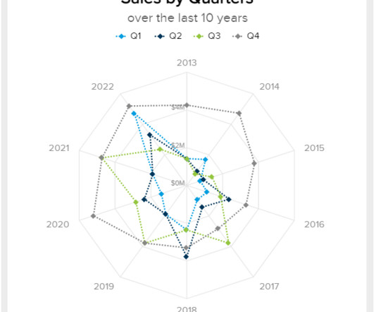
2) When To Use Spider Graphs 3) Types Of Radar Charts 4) Radar Graph Best Practices 5) Spider Chart Examples If you are reading this blog post then you must be somewhat aware of the value of data visualization. As the image above shows, these graphs use a node (anchor) and equiangular spokes (axis) to represent each data dimension.
IT then needs to analyze the data to identify potential issues in how IT services are delivered, and which user groups are most impacted,” Karalis says. Even if you’re an internal or service organization, you should be constantly driven by the amount of value you’re delivering to your stakeholders.” Here’s how to fix that.
Today’s tech-savvy customers are driven by experiences. For customer service industries, utilizing various customer satisfaction metrics like Customer Effort Score, Net Promoter Score, and Customer Satisfaction Score, with the help of the right KPI software will enable you to meet – or even exceed – your customers’ needs.
We organize all of the trending information in your field so you don't have to. Join 42,000+ users and stay up to date on the latest articles your peers are reading.
You know about us, now we want to get to know you!
Let's personalize your content
Let's get even more personalized
We recognize your account from another site in our network, please click 'Send Email' below to continue with verifying your account and setting a password.


Let's personalize your content