This site uses cookies to improve your experience. To help us insure we adhere to various privacy regulations, please select your country/region of residence. If you do not select a country, we will assume you are from the United States. Select your Cookie Settings or view our Privacy Policy and Terms of Use.
Cookie Settings
Cookies and similar technologies are used on this website for proper function of the website, for tracking performance analytics and for marketing purposes. We and some of our third-party providers may use cookie data for various purposes. Please review the cookie settings below and choose your preference.
Used for the proper function of the website
Used for monitoring website traffic and interactions
Cookie Settings
Cookies and similar technologies are used on this website for proper function of the website, for tracking performance analytics and for marketing purposes. We and some of our third-party providers may use cookie data for various purposes. Please review the cookie settings below and choose your preference.
Strictly Necessary: Used for the proper function of the website
Performance/Analytics: Used for monitoring website traffic and interactions
In our cutthroat digital economy, massive amounts of data are gathered, stored, analyzed, and optimized to deliver the best possible experience to customers and partners. At the same time, inventory metrics are needed to help managers and professionals in reaching established goals, optimizing processes, and increasing business value.
Using data in today’s businesses is crucial to evaluate success and gather insights needed for a sustainable company. By establishing clear operational metrics and evaluate performance, companies have the advantage of using what is crucial to stay competitive in the market, and that’s data.
The term ‘big data’ alone has become something of a buzzword in recent times – and for good reason. By implementing the right reporting tools and understanding how to analyze as well as to measure your data accurately, you will be able to make the kind of datadriven decisions that will drive your business forward.
Previously, we discussed the top 19 big data books you need to read, followed by our rundown of the world’s top business intelligence books as well as our list of the best SQL books for beginners and intermediates. Datavisualization, or ‘data viz’ as it’s commonly known, is the graphic presentation of data.
1) What Is Data Quality Management? 4) Data Quality Best Practices. 5) How Do You Measure Data Quality? 6) Data Quality Metrics Examples. 7) Data Quality Control: Use Case. 8) The Consequences Of Bad Data Quality. 9) 3 Sources Of Low-Quality Data. 10) Data Quality Solutions: Key Attributes.
That’s why it’s critical to monitor and optimize relevant supply chain metrics. Finally, we will show how to combine those metrics with the help of modern KPI software and create professional supply chain dashboards. Your Chance: Want to visualize & track supply chain metrics with ease?
That’s where recruitment metrics come in. By utilizing recruiting KPIs presented through the medium of visual and interactive HR dashboards , it’s possible to use recruitment metrics to better interpret and evaluate a variety of talent acquisition factors that aid in hiring processes. And why should you care? Let’s get started.
That said, to improve the overall efficiency, productivity, performance, and intelligence of your contact center you will need to leverage the wealth of digital data available at your fingertips. And the best way to do so is by using digital dashboards and a modern online reporting tool. What Is A Call Center Dashboard?
“By visualizing information, we turn it into a landscape that you can explore with your eyes. 90% of the information transmitted to the brain is visual. Concerning professional growth, development, and evolution, using data-driven insights to formulate actionable strategies and implement valuable initiatives is essential.
In a hyper-connected digital world driven by data, there has never been a better time for businesses to gather meaningful insights on their target prospects, in addition to measuring ongoing levels of commercial growth and performance. It’s clear that social media metrics are particularly valuable to the modern brand and business.
The rise of innovative, interactive, data-driven dashboard tools has made creating effective dashboards – like the one featured above – swift, simple, and accessible to today’s forward-thinking businesses. Dashboard design should be the cherry on top of your business intelligence (BI) project. Now, it’s time for the fun part.
Finally, we will show you a real-life example so you can get a visual overview and a clearer picture of the points discussed in this article. At its core, CRM dashboard software is a smart vessel for data analytics and business intelligence – digital innovation that hosts a wealth of insightful CRM reports. Let’s begin.
Exclusive Bonus Content: Download Data Implementation Tips! It helps managers and employees to keep track of the company’s KPIs and utilizes business intelligence to help companies make data-driven decisions. Organizations can also further utilize the data to define metrics and set goals.
In your daily business, many different aspects and ‘activities’ are constantly changing – sales trends and volume, marketing performance metrics, warehouse operational shifts, or inventory management changes. Now that we know what they are let’s go over some concrete, real-world examples of visuals you will need to include in your reports.
In Part 2 of this series, we discussed how to enable AWS Glue job observability metrics and integrate them with Grafana for real-time monitoring. QuickSight makes it straightforward for business users to visualizedata in interactive dashboards and reports.
Also, implementing effective management reports will create a data-driven approach to making business decisions and obtaining sustainable business success. Centralized data. It’s clear that a project management dashboard is a powerful online data analysis tool. What Is A Project Management Dashboard?
Management reporting is a source of business intelligence that helps business leaders make more accurate, data-driven decisions. They collect data from various departments of the company tracking key performance indicators ( KPIs ) and present them in an understandable way. They were using historical data only.
Turnover rates have taken center stage in workforce discussions, often being the first metric leaders request when assessing the state of the workforce. As leaders, we often report a series of metrics out of habitcost per hire sounds strategic, but it doesnt often lead to insights about long-term performance or retention.
In today’s data-rich environment, the challenge isn’t just collecting data but transforming it into actionable insights that drive strategic decisions. For organizations, this means adopting a data-driven approach—one that replaces gut instinct with factual evidence and predictive insights. What is BI Consulting?
Modern dashboard software makes it simpler than ever to merge and visualizedata in a way that’s as inspiring as it is accessible. Knowing who your audience is will help you to determine what data you need. Knowing what story you want to tell (analyzing the data) tells you which datavisualization type to use.
5) The Role Of Visuals In Accountant Reports. Minimize errors : You might have full trust in your accountant’s reporting abilities, however, managing data and sensitive information manually is both time-consuming and risky due to the possibility of human error. Table of Contents. 1) What Are Accounting Reports? The Balance Sheet.
To reduce its carbon footprint and mitigate climate change, the National Hockey League (NHL) has turned to data and analytics to gauge the sustainability performance of the arenas where its teams play. The only way for you to speak in the language of business is to have the data that help you derive those insights.”
Understanding and tracking the right software delivery metrics is essential to inform strategic decisions that drive continuous improvement. When tied directly to strategic objectives, software delivery metrics become business enablers, not just technical KPIs. This alignment sets the stage for how we execute our transformation.
A data-driven finance report is also an effective means of remaining updated with any significant progress or changes in the status of your finances, and help you measure your financial results, cash flow, and financial position. Make predictions based on trusted data. The reporting tools to do that exist for that very purpose.
In recent years, analytical reporting has evolved into one of the world’s most important business intelligence components, compelling companies to adapt their strategies based on powerful data-driven insights. No more sifting through droves of spreadsheets, no more patchwork data analysis, and reporting methods.
And to gain greater vision, you need to embrace the power of digital data. By leveraging smart online data analysis in the right way, you will gain access to insights that will help you develop strategies that foster growth and innovation while keeping your staff motivated, engaged, and happy. Wider accessibility to important data.
Big data has been incredibly important in the marketing profession. Marketers need to rely heavily on big data technology to reach customers more effectively. Big data technology isn’t just important for making better insights. Visual marketing dashboards are prime examples of using big data effectively in marketing.
Data exploded and became big. Spreadsheets finally took a backseat to actionable and insightful datavisualizations and interactive business dashboards. The rise of self-service analytics democratized the data product chain. 1) Data Quality Management (DQM). We all gained access to the cloud.
1) What Are Product Metrics? 2) Types Of Product Metrics. 3) Product Metrics Examples You Can Use. 4) Product Metrics Framework. In an increasingly data-driven business world, the product management field isn’t exempt from this need. What Are Product Metrics? Types Of Product Metrics.
Business reporting has been around for a long time but the tools and techniques of business intelligence have refined over time and now with the recent popularity of datadriven business approach, data has been identified as the most valuable asset of a business and data analytics and reporting has finally found a key place in the business world.
“It is a capital mistake to theorize before one has data.”– Data is all around us. Data has changed our lives in many ways, helping to improve the processes, initiatives, and innovations of organizations across sectors through the power of insight. Let’s kick things off by asking the question: what is a data dashboard?
Agency analytics is the process of taking data and transforming it into valuable insights that are then displayed with a professional agency dashboard. Apart from using their data to support decision-making, agencies also use metrics as the main language in which they speak to their clients. Benefits Of A Modern Agency Report.
Today’s tech-savvy customers are driven by experiences. Read here how these metrics can drive your customers’ satisfaction up! Customer satisfaction metrics evaluate how the products or services supplied by a company meet or surpass a customer’s expectations. ” – Julie Rice, entrepreneur, and investor.
Data analytics technology has changed many aspects of the modern workplace. A growing number of companies are using data to make more informed hiring decisions , track payroll issues and resolve internal problems. Keep reading to learn more about the benefits of a data-driven approach to conducting employee performance reviews.
“Without big data analytics, companies are blind and deaf, wandering out onto the web like deer on a freeway.” – Geoffrey Moore. And, as a business, if you use your data wisely, you stand to reap great rewards. Data brings a wealth of invaluable insights that could significantly boost the growth and evolution of your business.
For any modern data-driven company, having smooth data integration pipelines is crucial. These pipelines pull data from various sources, transform it, and load it into destination systems for analytics and reporting. Undetected errors result in bad data and impact downstream analysis.
Big data plays a crucial role in online data analysis , business information, and intelligent reporting. Companies must adjust to the ambiguity of data, and act accordingly. Business intelligence reporting, or BI reporting, is the process of gathering data by utilizing different software and tools to extract relevant insights.
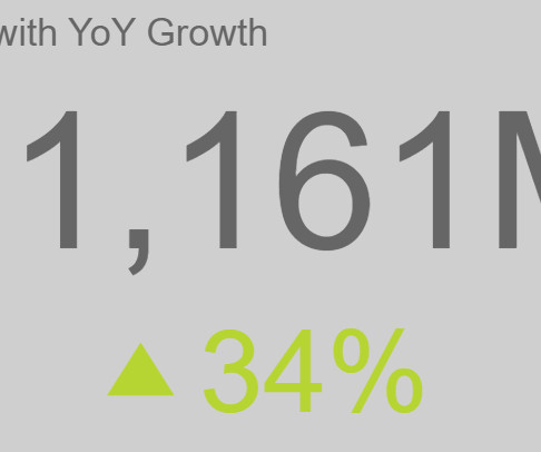
Here we’re going to look at the concept of YoY and consider how you can use this essential metric to your business-boosting advantage. YoY growth can be measured for revenue, leads, conversions, or any metric that an organization is looking to improve over time. Try our professional data analysis software for a 14-day free trial today!
“Big data is at the foundation of all the megatrends that are happening.” – Chris Lynch, big data expert. We live in a world saturated with data. Zettabytes of data are floating around in our digital universe, just waiting to be analyzed and explored, according to AnalyticsWeek. Wondering which data science book to read?
By gaining centralized access to business data and presenting it in a visual way that follows a logical path and provides invaluable insights on a particular area or subject, you stand to set yourself apart from your competitors and become a leader in your field. Exclusive Bonus Content: Your definitive guide to data storytelling!
Modern marketing strategies rely heavily on big data. One study found that retailers that use big data have 2.7 Big data is even more important for companies that depend on social media marketing. His statement about the importance of big data in social media marketing is even more true today.
Datavisualization has become a major part of life for those looking to make use of the large swathes of data available in the modern world. As important as this data is, understanding and making use of that data is even more important. That’s where datavisualization comes in.
Monitoring data pipelines in real time is critical for catching issues early and minimizing disruptions. AWS Glue has made this more straightforward with the launch of AWS Glue job observability metrics , which provide valuable insights into your data integration pipelines built on AWS Glue. Choose Add new data source.
Today, there are online datavisualization tools that make it easy and fast to build powerful market-centric research dashboards. On a typical market research results example, you can interact with valuable trends, gain an insight into consumer behavior, and visualizations that will empower you to conduct effective competitor analysis.
We organize all of the trending information in your field so you don't have to. Join 42,000+ users and stay up to date on the latest articles your peers are reading.
You know about us, now we want to get to know you!
Let's personalize your content
Let's get even more personalized
We recognize your account from another site in our network, please click 'Send Email' below to continue with verifying your account and setting a password.


Let's personalize your content