This site uses cookies to improve your experience. To help us insure we adhere to various privacy regulations, please select your country/region of residence. If you do not select a country, we will assume you are from the United States. Select your Cookie Settings or view our Privacy Policy and Terms of Use.
Cookie Settings
Cookies and similar technologies are used on this website for proper function of the website, for tracking performance analytics and for marketing purposes. We and some of our third-party providers may use cookie data for various purposes. Please review the cookie settings below and choose your preference.
Used for the proper function of the website
Used for monitoring website traffic and interactions
Cookie Settings
Cookies and similar technologies are used on this website for proper function of the website, for tracking performance analytics and for marketing purposes. We and some of our third-party providers may use cookie data for various purposes. Please review the cookie settings below and choose your preference.
Strictly Necessary: Used for the proper function of the website
Performance/Analytics: Used for monitoring website traffic and interactions
That said, to improve the overall efficiency, productivity, performance, and intelligence of your contact center you will need to leverage the wealth of digital data available at your fingertips. And the best way to do so is by using digital dashboards and a modern online reporting tool.
In this post, we focus on data management implementation options such as accessing data directly in Amazon Simple Storage Service (Amazon S3), using popular data formats like Parquet, or using open table formats like Iceberg. Data management is the foundation of quantitative research.
Open table formats are emerging in the rapidly evolving domain of big data management, fundamentally altering the landscape of data storage and analysis. By providing a standardized framework for data representation, open table formats break down data silos, enhance data quality, and accelerate analytics at scale.
A Dot Distribution Plot visualises the data distribution across multiple categories by plotting dots along an axis. Each dot can represent a single data point or a count. To help make overlapping values visible, the opacity of the dots can be reduced, which can help to reveal where the data distribution is concentrated.
Is Your Team in Denial of Data Quality? Here’s How to Tell In many organizations, data quality problems fester in the shadowsignored, rationalized, or swept aside with confident-sounding statements that mask a deeper dysfunction. That doesn’t mean the data inside was correct. A pipeline ran “all green”?
A CRM dashboard is a centralized hub of information that presents customer relationship management data in a way that is dynamic, interactive, and offers access to a wealth of insights that can improve your consumer-facing strategies and communications. Let’s look at this in more detail. What Is A CRM Report? Follow-Up Contact Rate.
Customer relationship management (CRM) platforms are very reliant on big data. As these platforms become more widely used, some of the data resources they depend on become more stretched. CRM providers need to find ways to address the technical debt problem they are facing through new big data initiatives. Unused assets.
The next phase of this transformation requires an intelligent data infrastructure that can bring AI closer to enterprise data. The challenges of integrating data with AI workflows When I speak with our customers, the challenges they talk about involve integrating their data and their enterprise AI workflows.
In the era of big data, data lakes have emerged as a cornerstone for storing vast amounts of raw data in its native format. They support structured, semi-structured, and unstructured data, offering a flexible and scalable environment for data ingestion from multiple sources.
Management reporting is a source of business intelligence that helps business leaders make more accurate, data-driven decisions. They collect data from various departments of the company tracking key performance indicators ( KPIs ) and present them in an understandable way. They were using historical data only.
Today, there are online data visualization tools that make it easy and fast to build powerful market-centric research dashboards. Such dashboards are extremely convenient to share the most important information in a snapshot. What Is A Market Research Report? Primary KPIs: a) Unaided Brand Awareness.
By gaining centralized access to business data and presenting it in a visual way that follows a logical path and provides invaluable insights on a particular area or subject, you stand to set yourself apart from your competitors and become a leader in your field. Exclusive Bonus Content: Your definitive guide to data storytelling!
As with many burgeoning fields and disciplines, we don’t yet have a shared canonical infrastructure stack or best practices for developing and deploying data-intensive applications. Why: Data Makes It Different. Not only is data larger, but models—deep learning models in particular—are much larger than before.
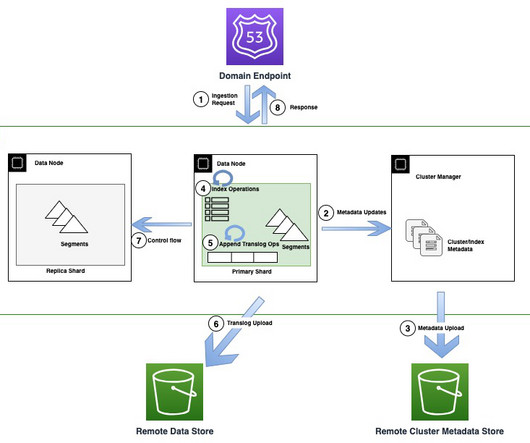
With this new instance family, OpenSearch Service uses OpenSearch innovation and AWS technologies to reimagine how data is indexed and stored in the cloud. Today, customers widely use OpenSearch Service for operational analytics because of its ability to ingest high volumes of data while also providing rich and interactive analytics.
With the growing emphasis on data, organizations are constantly seeking more efficient and agile ways to integrate their data, especially from a wide variety of applications. In addition, organizations rely on an increasingly diverse array of digital systems, data fragmentation has become a significant challenge.
In todays data-driven world, tracking and analyzing changes over time has become essential. As organizations process vast amounts of data, maintaining an accurate historical record is crucial. History management in data systems is fundamental for compliance, business intelligence, data quality, and time-based analysis.
It provides a brief snapshot of the entire business. In our world of digital analytics often these things are called dashboards… I had to shrink the size to make it fit the available screen, but even if you saw it at full glorious resolution, I'm sure you'll very quickly come to the conclusion that this is just a data puke.
If all you kept track of was customer lifetime value and customer acquisition cost, you could see a lot of important data about your business. Number 6 on our list is a sales graph example that offers a detailed snapshot of sales conversion rates. Fundamentally, it’s ideal to have your CAC as low as possible. 6) Sales Conversion.
In today’s business world, competition is fierce across all industries and sectors, which means that to survive and thrive, working with measurable online data analysis and performance metrics is essential. If the data is presented in a clear, digestible format, such as a customer service report , the proof will indeed be in the pudding.
Table of Contents 1) Benefits Of Big Data In Logistics 2) 10 Big Data In Logistics Use Cases Big data is revolutionizing many fields of business, and logistics analytics is no exception. The complex and ever-evolving nature of logistics makes it an essential use case for big data applications. Did you know?
Businesses are constantly evolving, and data leaders are challenged every day to meet new requirements. Customers are using AWS and Snowflake to develop purpose-built data architectures that provide the performance required for modern analytics and artificial intelligence (AI) use cases.
Big data plays a crucial role in online data analysis , business information, and intelligent reporting. Companies must adjust to the ambiguity of data, and act accordingly. Business intelligence reporting, or BI reporting, is the process of gathering data by utilizing different software and tools to extract relevant insights.
Enterprises and organizations across the globe want to harness the power of data to make better decisions by putting data at the center of every decision-making process. However, throughout history, data services have held dominion over their customers’ data.
Visualizing the data and interacting on a single screen is no longer a luxury but a business necessity. A professional dashboard maker enables you to access data on a single screen, easily share results, save time, and increase productivity. That’s why we welcome you to the world of interactive dashboards.
Remember: Today , access to your metrics 24/7/365 is really important, what online data analysis tools can guarantee and ensure that your chances of long-term success increase. In any case, it’s critical to compare your data with the averages of the relevant industry. Our Top 15 Supply Chain Metrics Examples. On-time Shipping.
Experts predict that by 2025, around 175 Zettabytes of data will be generated annually, according to research from Seagate. But with so much data available from an ever-growing range of sources, how do you make sense of this information – and how do you extract value from it? Looking for a bite-sized introduction to reporting?
Studies suggest that businesses that adopt a data-driven marketing strategy are likely to gain an edge over the competition and in turn, increase profitability. In fact, according to eMarketer, 40% of executives surveyed in a study focused on data-driven marketing, expect to “significantly increase” revenue. Still unsure?
Usually, these reports are considered to be financial statements which include: a balance sheet: is a snapshot of a business at a specific time and shows the ending assets, liability, and equity balances as of the balance sheet date. This eliminates potential data silos and creates a single source of information. The Balance Sheet.
We’re living in the age of real-time data and insights, driven by low-latency data streaming applications. The volume of time-sensitive data produced is increasing rapidly, with different formats of data being introduced across new businesses and customer use cases.
Objective Gupshup wanted to build a messaging analytics platform that provided: Build a platform to get detailed insights, data, and reports about WhatsApp/SMS campaigns and track the success of every text message sent by the end customers. Additionally, extract, load, and transform (ELT) data processing is sped up and made easier.
They may gather financial, marketing and sales-related information, or more technical data; a business report sample will be your all-time assistance to adjust purchasing plans, staffing schedules, and more generally, communicating your ideas in the business environment. Let’s get started. Explore our 14-day free trial.
Even metrics like time to productivity provide only a snapshot without delving deeper into the real story. Dashboards and reports can serve as a starting point, but true strategy requires us to remix and reimagine our data continuously to reflect the current landscape. So, what should we be focusing on?
A data-driven finance report is also an effective means of remaining updated with any significant progress or changes in the status of your finances, and help you measure your financial results, cash flow, and financial position. Make predictions based on trusted data. Plan out your budget more effectively.
Without big data analytics, companies are blind and deaf, wandering out onto the Web like deer on a freeway. We are indeed living in a time rich in invaluable digital data. Companies that use data analytics are five times more likely to make faster decisions, based on a survey conducted by Bain & Company.
This is a guest post by Miguel Chin, Data Engineering Manager at OLX Group and David Greenshtein, Specialist Solutions Architect for Analytics, AWS. We live in a data-producing world, and as companies want to become datadriven, there is the need to analyze more and more data.
In the digital age, great businesses are founded on great insight — the data-driven kind. Without access to valuable business data, regardless of your niche and sector, you’ll merely be shooting in the dark when making key commercial decisions. But data is only valuable if you know how to handle it effectively.
A business dashboard offers at-a-glance insights based on key performance indicators (KPIs) and is an intuitive and visually pleasing way to consume data. Unlike early predecessors, they give presenters the ability to engage audiences with real-time data. How familiar they are with the data or KPIs.
We’re living in the midst of the age of information, a time when online data analysis can determine the direction and cement the success of a business or a startup that decides to dig deeper into consumer behavior insights. By managing customer data the right way, you stand to reap incredible rewards.
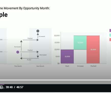
Best practice blends the application of advanced data models with the experience, intuition and knowledge of sales management, to deeply understand the sales pipeline. For this partnership to work, it requires sales leaders who really care about data and are open to analysts’ advice about how to use the Salesforce data they generate.
BI tools access and analyze data sets and present analytical findings in reports, summaries, dashboards, graphs, charts, and maps to provide users with detailed intelligence about the state of the business. Improved customer experience: Ready access to data can help employees charged with customer satisfaction provide better experiences.
Here is a snapshot from our growing new set of data and analytics case studies. D&A Strategy: Continuously Market-Tested Data & Analytics Strategy (UrbanShopping*) 710519. Analytics, BI and Data Science: Peer-Based Analytics Learning (ABB) 710371. Data Quality Score (TE Connectivity) 705649.
In the event of an upgrade failure, Amazon MWAA is designed to roll back to the previous stable version using the associated metadata database snapshot. During an upgrade, Amazon MWAA first creates a snapshot of the existing environment’s metadata database, which then serves as the basis for a new database.
To help make it quick and easy for IT leaders to get a reliable snapshot of the enterprise storage trends, we put together this “trends update” for the second half of 2022. In less than five minutes, you can take hold of useful and relevant information that will help you make more insights-driven decisions over the next six months.
As businesses strive to make informed decisions, the amount of data being generated and required for analysis is growing exponentially. This trend is no exception for Dafiti , an ecommerce company that recognizes the importance of using data to drive strategic decision-making processes. We started with 115 dc2.large
We organize all of the trending information in your field so you don't have to. Join 42,000+ users and stay up to date on the latest articles your peers are reading.
You know about us, now we want to get to know you!
Let's personalize your content
Let's get even more personalized
We recognize your account from another site in our network, please click 'Send Email' below to continue with verifying your account and setting a password.


Let's personalize your content