This site uses cookies to improve your experience. To help us insure we adhere to various privacy regulations, please select your country/region of residence. If you do not select a country, we will assume you are from the United States. Select your Cookie Settings or view our Privacy Policy and Terms of Use.
Cookie Settings
Cookies and similar technologies are used on this website for proper function of the website, for tracking performance analytics and for marketing purposes. We and some of our third-party providers may use cookie data for various purposes. Please review the cookie settings below and choose your preference.
Used for the proper function of the website
Used for monitoring website traffic and interactions
Cookie Settings
Cookies and similar technologies are used on this website for proper function of the website, for tracking performance analytics and for marketing purposes. We and some of our third-party providers may use cookie data for various purposes. Please review the cookie settings below and choose your preference.
Strictly Necessary: Used for the proper function of the website
Performance/Analytics: Used for monitoring website traffic and interactions
Amazon Q dataintegration , introduced in January 2024, allows you to use natural language to author extract, transform, load (ETL) jobs and operations in AWS Glue specific data abstraction DynamicFrame. In this post, we discuss how Amazon Q dataintegration transforms ETL workflow development.
This experience includes visual ETL, a new visual interface that makes it simple for data engineers to author, run, and monitor extract, transform, load (ETL) dataintegration flow. You can use a simple visual interface to compose flows that move and transform data and run them on serverless compute.
With the growing emphasis on data, organizations are constantly seeking more efficient and agile ways to integrate their data, especially from a wide variety of applications. We take care of the ETL for you by automating the creation and management of data replication. Glue ETL offers customer-managed data ingestion.
This article was published as a part of the Data Science Blogathon. Introduction Azure Synapse Analytics is a cloud-based service that combines the capabilities of enterprise data warehousing, big data, dataintegration, datavisualization and dashboarding.
Speaker: Anthony Roach, Director of Product Management at Tableau Software, and Jeremiah Morrow, Partner Solution Marketing Director at Dremio
Tableau works with Strategic Partners like Dremio to build dataintegrations that bring the two technologies together, creating a seamless and efficient customer experience. As a result, these two solutions come together to deliver: Lightning-fast BI and interactive analytics directly on data wherever it is stored.
Talend is a dataintegration and management software company that offers applications for cloud computing, big dataintegration, application integration, data quality and master data management. Its code generation architecture uses a visual interface to create Java or SQL code.
We are excited to announce a new capability of the AWS Glue Studio visual editor that offers a new visual user experience. Now you can author data preparation transformations and edit them with the AWS Glue Studio visual editor. You can configure all these steps in the visual editor in AWS Glue Studio. Choose Save.
While not uncommon in modern enterprises, this reality requires IT leaders to ask themselves just how accessible all that data is. Particularly, are they achieving real-time dataintegration ? For AI to deliver accurate insights and enable data-driven decision-making, it must be fed high-quality, up-to-date information.
There are countless examples of big data transforming many different industries. It can be used for something as visual as reducing traffic jams, to personalizing products and services, to improving the experience in multiplayer video games. We would like to talk about datavisualization and its role in the big data movement.
The steps described here can take months or even years to execute depending on the data needs of the business in question. Invest in purpose-built dataintegration Putting an emphasis on solutions that ease the dataintegration process can help uncover critical answers to many lingering data questions an organization might have.
AWS Glue interactive sessions now include native support for the matplotlib visualization library (AWS Glue version 3.0 In this post, we look at how we can use matplotlib and Seaborn to explore and visualizedata using AWS Glue interactive sessions, facilitating rapid insights without complex infrastructure setup. and later).
Third, some services require you to set up and manage compute resources used for federated connectivity, and capabilities like connection testing and data preview arent available in all services. To solve for these challenges, we launched Amazon SageMaker Lakehouse unified data connectivity. Under Create job , choose Visual ETL.
By using the AWS Glue OData connector for SAP, you can work seamlessly with your data on AWS Glue and Apache Spark in a distributed fashion for efficient processing. AWS Glue OData connector for SAP uses the SAP ODP framework and OData protocol for data extraction. In the navigation pane under ETL Jobs choose Visual ETL.
Nowadays, almost all businesses from all works believe in the potential of excellent BI tools to create stunning visualizations and effectively convey business information. There are many BI tools on the market that have potentially efficient visualization capabilities for customers to use. What are BI Visualization Tools?
Many AWS customers have integrated their data across multiple data sources using AWS Glue , a serverless dataintegration service, in order to make data-driven business decisions. Are there recommended approaches to provisioning components for dataintegration?
Cloud-based data-warehousing company Snowflake has taken this to heart with their Sales Assistant, an internal agentic AI tool designed to empower their global sales team with instant, data-driven insights, resulting in time savings and improved targeting. And around 45% also cite data governance and compliance concerns.
There’s no shortage of consultants who will promise to manage the end-to-end lifecycle of data from integration to transformation to visualization. . The challenge is that data engineering and analytics are incredibly complex. For example, DataOps can be used to automate dataintegration.
QuickSight makes it straightforward for business users to visualizedata in interactive dashboards and reports. You can slice data by different dimensions like job name, see anomalies, and share reports securely across your organization. Looking at the Skewness Job per Job visualization, there was spike on November 1, 2023.
Data exploded and became big. Spreadsheets finally took a backseat to actionable and insightful datavisualizations and interactive business dashboards. The rise of self-service analytics democratized the data product chain. 2) Data Discovery/Visualization. We all gained access to the cloud.
In addition to real-time analytics and visualization, the data needs to be shared for long-term data analytics and machine learning applications. This approach supports both the immediate needs of visualization tools such as Tableau and the long-term demands of digital twin and IoT data analytics.
Through powerful datavisualizations, managers and team members can get a bigger picture of their performance to optimize their processes and ensure healthy project development. The first section of this list of prime features of business intelligence software aims to cover the initial stage of the data analysis process.
BI architecture has emerged to meet those requirements, with data warehousing as the backbone of these processes. One of the BI architecture components is data warehousing. Each of that component has its own purpose that we will discuss in more detail while concentrating on data warehousing. Dataintegration.
One of the most common use cases for data preparation on Amazon Redshift is to ingest and transform data from different data stores into an Amazon Redshift data warehouse. AWS Glue provides an extensible architecture that enables users with different data processing use cases, and works well with Amazon Redshift.
When we talk about dataintegrity, we’re referring to the overarching completeness, accuracy, consistency, accessibility, and security of an organization’s data. Together, these factors determine the reliability of the organization’s data. In short, yes.
DataOps needs a directed graph-based workflow that contains all the data access, integration, model and visualization steps in the data analytic production process. It orchestrates complex pipelines, toolchains, and tests across teams, locations, and data centers. Meta-Orchestration .
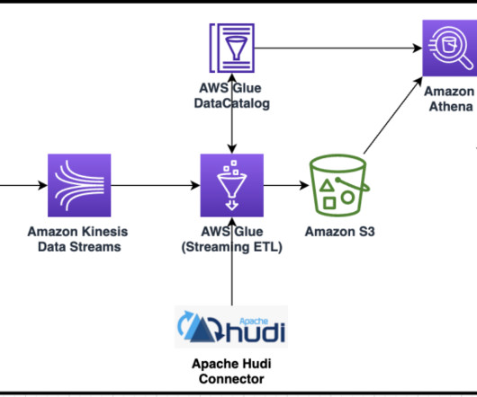
Expanding on the functionality we announced at AWS re:Invent 2022, AWS Glue now natively supports Hudi, Delta Lake and Iceberg through the AWS Glue Studio visual editor. In this post, we demonstrate how to ingest data stored in Hudi using the AWS Glue Studio visual editor. Choose Visual with a source and target.
A social media dashboard is an invaluable management tool that is used by professionals, managers, and companies to gather, optimize, and visualize important metrics and data from social channels such as Facebook, Twitter, LinkedIn, Instagram, YouTube, etc. Bring your data in a single, central place. click to enlarge**.
With the great dataintegration powers of GraphDB, LAZY has achieved a lot. But now the bottleneck moves from data processing towards data gathering. The post From Disparate Data to Visualized Knowledge Part II: Scaling on Both Ends appeared first on Ontotext. Inspectors operating locally are slow.
Dataintegration is the foundation of robust data analytics. It encompasses the discovery, preparation, and composition of data from diverse sources. In the modern data landscape, accessing, integrating, and transforming data from diverse sources is a vital process for data-driven decision-making.
The final model provides sales teams with the highest-value opportunities, which they can visualize in a business intelligence dashboard and take action on immediately. Reducing time-to-value in a unified environment What is remarkable about this example is that entire process happens in one integrated environment.
AWS Glue has made this more straightforward with the launch of AWS Glue job observability metrics , which provide valuable insights into your dataintegration pipelines built on AWS Glue. With Grafana, you can create, explore, and share visually rich, data-driven dashboards. Graph lines are visualized per job.
Certified Business Intelligence Professional IBM Data Analyst Professional Certificate Microsoft Certified: Power BI Data Analyst Associate QlikView Business Analyst SAP Certified Application Associate: SAP BusinessObjects Business Intelligence Platform 4.3 The certification requires passing the Microsoft Power BI Data Analyst exam.
Datavisualization techniques are paramount in today’s data-driven world. Mastering datavisualization techniques is not just a skill but a necessity for professionals across various industries. It plays a crucial role in simplifying complex datasets into easily understandable visuals.
In Figure 1, the nodes could be sources of data, storage, internal/external applications, users – anything that accesses or relates to data. Data fabrics provide reusable services that span dataintegration, access, transformation, modeling, visualization, governance, and delivery.
Enhanced dashboards and interactive visualizations enabled real-time performance monitoring, and streamlined workflows, and identified performance gaps, while ensuring dataintegrity and consistency across all divisions and operations. Download the Case study
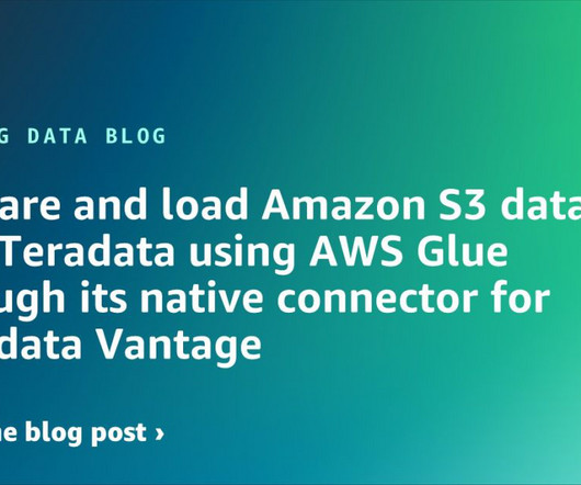
In this post, we explore how to use the AWS Glue native connector for Teradata Vantage to streamline dataintegrations and unlock the full potential of your data. Businesses often rely on Amazon Simple Storage Service (Amazon S3) for storing large amounts of data from various data sources in a cost-effective and secure manner.
In 2024, datavisualization companies play a pivotal role in transforming complex data into captivating narratives. This blog provides an insightful exploration of the leading entities shaping the datavisualization landscape. Market Impact The impact a company has on the market speaks volumes about its success.
The final point to which the data has to be eventually transferred is a destination. The destination is decided by the use case of the data pipeline. It can be used to run analytical tools and power datavisualization as well. Otherwise, it can also be moved to a storage centre like a data warehouse or lake.
Business and Market Requirements As organizations and business users embrace analytics, the need for new types of visualization, reporting and features changes quickly. Vendors can accommodate business-specific needs and datavisualization requirements without time-consuming, expensive customization.
In today’s data-driven world, the datavisualization specialist plays a pivotal role in transforming complex information into visually appealing formats. The demand for skilled professionals in this field is rapidly increasing as businesses rely more on data for decision-making and operations.
Change data capture (CDC) is one of the most common design patterns to capture the changes made in the source database and reflect them to other data stores. a new version of AWS Glue that accelerates dataintegration workloads in AWS. Then we can query the data with Amazon Athena visualize it in Amazon QuickSight.
There are multiple locations where problems can happen in a data and analytic system. What is Data in Use? Data in Use pertains explicitly to how data is actively employed in business intelligence tools, predictive models, visualization platforms, and even during export or reverse ETL processes.
Unlock the power of datavisualization in your decision-making process by partnering with a datavisualization consultant. These experts transform complex data into insightful visuals, enabling you to identify trends and make strategic choices with confidence.
In this post, we discuss different architecture patterns to keep data in sync and up to date between data lakes built on open table formats and data warehouses such as Amazon Redshift. Various data stores are supported in AWS Glue; for example, AWS Glue 4.0 The data is publicly accessible through an S3 bucket.
We organize all of the trending information in your field so you don't have to. Join 42,000+ users and stay up to date on the latest articles your peers are reading.
You know about us, now we want to get to know you!
Let's personalize your content
Let's get even more personalized
We recognize your account from another site in our network, please click 'Send Email' below to continue with verifying your account and setting a password.


Let's personalize your content