This site uses cookies to improve your experience. To help us insure we adhere to various privacy regulations, please select your country/region of residence. If you do not select a country, we will assume you are from the United States. Select your Cookie Settings or view our Privacy Policy and Terms of Use.
Cookie Settings
Cookies and similar technologies are used on this website for proper function of the website, for tracking performance analytics and for marketing purposes. We and some of our third-party providers may use cookie data for various purposes. Please review the cookie settings below and choose your preference.
Used for the proper function of the website
Used for monitoring website traffic and interactions
Cookie Settings
Cookies and similar technologies are used on this website for proper function of the website, for tracking performance analytics and for marketing purposes. We and some of our third-party providers may use cookie data for various purposes. Please review the cookie settings below and choose your preference.
Strictly Necessary: Used for the proper function of the website
Performance/Analytics: Used for monitoring website traffic and interactions
Not only are you responsible for the ongoing financial strategy of your organization, but you’re probably expected to provide timely, accurate reports to a variety of stakeholders. CFO reports supercharge your financial initiatives. Benefit from great CFO dashboards & reports! What Is A CFO Report?
In recent years, analytical reporting has evolved into one of the world’s most important business intelligence components, compelling companies to adapt their strategies based on powerful data-driven insights. What Is An Analytical Report? Your Chance: Want to build your own analytical reports completely free? Let’s get started.
To put the power of CRM software (or customer relationship management dashboard software) into a living, breathing, real-world perspective, we’ll explore CRM dashboards in more detail, starting with basic definitions of such dashboards and reports while considering how you can use CRM dashboard software to your business-boosting advantage.
Moreover, within just five years, the number of smart connected devices in the world will amount to more than 22 billion – all of which will produce colossal sets of collectible, curatable, and analyzable data, claimed IoT Analytics in their industry report. One of the most effective means of doing this is by utilizing KPI reporting tools.
Big data plays a crucial role in online data analysis , business information, and intelligent reporting. That’s where business intelligence reporting comes into play – and, indeed, is proving pivotal in empowering organizations to collect data effectively and transform insight into action. What Is BI Reporting?
As a business, you need the reliability of frequent financial reports to gain a better grasp of your financial status, both current and future. A robust finance report communicates crucial financial information that covers a specified period through daily, weekly, and monthly financial reports. What Is A Finance Report?
As in many other industries, the information technology sector faces the age-old issue of producing IT reports that boost success by helping to maximize value from a tidal wave of digital data. Get our summary to learn the key elements and benefits of IT reporting! What Are IT Reports? Why Do You Need An IT Report?
To squeeze every last drop of value from your data, both in an operational and strategic sense, it’s important to leverage the right online reporting tool. When it comes to reporting, the daily running of your business, the plans and methods you formulate to improve the organization will steer your long-term success. Let’s begin.
In essence, in this post, we will explain all the details needed for dashboard reporting and creation, compare interactive vs. static reporting, and provide tips and tricks to make your business perform even better. Interactive Dashboards vs. Static Reporting. With modern reporting tools , there is no need to do so.
By gaining the ability to gather, organize and analyze the metrics that are most important to your organization, you stand to make your business empire more intelligent than ever before – and executive reporting and business dashboards will help you do just that. Exclusive Bonus Content: Executive Dashboards & Reports: A Summary.
These are measured through KeyPerformanceIndicators (KPIs), which provide insights that help to foster growth and improvement. Without the existence of dashboards and dashboard reporting practices, businesses would need to sift through colossal stacks of unstructured data, which is both inefficient and time-consuming.
Next, we focus on building the enterprise data platform where the accumulated data will be hosted. Amazon QuickSight is used to read from Amazon Athena and generate reports that is consumed by the line of business users and other stakeholders. Amazon QuickSight is used to read from Amazon Athena and generate reports.
This is where LLMs can extend the systems capabilities by converting raw data into actionable insights on a zero-shot basis , without the need for specialized machine learning models, namely: Automatic reporting: LLMs can analyze time series data and generate detailed reports in natural language.
To help you understand the potential of analysis and how you can use it to enhance your business practices, we will answer a host of important analytical questions. To help you set the best possible KPIs for your initiatives and activities, explore our collection of keyperformanceindicator examples. Omit useless data.
4) How to Select Your KPIs 5) Avoid These KPI Mistakes 6) How To Choose A KPI Management Solution 7) KPI Management Examples Fact: 100% of statistics strategically placed at the top of blog posts are a direct result of people studying the dynamics of KeyPerformanceIndicators, or KPIs. What Is KPI Management?
Also, implementing effective management reports will create a data-driven approach to making business decisions and obtaining sustainable business success. Dashboards project management comes with a host of benefits to any modern organization regardless of industry or niche. The key to successful project management is communication.
A digital dashboard is an electronic tracking tool used to build an interactive, visual representation of data from a host of sources including databases, CRM- and ERP data or other web services to monitor important business metrics and overall company’s performance. Set the right keyperformanceindicators (KPIs).
It’s necessary to say that these processes are recurrent and require continuous evolution of reports, online data visualization , dashboards, and new functionalities to adapt current processes and develop new ones. Understand the expected information delivery avenues: reports, dashboards, ad hoc reporting , etc.
A host of business intelligence concepts are executed through intuitive, interactive tools and dashboards – a centralized space that provides the ability to drill down into your data with ease. By working with BI-based keyperformanceindicators (KPIs), you’ll gain the ability to set actionable goals. 1) The raw data.
By harnessing the insights, information, and metrics that are most valuable to key aspects of your business and understanding how to take meaningful actions from your data, you will ensure your business remains robust, resilient, and competitive. Intelligent reporting. Instant insights. Progress monitoring.
If you customize your dashboard presentation to your audience and run in through a dynamic TV dashboard display for all to see, you’re essentially giving everyone within the organization untapped access to the kind of real-time information and reports that will help them do their job better. Upsell & Cross-Sell Rates. click to enlarge**.
Data storytelling has a host of business-boosting benefits. One of the most effective ways of transforming quantitative data into a results-driven narrative is by working with keyperformanceindicators (KPIs). A prime business report example of data storytelling in action. The Benefits Of Data Storytelling.
A SaaS dashboard is a powerful business intelligence tool that offers a host of benefits for ambitious tech businesses. Whether you need to develop an IT report or tackle deeper into the financial analytics side of the business, a dashboard will prove its worth when you see all your data in a clean, interactive screen.
These benefits include cost efficiency, the optimization of inventory levels, the reduction of information waste, enhanced marketing communications, and better internal communication – among a host of other business-boosting improvements. Consult with key stakeholders, including IT, finance, marketing, sales, and operations.
Let’s examine how you can do so with the following sales KPIs, created for a comprehensive sales report. Setting goals and then keeping track of whether those goals are being met is a hallmark of high-performing teams. If you enjoy working with databases, you can easily create this graph with the help of SQL reporting tools.
Collect and prioritize pain points and keyperformanceindicators (KPIs) across the organization. Find out what is working, as you don’t want to totally scrap an already essential report or process. Then for knowledge transfer choose the repository, best suited for your organization, to host this information.
On the flip side, if you enjoy diving deep into the technical side of things, with the right mix of skills for business intelligence you can work a host of incredibly interesting problems that will keep you in flow for hours on end. There’s A Wealth Of Choice. Your Chance: Want to start your business intelligence journey today?
The National Fire Protection Assocation has actually hosted a seminar on the role of big data in their profession. For instance, collecting and analysing data can tell fire departments how long it normally takes to respond to fires reported at certain times of the day. Data analytics is really all about keyperformanceindicators.
They’re designed to work with multiple clouds and build reports that unify the data for easy consumption. The tool is now part of a larger system that watches clusters in public clouds or running locally to ensure they are performing correctly. There’s also a focus on supporting public clouds used by governments.
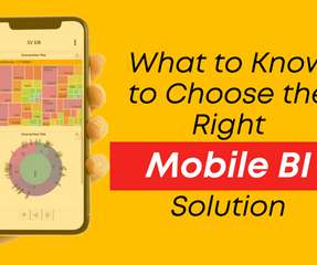
Be sure your Mobile BI App provides intuitive dashboards, graphs, keyperformanceindicators (KPIs), PDF reports and natural language processing (NLP) searching all within the mobile app. Mobile Hosting. Be sure the augmented analytics provider is not charging expensive add-ons for the mobile app.
A business dashboard is a data management tool used to track keyperformanceindicators ( KPIs ), metrics and other relevant data points for your business. A digital dashboard is an electronic interface that combines visual data from many sources, which may include databases, locally hosted files, and web services.
A very special type of metric is designated to be a KeyPerformanceIndicator (KPI). We can start to create some lovely music, and it will come via the use of custom reports – one of my favourite features in any digital analytics tool. I said custom reports. Percentage that other thing. Now your core is set.
CIOs and their IT teams have enjoyed a bump in power and prestige in recent years, as the C-suite has embraced continuous transformation, digital everything, and a host of emerging technologies — all enabled by IT. Consider the findings of a report from professional services firm Accenture.
Solution overview In this post, we walk through a call center analytics solution that provides insights into the call center’s performance in near-real time through metrics that determine agent efficiency in handling calls in the queue. Agent states are reported in agent-state events.
Tools such as Power BI, Tableau and Google Data Studio are growing in popularity and organisations are increasingly looking to utilise dashboards to report and monitor performance. Benchmark and track performance Dashboards allow you to set benchmarks and monitor performance in real time. So, what’s all the fuss about?
Most CEOs (72%) continue to prioritize digital investments, according to the 2022 CEO Outlook report from KPMG, in part due to concerns about emerging and disruptive technology, a top three risk to organizational growth. Once a vanguard business strategy, digital transformation has become a perennial objective for business survival.
While there’s no quickfire solution or definitive answer to this question, we can say that investing in data-driven solutions, reporting tools , and leveraging the power of restaurant analytics will help you succeed in this most cutthroat of industries. And as we said, restaurant analytics will help you with the process.
In recent years, cloud adoption services have accelerated, with companies increasingly moving from traditional on-premises hosting to public cloud solutions. According to a Gartner report , cloud operational expenses are expected to surpass traditional IT spending, reflecting the ongoing transformation in expenditure patterns by 2025.
Success criteria alignment by all stakeholders (producers, consumers, operators, auditors) is key for successful transition to a new Amazon Redshift modern data architecture. The success criteria are the keyperformanceindicators (KPIs) for each component of the data workflow.
A business dashboard offers at-a-glance insights based on keyperformanceindicators (KPIs) and is an intuitive and visually pleasing way to consume data. Our interactive dashboards combine the level power and flexibility that will pull your key metrics together, empowering you to run a better, more data-driven business.
It’s important to ask yourself how you want to showcase your keyperformanceindicators as not only will this dictate the success of your analytical activities but it will also determine how clear your visualizations or data-driven stories resonate with your audience. Bar graphs. How do you want to show your KPIs?
It also becomes difficult to label the pie chart, and valuable online dashboard /reporting real estate is often wasted in the process. The gauge chart is often used in executive dashboards and reports to display progress against key business indicators. They lose presentation value after six segments.
Virtual events and career fairs: Host virtual career fairs and events using online platforms to connect with a broader pool of candidates and showcase the employer brand. This technology can streamline the employee referral process.
Furthermore, frequent reporting through HR analytics tools helps companies uphold their business culture, attract and retain employees, and provide them with invaluable knowledge while offering the astute ability to perform at their best potential. Exclusive Bonus Content: Learn more on monthly and annual HR reports!
We organize all of the trending information in your field so you don't have to. Join 42,000+ users and stay up to date on the latest articles your peers are reading.
You know about us, now we want to get to know you!
Let's personalize your content
Let's get even more personalized
We recognize your account from another site in our network, please click 'Send Email' below to continue with verifying your account and setting a password.


Let's personalize your content