KitikiPlot: Your New Go-To for Time-Series Data Visualization
Analytics Vidhya
DECEMBER 11, 2024
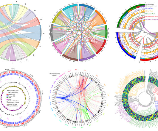
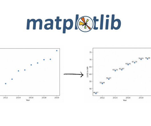
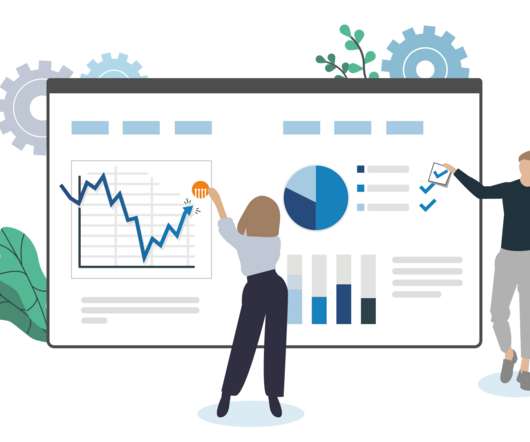
Introducing KitikiPlot, a Python library designed for visualizing sequential and time-series categorical “Sliding Window” patterns.

 data Visualization Related Topics
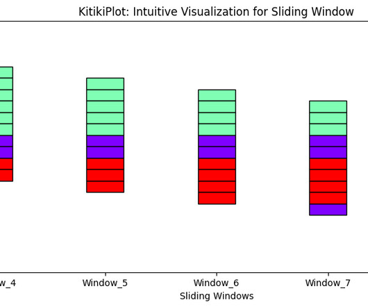
Analytics Vidhya
DECEMBER 11, 2024
Introducing KitikiPlot, a Python library designed for visualizing sequential and time-series categorical “Sliding Window” patterns.
Analytics Vidhya
AUGUST 1, 2021
ArticleVideo Book This article was published as a part of the Data Science Blogathon Data Visualization Data Visualization techniques involve the generation of graphical or. The post Effective Data Visualization Techniques in Data Science Using Python appeared first on Analytics Vidhya.
This site is protected by reCAPTCHA and the Google Privacy Policy and Terms of Service apply.
Analytics Vidhya
JULY 27, 2022
This article was published as a part of the Data Science Blogathon. Introduction Data Visualization is used to present the insights in a given dataset. With meaningful and eye-catching charts, it becomes easier to communicate data analysis findings.

Analytics Vidhya
SEPTEMBER 11, 2022
This article was published as a part of the Data Science Blogathon. Introduction Data visualization is the skill that helps us to interpret the data in a creative and intrusive way. Suppose we break down more aspects of data visualization.

Advertisement
Think your customers will pay more for data visualizations in your application? But today, dashboards and visualizations have become commonplace. Which analytics features are replacing visualizations as “the next big thing”. Five years ago they may have. You’ll learn: The 3 benefits of deeply embedding BI.
Analytics Vidhya
JANUARY 10, 2022
This article was published as a part of the Data Science Blogathon. Overview In this article, we will be dealing with Walmart’s sales dataset and will follow all the data analysis steps on the same and as a result, will try to get some business-related insights from the operations we will be performing on this dataset. […].

Analytics Vidhya
MARCH 19, 2025
yFiles is a powerful SDK designed to simplify the visualization of complex networks and data relationships. When combined with LlamaIndex, it becomes a powerful tool for visualizing and interacting with knowledge graphs in real time. appeared first on Analytics Vidhya.

Advertisement
In the rapidly evolving healthcare industry, delivering data insights to end users or customers can be a significant challenge for product managers, product owners, and application team developers. The complexity of healthcare data, the need for real-time analytics, and the demand for user-friendly interfaces can often seem overwhelming.

Advertisement
In the fast-moving manufacturing sector, delivering mission-critical data insights to empower your end users or customers can be a challenge. Traditional BI tools can be cumbersome and difficult to integrate - but it doesn't have to be this way.

Advertisement
Think your customers will pay more for data visualizations in your application? But today, dashboards and visualizations have become table stakes. Five years ago, they may have. Turning analytics into a source of revenue means integrating advanced features in unique, hard-to-steal ways.

Advertisement
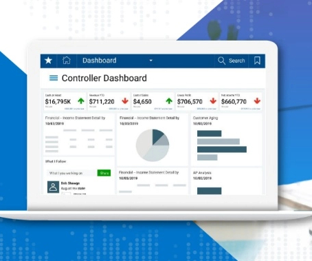
The complexity of financial data, the need for real-time insight, and the demand for user-friendly visualizations can seem daunting when it comes to analytics - but there is an easier way. Together, we can overcome these hurdles and empower your users with the data they need to drive success.

Advertisement
Organizations look to embedded analytics to provide greater self-service for users, introduce AI capabilities, offer better insight into data, and provide customizable dashboards that present data in a visually pleasing, easy-to-access format.

Advertisement
Entity Resolution Sometimes referred to as data matching or fuzzy matching, entity resolution, is critical for data quality, analytics, graph visualization and AI. Advanced entity resolution using AI is crucial because it efficiently and easily solves many of today’s data quality and analytics problems.
Advertisement
That’s one of the many reasons we wrote The Definitive Guide to Dashboard Design—to help you avoid common pitfalls, including… Cramming too much onto one screen and expecting the user to figure out what’s interesting and relevant on their own Getting carried away with fonts and colors so the user is distracted by formatting instead of focusing on the (..)

Advertiser: Jinfonet
Get inspiration for your next dashboard update in this guide to the six styles of analytics and data visualizations.

Expert insights. Personalized for you.


Let's personalize your content