This site uses cookies to improve your experience. To help us insure we adhere to various privacy regulations, please select your country/region of residence. If you do not select a country, we will assume you are from the United States. Select your Cookie Settings or view our Privacy Policy and Terms of Use.
Cookie Settings
Cookies and similar technologies are used on this website for proper function of the website, for tracking performance analytics and for marketing purposes. We and some of our third-party providers may use cookie data for various purposes. Please review the cookie settings below and choose your preference.
Used for the proper function of the website
Used for monitoring website traffic and interactions
Cookie Settings
Cookies and similar technologies are used on this website for proper function of the website, for tracking performance analytics and for marketing purposes. We and some of our third-party providers may use cookie data for various purposes. Please review the cookie settings below and choose your preference.
Strictly Necessary: Used for the proper function of the website
Performance/Analytics: Used for monitoring website traffic and interactions
In this post, we will explain what is a KPI scorecard, when to use it, what is the difference between scorecard and dashboard, and KPI scorecard examples and templates from business scenarios that can be applied to different departments and organizations or used as a roadmap for online data analysis. What Is A KPI Scorecard?
By taking an online data visualization approach to handling your company’s strategic activities, big or small, you will make your business more cohesive, collaborative, intelligent and profitable – and project management dashboards will help you do just that. Download right here our free guide and get started with dashboards!
Exclusive Bonus Content: The Top 18 Social KPIs You Need To Know! Download our guide about the top 18 KPIs your social platforms need! It’s possible to measure a wealth of KPIs for social media, from post engagements (likes, shares, etc.) 3) Top 5 Tweets by engagement. 4) CPM of Twitter Ads.
By gaining centralized access to business data and presenting it in a visual way that follows a logical path and provides invaluable insights on a particular area or subject, you stand to set yourself apart from your competitors and become a leader in your field. Download our free executive summary and start creating your stories!
Modern dashboard software makes it simpler than ever to merge and visualize data in a way that’s as inspiring as it is accessible. Knowing what story you want to tell (analyzing the data) tells you which data visualization type to use. Let’s assume you have the right data and the right data visualization software. Distribution.
Exclusive Bonus Content: Download Dashboard Design Tips & Tricks! Your KPIs will help to shape the direction of your dashboards as these metrics will display visual representations of relevant insights based on specific areas of the business. Exclusive Bonus Content: Download Dashboard Design Tips & Tricks!
Exclusive Bonus Content: Download Data Implementation Tips! By integrating these key performance indicators (KPIs) and goals into their dashboards, companies can proactively identify issues, minimize costs and strive to exceed performance expectations. Of course, it is also important to choose the right KPI.
Download our short executive guide to daily, weekly and monthly reports! Our monthly reports are on top illustrated with beautiful data visualizations that provide a better understanding of the metrics tracked. Download our short executive guide to daily, weekly and monthly reports! Weekly Financial Report Examples And KPIs.
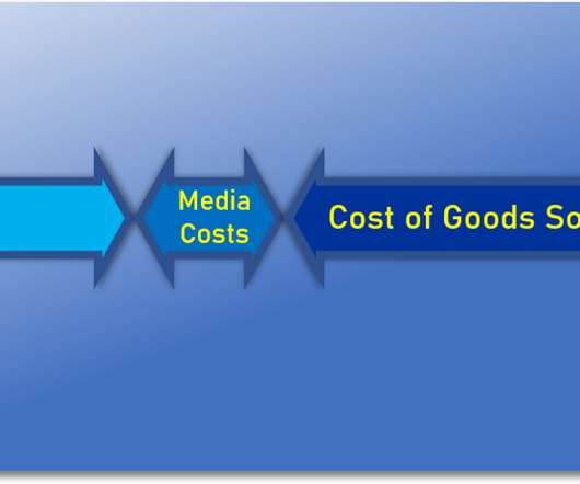
Download our short summary and become the best leader you can be! A CEO dashboard is an interactive platform that visualizes data to empower business leaders to track, measure, analyze, and monitor business performance in a number of areas, enabling them to make data-driven decisions and see the big business picture. Cost per Lead.
Download our free executive summary and boost your sales strategy! It tells you how many new customers you’ve gotten this year, how much revenue each one of those customers is driving, and how much each of those customers costs to acquire – along with many other useful sales KPIs. 11) Sales KPI Dashboard. click to enlarge**.
By choosing from various KPI examples to help track and measure the success of your company’s customer-facing activities, you stand to set yourself apart from the competition in a big way. Working with service desk metrics and KPI reports will help you make the improvements you need for continual growth and success.
There are a lot of KPI examples out there to monitor progress and assess productivity Likewise, there are a lot of guides on how to be productive at work. Your Chance: Want to test a professional KPI tracking software? Use our 14-day free trial and start measuring your productivity today! What Are Productivity Metrics? Overtime hours.
Online data visualization is taking precedence in business operations, creating more efficient and faster workspaces. Download: A pocket-sized guide to invaluable financial graphs and charts. As humans, we respond to, and process visual data better than anything else. That said, in a time wherein less than two years, around 1.7
Download the list of the 11 essential steps to implement your BI strategy! As a direct result, less IT support is required to produce reports, trends, visualizations, and insights that facilitate the data decision making process. This is a testament to the importance of online data visualization in decision making.
Download: A pocket-sized guide to operational and strategic reports! By gaining access to highly-visual interactive insights, you can: Make swift, informed decisions, often in real-time. Primary KPIs: On-Time Shipping. Primary KPIs: Revenue per Sales Rep. Let’s begin. What Is Operational Reporting? click to enlarge**.
Download here the top benefits cheat sheet, and start reporting! One additional element to consider is visualizing data. Since humans process visual information 60.000 times faster than text , the workflow can be significantly increased by utilizing smart intelligence in the form of interactive, and real-time visual data.
Download our bite-sized guide and unlock your fullest analysis potential! Any stats, facts, figures, or metrics that don’t align with your business goals or fit with your KPI management strategies should be eliminated from the equation. Download our bite-sized guide and unlock your fullest analysis potential!
Download our guide to boost your business efforts and jump to success! Modern executive reporting consolidates key business metrics while outlining problems and solutions in which KPI dashboards are used to provide additional insights and serve as an added visual representation that usually lacks in executive reports and summaries.
Nowadays, almost all businesses from all works believe in the potential of excellent BI tools to create stunning visualizations and effectively convey business information. There are many BI tools on the market that have potentially efficient visualization capabilities for customers to use. What are BI Visualization Tools?
JavaScript data visualization tools are in greater demand now than ever before because of the enormous growth of data. Marketing , finance , and sales teams all rely on visualizations to help them understand their data. Understanding Javascript data visualization libraries.
Exclusive Bonus Content: Download Our Free Dashboard Checklist! A BI dashboard — or business intelligence dashboard — is an information management tool that uses data visualization to display KPIs (key performance indicators) tracked by a business to assess various aspects of performance while generating actionable insights.
Thanks to the right KPI software , it is much easier to identify trends and setting goals that will ultimately increase productivity, drive growth, and boost profits. Download our guide to find out about the power of procurement reports! c) Increase the efficiency of crucial KPIs. Without further ado, let’s get started.
Download our short & sweet guide to daily, weekly and monthly reports. Usually, reports are done on an annual, monthly, weekly or daily basis, but sometimes you need to create an ad-hoc, KPI report for a particular purpose. 2) Marketing KPI Report. Download our short & sweet guide to daily, weekly and monthly reports.
Download our pocket-sized summary and improve your operations! A performance dashboard is a data visualization tool that offers a wealth of knowledge on invaluable insights, enabling the user to gain a deeper understanding of their business’s performance in a number of areas while making valuable decisions that foster growth.
Data is most effective when it’s visual, easy to analyze, and accessible to everyone in the organization. Download our bite-sized guide and learn everything you need to know! a) Sales KPI dashboard. Primary KPIs: Revenue per Sales Rep. Download our bite-sized guide and learn everything you need to know!
Download our game-changing summary and see your company grow! Although there are various KPI examples , you should choose only the best fit for your department or industry. These tools allow for a wide range of users to easily connect to, interact with, visualize and communicate their data. Let’s get started!
Download our executive, pocket-sized guide to real time BI and analytics! Real time BI is the application of analytics and data processing tools to gain insight into relevant data and visualizations as they’re created. Download our executive, pocket-sized guide to real time BI and analytics! c) Hospital KPI dashboard.
Similar to the instrument panel equipped in a car, it transforms obscure expertise into plain visualizations which are pleasing to both the eye and mind. A data dashboard is a useful tool that could display and analyze users’ complex data by means of data visualization so that the user gains a deep insight into the value of data.
That’s where KPI tracking comes into play. In this article, we will explore the concept of KPI tracking, its definition, its importance for businesses, and how to perform KPI tracking. Additionally, we will provide real-life examples of KPI tracking dashboards and a step-by-step guide to setting up your own dashboard.
KPI dashboard releases you from your worries and troubles. What is a KPI dashboard? Definition of KPI dashboard. KPIs (Key performance indicators) are quantitative indicators used to measure the work performance of staff, being the foundation of an enterprise performance management system. Reality Use of KPI Dashboard.
Here we explore the meaning and value of incremental sales in the world of business, as well as the additional KPI examples and metrics you should track to ensure ongoing success. Incremental sales is a KPI used by marketers to assess the financial value of various promotional activities. What Are Incremental Sales?
Download our free list with recommendations for different report types! Users can also easily export these dashboards and data visualizations into visually stunning reports that can be shared via multiple options such as automating e-mails or providing a secure viewer area, even embedding reports into your own application, for example.
A small business dashboard is an all-in-one analysis tool that provides real-time access to various KPIs related to marketing, finances, customers, and others. Powered by data visualizations, small businesses can use them to track performance and ensure steady growth. Why Do You Need Small Business KPI Dashboards?
Common indicators used at this stage include the number of new signups, app downloads, website traffic, and more. Each of these examples, generated with a professional KPI tool , will enable you to monitor your product performance, according to what you decide to prioritize on your strategic roadmap. Let’s dive in! Acquisition metrics.
To effectively monitor and analyze these metrics, businesses utilize KPI reports. In this article, we will explore the concept of KPI reports, highlight their significance, provide examples and templates, discuss the essential components, and offer valuable insights on creating KPI reports efficiently.
Most important KPI? It is not a leap to suggest that it is a big distraction from what's important to anoint this barely-a-metric as a KPI. Occasionally, I might call it a KPI, but I have never anointed it as the Most Important KPI. We expect greatness from our work, let’s focus on great KPIs. No siree, Bob!
Download our bite-sized guide and learn everything you need to know! As a result of their interactive nature, dynamic reporting dashboards also help businesses become more responsive to unexpected issues or sudden changes in direction by gaining quick-fire access to visual data as it unfolds—a priceless capability regardless of your industry.
Here, we will consider what a mobile dashboard is, the dashboard mobile design, making visualizations on mobile, and real business examples to explain the benefits this most flexible of data-driven technology can offer your business. Download our bite-sized guide and unlock your fullest mobile potential! What Is A Mobile Dashboard?
Download our bite-sized guide and start with social reporting today! Download our bite-sized guide and start with social reporting today! Another LinkedIn KPI , the 3 most recent updates will remind you what did you recently publish and if you see a spike, you might want to consider taking a closer look at those posts.
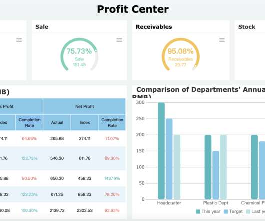
These KPI metrics are critical data to analyze and evaluate a company’s sales, human resources, and marketing, and operational activities. KPI Dashboard (From FineReport?. For example, track the efficacy of particular sales efforts using a measure or KPI (Key Performance Indicator). Dashboard metrics from FineReport.
Therefore, the strategic dashboard does not require real-time data display, but a concise visual display of critical mission information. Threshold early warning: Another factor accompanying KPI monitoring is necessarily an early warning factor. Data visualization software is required to make these cool data charts. Conclusion.
KPI dashboard for Finance (from FineReport). KPI (Key Performance Indicator)-the indicator you will use to measure performance. You can download the templates built in the software in FineReport Demo and apply them directly. BI visualization to analyze cost(by FineReport). Free Download. Free Download.
Among all reports, the dashboard report is the most typical application that uses various visual elements. So it is often used as a visual representation of the company’s key performance indicators (KPI). Free Download. Tables, charts, and other visual widgets are often used in reports. Free Download.
Download right here your quick summary of the customers’ data world! The ability to visualize real-time market changes. Download right here your quick summary of the customers’ data world! Visualize your data. 90% of the information transmitted to our brains is visual. Enhancing your sales efficiency.
We organize all of the trending information in your field so you don't have to. Join 42,000+ users and stay up to date on the latest articles your peers are reading.
You know about us, now we want to get to know you!
Let's personalize your content
Let's get even more personalized
We recognize your account from another site in our network, please click 'Send Email' below to continue with verifying your account and setting a password.


Let's personalize your content