

Digital twins at scale: Building the AI architecture that will reshape enterprise operations
CIO Business Intelligence
MAY 22, 2025
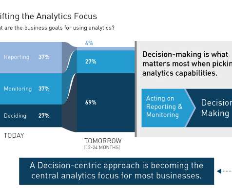
Visualization. Visualization tools Visualization is a critical aspect of digital twins, enabling stakeholders to interact with and understand the digital representation. Advanced visualization tools, including 3D modeling and augmented reality, provide intuitive interfaces for monitoring and decision-making.


Let's personalize your content