This site uses cookies to improve your experience. To help us insure we adhere to various privacy regulations, please select your country/region of residence. If you do not select a country, we will assume you are from the United States. Select your Cookie Settings or view our Privacy Policy and Terms of Use.
Cookie Settings
Cookies and similar technologies are used on this website for proper function of the website, for tracking performance analytics and for marketing purposes. We and some of our third-party providers may use cookie data for various purposes. Please review the cookie settings below and choose your preference.
Used for the proper function of the website
Used for monitoring website traffic and interactions
Cookie Settings
Cookies and similar technologies are used on this website for proper function of the website, for tracking performance analytics and for marketing purposes. We and some of our third-party providers may use cookie data for various purposes. Please review the cookie settings below and choose your preference.
Strictly Necessary: Used for the proper function of the website
Performance/Analytics: Used for monitoring website traffic and interactions
You’ll want to be mindful of the level of measurement for your different variables, as this will affect the statistical techniques you will be able to apply in your analysis. There are basically 4 types of scales: *Statistics Level Measurement Table*. 5) Which statistical analysis techniques do you want to apply?
Imagine generating complex narratives from data visualizations or using conversational BI tools that respond to your queries in real time. Tableau, Qlik and Power BI can handle interactive dashboards and visualizations. In life sciences, simple statistical software can analyze patient data.
While the collection and processing of data involves a lot of technology and expertise, creating a visual representation of the data, which can be read and understood by one and all, also requires an intuitive excellence. Such excellence predominantly is needed to select visualization formats for a specific set of sample data.
According to the US Bureau of Labor Statistics, demand for qualified business intelligence analysts and managers is expected to soar to 14% by 2026, with the overall need for data professionals to climb to 28% by the same year. The Bureau of Labor Statistics also states that in 2015, the annual median salary for BI analysts was $81,320.
While some experts try to underline that BA focuses, also, on predictive modeling and advanced statistics to evaluate what will happen in the future, BI is more focused on the present moment of data, making the decision based on current insights. Well, what if you do care about the difference between business intelligence and data analytics?
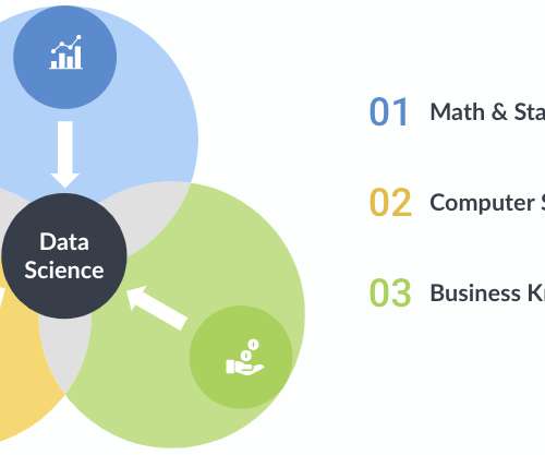
A data scientist must be skilled in many arts: math and statistics, computer science, and domain knowledge. No matter your skill, career level, or title, the ability to analyze, organize, and visualize data are vital skills in our world of quickly growing and ever-changing data. Statistics and programming go hand in hand.
Spreadsheets finally took a backseat to actionable and insightful data visualizations and interactive business dashboards. Companies are no longer wondering if data visualizations improve analyses but what is the best way to tell each data-story. 2) Data Discovery/Visualization. Data exploded and became big.
Based on that amount of data alone, it is clear the calling card of any successful enterprise in today’s global world will be the ability to analyze complex data, produce actionable insights and adapt to new market needs… all at the speed of thought. In fact, a Digital Universe study found that the total data supply in 2012 was 2.8
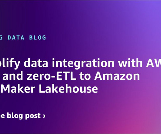
It makes data available in Amazon SageMaker Lakehouse and Amazon Redshift from multiple operational, transactional, and enterprise sources. After you create a connection once, you can choose to use the same connection across various AWS Glue components including Glue ETL, Glue Visual ETL and zero-ETL.
As a direct result, less IT support is required to produce reports, trends, visualizations, and insights that facilitate the data decision making process. From these developments, data science was born (or at least, it evolved in a huge way) – a discipline where hacking skills and statistics meet niche expertise.
Amazon Redshift scales linearly with the number of users and volume of data, making it an ideal solution for both growing businesses and enterprises. Industry-leading price-performance Amazon Redshift offers up to three times better price-performance than alternative cloud data warehouses.
But sometimes can often be more than enough if the prediction can help your enterprise plan better, spend more wisely, and deliver more prescient service for your customers. Most tools offer visual programming interfaces that enable users to drag and drop various icons optimized for data analysis. For enterprise support, cloud options.
Today, organizations look to data and to technology to help them understand historical results, and predict the future needs of the enterprise to manage everything from suppliers and supplies to new locations, new products and services, hiring, training and investments. But too much data can also create issues.
What Is Enterprise Reporting? Enterprise reporting is a process of extracting, processing, organizing, analyzing, and displaying data in the companies. It uses enterprise reporting tools to organize data into charts, tables, widgets, or other visualizations. And enterprise reporting is a more specific category within BI.
The chief aim of data analytics is to apply statistical analysis and technologies on data to find trends and solve problems. Data analytics has become increasingly important in the enterprise as a means for analyzing and shaping business processes and improving decision-making and business results.
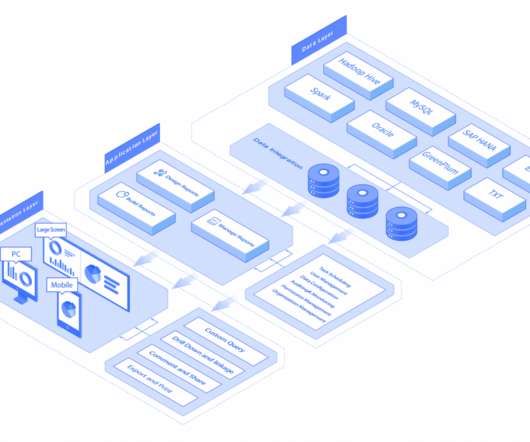
Industry analysts who follow the data and analytics industry tell DataKitchen that they are receiving inquiries about “data fabrics” from enterprise clients on a near-daily basis. Data fabrics provide reusable services that span data integration, access, transformation, modeling, visualization, governance, and delivery.
Business analytics is the practical application of statistical analysis and technologies on business data to identify and anticipate trends and predict business outcomes. Business analytics also involves data mining, statistical analysis, predictive modeling, and the like, but is focused on driving better business decisions.
The concept of DSS grew out of research conducted at the Carnegie Institute of Technology in the 1950s and 1960s, but really took root in the enterprise in the 1980s in the form of executive information systems (EIS), group decision support systems (GDSS), and organizational decision support systems (ODSS). Parmenides Edios.
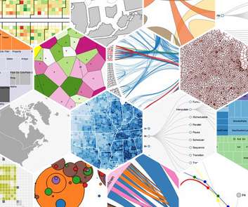
Data visualization software is an application that helps you to transforms raw data in easy to understand graphical formats. Various data visualization software on the market specializes in different data visualization types. Following is a list of 20 Best Data Visualization Tools with their pros, cons, and suitable crowd.
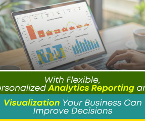
Reporting and Data Visualization Improves Team Understanding! Statistics reveal that many people learn best when they see a story or information depicted in an image. According to Forbes, ‘Almost eighty-thousand scientific studies attest that visual images promote retention.’
The data architect is responsible for visualizing and designing an organization’s enterprise data management framework. Data architects and data engineers work together to visualize and build the enterprise data management framework. In some ways, the data architect is an advanced data engineer.
Business and Market Requirements As organizations and business users embrace analytics, the need for new types of visualization, reporting and features changes quickly. Vendors can accommodate business-specific needs and data visualization requirements without time-consuming, expensive customization.
It can be used to run analytical tools and power data visualization as well. Although a data pipeline can serve several functions, here are a few main use cases of them in the industry: Data Visualizations represent any data via graphics like plots, infographics, charts, and motion graphics. Data Pipeline Architecture Planning.
Through use of data analytics, data visualization, and data modeling techniques and technologies, BI analysts can identify trends that can help other departments, managers, and executives make business decisions to modernize and improve processes in the organization.
Exciting and futuristic, the concept of computer vision is based on computing devices or programs gaining the ability to extract detailed information from visual images. Visual analytics: Around three million images are uploaded to social media every single day. How it will be used in enterprises , we will yet to see.
In a medium to large enterprise, thousands of things have to happen correctly in order to deliver perfect analytic insights. A robust process checks source data and work-in-progress at each processing step along the way to polished visualizations, charts, and graphs. Data sources must deliver error-free data on time.
BI directors, with an average salary of $127,169 per year, lead design and development activities related to the enterprise data warehouse. SAS Certified Specialist: Visual Business Analytics Tableau Certified Data Analyst Tableau Desktop Specialist Tableau Server Certified Associate Certified Business Intelligence Professional (CBIP).
Moreover, 57% of enterprise organizations currently employ a chief data officer, another study conducted by MicroStrategy. By gaining access to detailed sets of visually digestible information from one central location, you’ll be able to make more informed decisions on a regular basis. What Is A Performance Dashboard In Business?
Business intelligence definition Business intelligence (BI) is a set of strategies and technologies enterprises use to analyze business information and transform it into actionable insights that inform strategic and tactical business decisions.
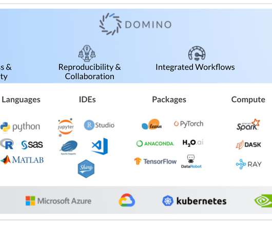
Domino’s Enterprise MLOps platform was designed with this diversity in mind so that as your projects and data science tool ecosystem evolves, the options available to your team won’t be limited to a single approach. RStudio is an IDE for the R language used primarily for statistical analysis as well as data visualization.
Candidates are required to complete a minimum of 12 credits, including four required courses: Algorithms for Data Science, Probability and Statistics for Data Science, Machine Learning for Data Science, and Exploratory Data Analysis and Visualization. The exam consists of 40 questions and the candidate has 120 minutes to complete it.
Top RPA tools RPA tools have grown to be parts of larger ecosystems that map out and manage the enterprise computing architecture. AI routines can also help look for patterns that may speed up the bots in the future. These systems can manage the various APIs and services while also helping the data flow with extra bots.
These predictive models can be used by enterprise marketers to more effectively develop predictions of future user behaviors based on the sourced historical data. These statistical models are growing as a result of the wide swaths of available current data as well as the advent of capable artificial intelligence and machine learning.
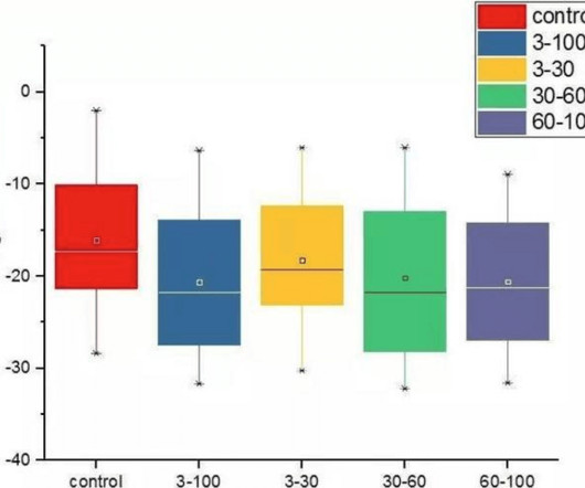
Also referred to as a box-and-whisker plot, this visualization method derives its name from its resemblance to a box. Boxplots are non-parametric; they depict variations in the statistical sample without making assumptions about the underlying statistical distribution. What is a Boxplot? Firstly, what is a boxplot?
Most traditional business insight tools are no longer capable of processing and visualizing the growing volumes of complex data coming from various devices, channels, and business systems. In addition, several enterprises are using AI-enabled programs to get business analytics insights from volumes of complex data coming from various sources.
Its challenge now is to remain at the forefront in applying these technologies to improve the productivity, efficiency, agility and service level delivery capabilities of enterprises with the most demanding supply chain environments. Data is the foundation for successful use of everything related to AI.
For an enterprise company , that can mean building and maintaining data pipelines or optimizing database queries and anything in between. The aged statistic still stands that 80% of your time will be spent preparing and optimizing data. Enterprise companies are naturally complex. Not if you have the right BI platform in place.
Through a marriage of traditional statistics with fast-paced, code-first computer science doctrine and business acumen, data science teams can solve problems with more accuracy and precision than ever before, especially when combined with soft skills in creativity and communication. Math and Statistics Expertise.
A KPI scorecard is a term used to describe a statistical record that measures progress or achievement towards a set performance indicator. Let’s see this through a visual example. We have explained what is a KPI scorecard, provided real business scenarios that can be used in enterprises, mid-sized and even small businesses.
In addition, the incapacity to properly utilize advanced analytics, artificial intelligence (AI), and machine learning (ML) shut out users hoping for statistical analysis, visualization, and general data-science features. As a result, data teams exhausted valuable time resolving problems and fixing glitches, and the approximately 1.5
In the coming years they are more likely to become a part of enterprise solutions. In the future of business intelligence, eliminating waste will be easier thanks to better statistics, timely reporting on defects and improved forecasts. Unique feature: custom visualizations to fit your business needs better. QlickSense.
Amazon SageMaker Unified Studio brings together functionality and tools from the range of standalone studios, query editors, and visual tools available today in Amazon EMR , AWS Glue , Amazon Redshift , Amazon Bedrock , and the existing Amazon SageMaker Studio.
For enterprise organizations, managing and operationalizing increasingly complex data across the business has presented a significant challenge for staying competitive in analytic and data science driven markets. Enterprise Data Engineering From the Ground Up. Let’s take a technical look at what’s included. Managed, Serverless Spark.
The US Bureau of Labor Statistics (BLS) forecasts employment of data scientists will grow 35% from 2022 to 2032, with about 17,000 openings projected on average each year. The certification requires passing three exams: Predictive Modeling Using SAS Enterprise Miner 14; SAS Advanced Predictive Modeling Using SAS 9.4;
We organize all of the trending information in your field so you don't have to. Join 42,000+ users and stay up to date on the latest articles your peers are reading.
You know about us, now we want to get to know you!
Let's personalize your content
Let's get even more personalized
We recognize your account from another site in our network, please click 'Send Email' below to continue with verifying your account and setting a password.


Let's personalize your content