This site uses cookies to improve your experience. To help us insure we adhere to various privacy regulations, please select your country/region of residence. If you do not select a country, we will assume you are from the United States. Select your Cookie Settings or view our Privacy Policy and Terms of Use.
Cookie Settings
Cookies and similar technologies are used on this website for proper function of the website, for tracking performance analytics and for marketing purposes. We and some of our third-party providers may use cookie data for various purposes. Please review the cookie settings below and choose your preference.
Used for the proper function of the website
Used for monitoring website traffic and interactions
Cookie Settings
Cookies and similar technologies are used on this website for proper function of the website, for tracking performance analytics and for marketing purposes. We and some of our third-party providers may use cookie data for various purposes. Please review the cookie settings below and choose your preference.
Strictly Necessary: Used for the proper function of the website
Performance/Analytics: Used for monitoring website traffic and interactions
You ’re building an enterprise data platform for the first time in Sevita’s history. We knew we had to bring the data together in an enterprise data platform. We’re doing KPI visualization and trend analysis, and highlighting variances over time. What’s driving this investment? What kinds of data did you want to correlate?
For CIOs leading enterprise transformations, portfolio health isnt just an operational indicator its a real-time pulse on time-to-market and resilience in a digital-first economy. In todays digital-first economy, enterprise architecture must also evolve from a control function to an enablement platform.
Visualization. Visualization tools Visualization is a critical aspect of digital twins, enabling stakeholders to interact with and understand the digital representation. Advanced visualization tools, including 3D modeling and augmented reality, provide intuitive interfaces for monitoring and decision-making.
Bria AI is a generative AI platform for the production of professional-grade visual content, mainly for enterprises. Established in 2020, they have the tools there, including text-to-image generation, editing with inpainting, background removal, and more.
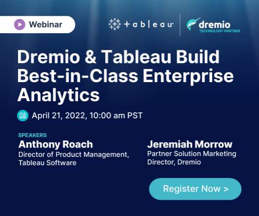
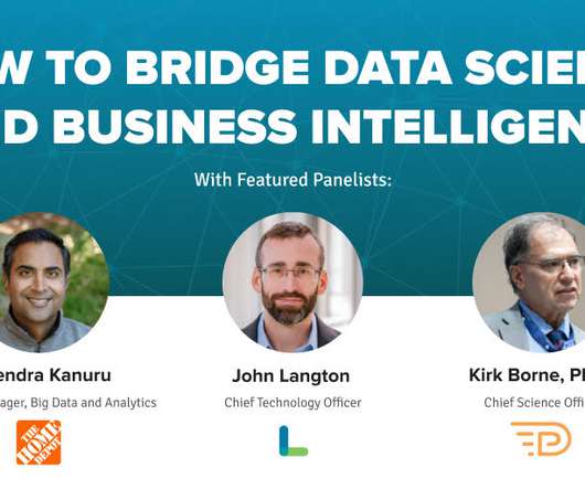
Speaker: Anthony Roach, Director of Product Management at Tableau Software, and Jeremiah Morrow, Partner Solution Marketing Director at Dremio
A self-service platform for data exploration and visualization that broadens access to analytic insights. As a result, these two solutions come together to deliver: Lightning-fast BI and interactive analytics directly on data wherever it is stored. A seamless and efficient customer experience.
This makes it possible to create dynamic, graphical user interfaces that visually represent complex information. and immediately receive relevant answers and visualizations. One example of this would be an application that helps users process complex visual content and prepare it in text or speech.
This integration enables our customers to seamlessly explore data with AI in Tableau, build visualizations, and uncover insights hidden in their governed data, all while leveraging Amazon DataZone to catalog, discover, share, and govern data across AWS, on premises, and from third-party sources—enhancing both governance and decision-making.”
Introduction QlikView is a popular enterprise discovery platform that enables all users in an organization to perform self-service BI. With QlikView, you can analyze and visualize data and their relationships and use these analyzes to make decisions. This article was published as a part of the Data Science Blogathon.
Rapidminer is a visualenterprise data science platform that includes data extraction, data mining, deep learning, artificial intelligence and machine learning (AI/ML) and predictive analytics. It can support AI/ML processes with data preparation, model validation, results visualization and model optimization.
Customer relationship management ( CRM ) software provider Salesforce has updated its agentic AI platform, Agentforce , to make it easier for enterprises to build more efficient agents faster and deploy them across a variety of systems or workflows. Christened Agentforce 2.0, New agent skills in Agentforce 2.0
Introduction Azure Synapse Analytics is a cloud-based service that combines the capabilities of enterprise data warehousing, big data, data integration, data visualization and dashboarding. This article was published as a part of the Data Science Blogathon.
From Cattle to Clarity: Visualizing Thousands of Data Pipelines with Violin Charts Most data teams work with a dozen or a hundred pipelines in production. Is there a way that you can visualize what is happening in production quickly and easily? The shape of each violin lets you visually spot when something is different.
Here, we explore enterprise dashboards in more detail, looking at the benefits of corporate dashboard software as well as a mix of real industry examples. Let’s kick things off by considering what a company dashboard is — or, in other words, provide an enterprise dashboard definition. Enterprise Dashboards Examples.
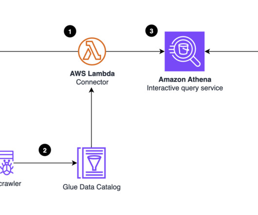
Amazon DataZone recently announced the expansion of data analysis and visualization options for your project-subscribed data within Amazon DataZone using the Amazon Athena JDBC driver. When you’re connected, you can query, visualize, and share data—governed by Amazon DataZone—within Tableau. Connect with him on LinkedIn.
Were thrilled to unveil TestGen Enterprise V3 , the latest evolution in Data Quality automation, featuring Data Quality Scoring. With automatic scorecards generated for your table groups, you can visualize data hygiene instantly. This game-changing capability brings more profound insights and greater control over your data health.
Domo is best known as a business intelligence (BI) and analytics software provider, thanks to its functionality for visualization, reporting, data science and embedded analytics. Domos platform addresses the full breadth of an enterprises analytics needs. Workspaces is in alpha testing. Regards, Matt Aslett
With digital operating models altering business processes and the IT landscape, enterprise architecture (EA) — a rigid stalwart of IT — has shown signs of evolving as well. That’s where the opportunity is for enterprise architects, among others.” Therefore EA is broadening its focus, too. In other words, it creates ownership. “It
Every enterprise needs a data strategy that clearly defines the technologies, processes, people, and rules needed to safely and securely manage its information assets and practices. Guan believes that having the ability to harness data is non-negotiable in today’s business environment.
Here we take the time to define business report, explore visual report examples, and look at how to write one for various needs, goals, and objectives. In the process, we will use an online data visualization software that lets us interact with, and drill deeper into bits and pieces of relevant data. Let’s get started.
AWS Glue interactive sessions now include native support for the matplotlib visualization library (AWS Glue version 3.0 In this post, we look at how we can use matplotlib and Seaborn to explore and visualize data using AWS Glue interactive sessions, facilitating rapid insights without complex infrastructure setup. and later).
These updates are set to revolutionize how organizations create and manage visual content. At the event, the company unveiled a suite of innovative features and tools designed to enhance productivity and collaboration across various teams. From […] The post 30 Exciting New Features by Canva appeared first on Analytics Vidhya.
From IT, to finance, marketing, engineering, and more, AI advances are causing enterprises to re-evaluate their traditional approaches to unlock the transformative potential of AI. What can enterprises learn from these trends, and what future enterprise developments can we expect around generative AI?
We may look back at 2024 as the year when LLMs became mainstream, every enterprise SaaS added copilot or virtual assistant capabilities, and many organizations got their first taste of agentic AI. AI at Wharton reports enterprises increased their gen AI investments in 2024 by 2.3
This is not surprising given that DataOps enables enterprise data teams to generate significant business value from their data. DataOps needs a directed graph-based workflow that contains all the data access, integration, model and visualization steps in the data analytic production process. DataOps is a hot topic in 2021.
The secret is out, and has been for a while: In order to remain competitive, businesses of all sizes, from startup to enterprise, need business intelligence (BI). That interactivity is indeed what drives a profitable result by visually depict important data which can be accessed by different departments. Digital age needs digital data.
Agentic AI is the new frontier in AI evolution, taking center stage in todays enterprise discussion. Agentic AIs future in the enterprise In the enterprise, AI agents will go from assistants to decision-makers predicting problems, taking action, and continuously optimizing operations, says Akamais Prouty.
BI projects aren’t just for the big fishes in the sea anymore; the technology has developed rapidly, the software has become more accessible while business intelligence and analytics projects implemented in various industries regularly, no matter the shape and size, small businesses or large enterprises.
The BI (business intelligence) analysts need to find the right data for their visualization packages, business questions, and decision support tools — they also need the outputs from the data scientists’ models, such as forecasts, alerts, classifications, and more. That’s data fluency/literacy-building across the enterprise.
Against a backdrop of disruptive global events and fast-moving technology change, a cloud-first approach to enterprise applications is increasingly critical. A cloud-first enterprise applications strategy helps make data more accessible to distributed users and workflows, he says.
Content includes reports, documents, articles, presentations, visualizations, video, and audio representations of the insights and knowledge that have been extracted from data. And AI can help users find the appropriate data that they need from across the enterprise. AI can help business users extract and produce (i.e.,
There’s no shortage of consultants who will promise to manage the end-to-end lifecycle of data from integration to transformation to visualization. . The sales team at the consulting firm proposed that a bigger budget was needed to keep the data factory churning out enterprise-critical analytics.
And with the rise of generative AI, artificial intelligence use cases in the enterprise will only expand. At Estée Lauder , the company has released a voice-enabled makeup assistant designed to assist visually impaired people with applying makeup.
Moreover, a host of ad hoc analysis or reporting platforms boast integrated online data visualization tools to help enhance the data exploration process. Typically, ad hoc data analysis involves discovering, presenting, and actioning information for a smaller, more niche audience and is slightly more visual than a standard static report.
QuickSight makes it straightforward for business users to visualize data in interactive dashboards and reports. QuickSight periodically runs Amazon Athena queries to load query results to SPICE and then visualize the latest metric data. You can deploy the end-to-end solution to visualize and analyze trends of the observability metrics.
Imagine generating complex narratives from data visualizations or using conversational BI tools that respond to your queries in real time. Tableau, Qlik and Power BI can handle interactive dashboards and visualizations. with over 15 years of experience in enterprise data strategy, governance and digital transformation.
Nvidia and SAP also announced that Joule will receive new capabilities through Nvidia’s AI Enterprise software, and SAP will integrate Nvidia Omniverse Cloud APIs into its Intelligent Product Recommendation solution as well, so customers can use digital twins to visualize recommended products.
Spreadsheets finally took a backseat to actionable and insightful data visualizations and interactive business dashboards. Companies are no longer wondering if data visualizations improve analyses but what is the best way to tell each data-story. 2) Data Discovery/Visualization. Data exploded and became big.
Lack of clear, unified, and scaled data engineering expertise to enable the power of AI at enterprise scale. Some of the work is very foundational, such as building an enterprise data lake and migrating it to the cloud, which enables other more direct value-added activities such as self-service. What differentiates Fractal Analytics?
Create an ETL job to ingest data from SAP In the AWS Glue console, create a new Visual Editor AWS Glue job. In the navigation pane under ETL Jobs choose Visual ETL. Choose Visual ETL to create a job in the Visual Editor. On your Visual Editor canvas, select your SAP sources. Go to the AWS Glue console.
Finally, to visualize BI insights, you can use Amazon QuickSight , a cloud-powered business analytics service. QuickSight makes it straightforward for organizations to build visualizations, perform ad hoc analysis, and quickly get business insights from their data, anytime, on any device. Choose Visualize.
But let’s see in more detail what the benefits of these kinds of reporting practices are, and how businesses, whether small or enterprises, can develop profitable results. One additional element to consider is visualizing data. This kind of report will become visual, easily accessed, and steadfast in gathering insights.
However, enterprises often encounter challenges with data silos, insufficient access controls, poor governance, and quality issues. By decentralizing data ownership and distribution, enterprises can break down silos and enable seamless data sharing. At the core of this ecosystem lies the enterprise data platform.
Vendors are providing built-in RAG solutions so enterprises won’t have to build them themselves. Tenjin is also being used for AI-assisted software development, data preparation and visualization, and content generation. Google has come up with a RAG service. SAIC offers it to SAIC customers as well.
Based on that amount of data alone, it is clear the calling card of any successful enterprise in today’s global world will be the ability to analyze complex data, produce actionable insights and adapt to new market needs… all at the speed of thought. In fact, a Digital Universe study found that the total data supply in 2012 was 2.8
We organize all of the trending information in your field so you don't have to. Join 42,000+ users and stay up to date on the latest articles your peers are reading.
You know about us, now we want to get to know you!
Let's personalize your content
Let's get even more personalized
We recognize your account from another site in our network, please click 'Send Email' below to continue with verifying your account and setting a password.


Let's personalize your content