This site uses cookies to improve your experience. To help us insure we adhere to various privacy regulations, please select your country/region of residence. If you do not select a country, we will assume you are from the United States. Select your Cookie Settings or view our Privacy Policy and Terms of Use.
Cookie Settings
Cookies and similar technologies are used on this website for proper function of the website, for tracking performance analytics and for marketing purposes. We and some of our third-party providers may use cookie data for various purposes. Please review the cookie settings below and choose your preference.
Used for the proper function of the website
Used for monitoring website traffic and interactions
Cookie Settings
Cookies and similar technologies are used on this website for proper function of the website, for tracking performance analytics and for marketing purposes. We and some of our third-party providers may use cookie data for various purposes. Please review the cookie settings below and choose your preference.
Strictly Necessary: Used for the proper function of the website
Performance/Analytics: Used for monitoring website traffic and interactions
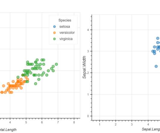
Introduction Data Visualization is used to present the insights in a given dataset. Several charts are available for specific purposes, like bar charts to present categorical distribution, line charts to […]. The post Interactive Data Visualization using rbokeh appeared first on Analytics Vidhya.
With enhanced capabilities and a refined architecture, Idefics2 promises to reshape how we interact with visual and textual data. Also Read: Meta Releases Much-Awaited Llama 3 Model The Evolution of Idefics […] The post Hugging Face Presents Idefics2: An 8B Vision-Language Model Revolution appeared first on Analytics Vidhya.
From enhancing user interactions to transforming efficiency, the rivalry is intense. Companies are competing to integrate advanced generative AI features into their devices.
Data Visualization is the process of presenting data in pictorial and graphical format. The post Interactive Plots in Python with Plotly: A complete Guide appeared first on Analytics Vidhya. The visual representation of data makes understanding […].
Speaker: Dan Jenkins - Human Factors & Research Lead – DCA Design International
It is a philosophy that encourages us to consider how size, shape, age, gender, sexuality, ethnicity, education levels, income, spoken languages, culture and customs, and even diets shape the way we interact with the world. More importantly, it is about designing products and services in light of this understanding.
This improvement streamlines the ability to access and manage your Airflow environments and their integration with external systems, and allows you to interact with your workflows programmatically. In this post, we discuss the enhancement and present several use cases that the enhancement unlocks for your Amazon MWAA environment.
Visualizing the data and interacting on a single screen is no longer a luxury but a business necessity. That’s why we welcome you to the world of interactive dashboards. But before we delve into the bits and pieces of our topic, let’s answer the basic questions: What is an interactive dashboard, and why you need one?
However, today’s business world still lacks a way to present market-based research results in an efficient manner – the static, antiquated nature of PowerPoint makes it a bad choice in the matter, yet it is still widely used to present results. How To Present Your Results: 3 Market Research Example Dashboards.
These are systems that engage in conversations and integrate with APIs but dont create stand-alone content like emails, presentations, or documents. This distinction is critical because the challenges and solutions for conversational AI are unique to systems that operate in an interactive, real-time environment.
Speaker: Ramli John, Managing Director at ProductLed and Author
In this interactive, fun presentation and Q&A, Ramli John, author of bestselling book Product-Led Onboarding, will share a simple but powerful framework to get more users to experience a product’s "Eureka!" So, if their first date with your product is anything but silky-smooth, you risk losing out to the competition.
Introduction Technology has given us a sense of imagining our world where machines can even identify our preferences and anticipate the things that we need along with analyzing past interactions to deliver better output. The future depicted in this world is not the future; it is the present, facilitated by Artificial Intelligence.
Introduction Tableau is a powerful data visualization tool that allows users to analyze and present data interactively and meaningfully. It helps businesses make data-driven decisions by providing easy-to-understand insights and visualizations.
Together, they provide a wide range of tools for trend analysis, results presentation, and the creation of dynamic dashboards. Introduction Strong libraries like Matplotlib, Seaborn, Plotly, and Bokeh serve as the foundation of Python’s data visualization ecosystem.
There are a lot of articles on making presentations about AI technology , such as this article from Medium. However, AI can also be used to create powerful presentations on just about any topic. What Are the Best AI Tools for Making Quality Business Presentations? This is where an interactive mapping tool comes into play.
While rich in diversity, language often presents challenges in cross-cultural interactions, hindering seamless dialogue and understanding. Introduction Effective communication across language barriers is paramount in an increasingly interconnected world characterized by globalization and cultural diversity.
The answer is modern agency analytics reports and interactive dashboards. Explore our 14 days free trial & benefit from interactive agency reports! Agencies benefit from interactive dashboard tools to prove the success of their strategies and campaigns to clients. What Are Agency Analytics?
Introduction Anish Mahapatra has is conducting an interactive DataHour session with us. He will be explaining MLOps referred as Machine learning operations, the present and future state […]. The post The DataHour: Introduction to MLOps appeared first on Analytics Vidhya.
We will discuss report examples and templates you can use to create your own report, use its features in an interactive way, and discover relevant inputs for your specific industry. In the process, we will use an online data visualization software that lets us interact with, and drill deeper into bits and pieces of relevant data.
The rise of innovative, interactive, data-driven dashboard tools has made creating effective dashboards – like the one featured above – swift, simple, and accessible to today’s forward-thinking businesses. Will dashboard be viewed on-the-go, in silence at the office desk or will it be displayed as a presentation in front of a large audience?
Or, in some cases, companies have platforms that were built with human interactions in mind and aren’t ideal today for many gen AI implementations. Present a balanced solution Here’s where many CIOs stumble: presenting technical debt as a problem that needs to be eliminated.
Digital data not only provides astute insights into critical elements of your business but if presented in an inspiring, digestible, and logical format, it can tell a tale that everyone within the organization can get behind. Data visualization methods refer to the creation of graphical representations of information.
Data dashboards provide a centralized, interactive means of monitoring, measuring, analyzing, and extracting a wealth of business insights from relevant datasets in several key areas while displaying aggregated information in a way that is both intuitive and visual. They Are Interactive. What Is A Data Dashboard? click to enlarge**.
ML presents a problem for CI/CD for several reasons. There are many possibilities, ranging from interactive assistants and automated customer service to automated fake news. Some of these are emerging topics and others are developments on existing concepts, but all of them will inform our thinking in the coming year.
There are many areas of research and focus sprouting from the capabilities presented through LLMs. Kevin Weil, chief product officer at OpenAI, wants to make it possible to interact with AI in all the ways that you interact with another human being. In 2024, a new trend called agentic AI emerged.
Spreadsheets finally took a backseat to actionable and insightful data visualizations and interactive business dashboards. The trends we presented last year will continue to play out through 2020. Time gain is also present in the form of AI assistants. The rise of self-service analytics democratized the data product chain.
Typically, ad hoc data analysis involves discovering, presenting, and actioning information for a smaller, more niche audience and is slightly more visual than a standard static report. Ad hoc data analysis offers an interactive reporting experience, empowering end-users to make modifications or additions in real-time.
The goals of such activities are to improve customer service, customer interactions, customer engagement, and customer experience (CX) through just-in-time customer assistance, personalization, and loyalty-building activities. Learn more about the modern Call Center and CX Reimagined at CX Summit 2021 , presented by Five9.
But, these reports are only as useful as the work that goes into preparing and presenting them. They collect data from various departments of the company tracking key performance indicators ( KPIs ) and present them in an understandable way. Let’s dive into the best practices for preparing and presenting them.
Each interaction amplifies the potential for errors, breaches, or misuse, underscoring the critical need for a strong governance framework to mitigate these risks. As AI adoption accelerates, it demands increasingly vast amounts of data, leading to more users accessing, transferring, and managing it across diverse environments.
Shortly after IBM’s Watson beat the world Jeopardy champions, IBM invited me to see a presentation about it. That cyclic process, which is about collaboration between software developers and customers, may be exactly what we need to get beyond the “AI as Oracle” interaction.
We won’t delve into details about the career prospects of this C-level position but we will present COO dashboards and reports that are critical for helping chief operating officers across the world to effectively manage their time, company, operational processes, and results. And present COO dashboard examples and templates.
AI has the capability to perform sentiment analysis on workplace interactions and communications. AI issues represented a significant portion of Gartner’s Top 10 strategic technology trends for 2025 , which the firm also presented this week.
Use digital dashboards: When considering the question “what is an analytical report,” it’s important to think about the best medium in terms of usability and presentation. But with dynamic, interactive dashboard reporting software , your structure will be far simpler and more holistic.
I started to work with my business partners to define our capabilities at an aggregate level and ask some foundational questions: How do these capabilities interact? I presented a proposal with two options: a federated or centralized model, with the pros and cons of each. Which do we use as a company to make money?
A CEO dashboard is an interactive platform that visualizes data to empower business leaders to track, measure, analyze, and monitor business performance in a number of areas, enabling them to make data-driven decisions and see the big business picture. Investor Relations Dashboard For Powerful Presentations. Let’s get started.
The traditional types of reporting don’t meet the requirements of today’s data management nor can they produce efficiency like an interactive dashboard where sets of data are presented in a complementary way. Encourages interactivity and analysis. But what do you do with all this business intelligence? Have no fear!
In this article, we will present the basic definition of financial graphs, explain why you need them, and answer the most basic of questions: what graphs to include in financial analysis? Download: A pocket-sized guide to invaluable financial graphs and charts. Let’s see this in more detail. Which Role Financial Dashboards Play.
For a few years now, Business Intelligence (BI) has helped companies to collect, analyze, monitor, and present their data in an efficient way to extract actionable insights that will ensure sustainable growth. Table of Contents. 1) Benefits Of Business Intelligence Software. 2) Top Business Intelligence Features. a) Data Connectors Features.
But often that’s how we present statistics: we just show the notes, we don’t play the music.” – Hans Rosling, Swedish statistician. Data visualization, or ‘data viz’ as it’s commonly known, is the graphic presentation of data. They can be fun and interactive, too. datapine is filling your bookshelf thick and fast.
A CRM dashboard is a centralized hub of information that presents customer relationship management data in a way that is dynamic, interactive, and offers access to a wealth of insights that can improve your consumer-facing strategies and communications. Try our professional dashboard software for 14 days, completely free!
In essence, they are able to learn from historical data and adjust for present and future operational and strategic performance. What are key metrics in this case enabling – is an environment that focuses on making the right decision at the right time since they will present the data, and help you derive insights.
Since humans process visual information 60.000 times faster than text , the workflow can be significantly increased by utilizing smart intelligence in the form of interactive, and real-time visual data. Creating a simple presentation out of voluminous information can challenge even the most experienced managers.
From sales performance and targets through to customer acquisition costs, sales cycle, and beyond — here, we’ll present sales graphs and charts that matter to the ongoing growth of your business, in turn considering the essential question, what type of charts are used for sales? 8) Revenue And Sales Interactive Management Overview.
BI technologies offer present (real-time), historical, and predictive views of internally structured data relating to all departments within an organization, which exponentially enhances operational insight and improves the decision-making process. Data access, analytics, and presentation. 3) Data access, analytics, and presentation.
We organize all of the trending information in your field so you don't have to. Join 42,000+ users and stay up to date on the latest articles your peers are reading.
You know about us, now we want to get to know you!
Let's personalize your content
Let's get even more personalized
We recognize your account from another site in our network, please click 'Send Email' below to continue with verifying your account and setting a password.


Let's personalize your content