This site uses cookies to improve your experience. To help us insure we adhere to various privacy regulations, please select your country/region of residence. If you do not select a country, we will assume you are from the United States. Select your Cookie Settings or view our Privacy Policy and Terms of Use.
Cookie Settings
Cookies and similar technologies are used on this website for proper function of the website, for tracking performance analytics and for marketing purposes. We and some of our third-party providers may use cookie data for various purposes. Please review the cookie settings below and choose your preference.
Used for the proper function of the website
Used for monitoring website traffic and interactions
Cookie Settings
Cookies and similar technologies are used on this website for proper function of the website, for tracking performance analytics and for marketing purposes. We and some of our third-party providers may use cookie data for various purposes. Please review the cookie settings below and choose your preference.
Strictly Necessary: Used for the proper function of the website
Performance/Analytics: Used for monitoring website traffic and interactions
This article was published as a part of the Data Science Blogathon. The post Interactive Tweet Sentiment Visualization appeared first on Analytics Vidhya. Introduction With the advent of social media, a lot of data has been generated and is being generated. Mining this […].
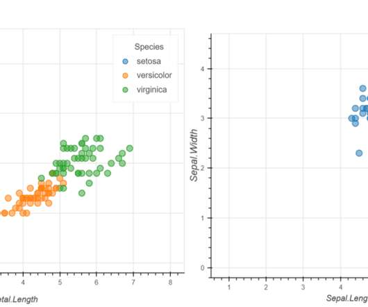
This article was published as a part of the Data Science Blogathon. The post Interactive Data Visualization using rbokeh appeared first on Analytics Vidhya. Introduction Data Visualization is used to present the insights in a given dataset.
This article was published as a part of the Data Science Blogathon Introduction I have been using Pandas with Python and Plotly to create some of the most stunning dashboards for my projects. The post How to Create Stunning and Interactive Dashboards in Excel? The post How to Create Stunning and Interactive Dashboards in Excel?
This article was published as a part of the Data Science Blogathon Introduction This article will introduce you to the Spotfire Business Intelligence tool for creating interactive visualization, performing data analysis, and data science. Spotfire a major player in the BI space is a product from TIBCO.
ArticleVideo Book This article was published as a part of the Data Science Blogathon. The post Creating Interactive Visualizations using Plotly in Python appeared first on Analytics Vidhya. Introduction In today’s world, every second the data keeps on.
This article was published as a part of the Data Science Blogathon. This article explores the fundamentals of interacting with a database and using Database APIs (DBAPI) to connect with a database from another language or […].
ArticleVideo Book This article was published as a part of the Data Science Blogathon Introduction Data is everywhere in today’s world of data, and we. The post Interactive Data Visualization Plots with Plotly and Cufflinks appeared first on Analytics Vidhya.
This article was published as a part of the Data Science Blogathon image source: Author The Importance of Data Visualization A huge amount of data is being generated every instant due to business activities in globalization. The post Building an Interactive Dashboard using Bokeh and Pandas appeared first on Analytics Vidhya.
This article was published as a part of the Data Science Blogathon. The post Create Interactive Dashboards with Streamlit and Python appeared first on Analytics Vidhya. Introduction In Data Visualization, Dashboard is the great Graphical User Interfaces that.
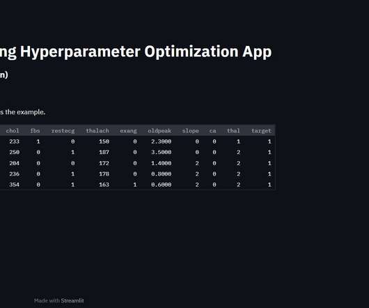
ArticleVideos This article was published as an entry for the Data Science Blogathon. The post Interactive Widget-Based Hyperparameter Tuning and Tracking in Pywedge appeared first on Analytics Vidhya. Introduction Machine Learning is an iterative process and the Model building.
ArticleVideo Book This article was published as a part of the Data Science Blogathon Everything is going to be connected to cloud and data… The post Build Interactive Models With R Shiny! appeared first on Analytics Vidhya.
This article was published as a part of the Data Science Blogathon. The post Interactive Data Visualization Using Bqplot appeared first on Analytics Vidhya. Introduction Data visualization is crucial in Data Analytics. Several popular open-source Python libraries like Matplotlib, seaborn, Altair, Bokeh, Plotly, etc. are […].
ArticleVideo Book This article was published as a part of the Data Science Blogathon Objectives The article focuses on building beautiful and interactive ML web. The post A brief introduction to building interactive ML WebApps With Streamlit appeared first on Analytics Vidhya.
ArticleVideo Book This article was published as a part of the Data Science Blogathon. The post Pandas Visual Analysis – Interactive Visual Analysis appeared first on Analytics Vidhya. Introduction “A visual always brings a first impression.” ” It’s a.
This article was published as a part of the Data Science Blogathon Introduction to Data Visualization Plotting and data representation is an important part of the data-driven decision-making process and the whole data science roadmap. The post Interactive Plots in Python with Plotly: A complete Guide appeared first on Analytics Vidhya.
ArticleVideo Book This article was published as a part of the Data Science Blogathon. The post Implement Of Decision Tree Using Chi_Square Automatic Interaction Detection appeared first on Analytics Vidhya. DECISION TREE Decision tree learning or classification Trees are a.
ArticleVideo Book This article was published as a part of the Data Science Blogathon Introduction Python is one of the most popular and frequently used. The post How to Interact with Operating System using Python and Jupyter Notebook appeared first on Analytics Vidhya.
This article was published as a part of the Data Science Blogathon. The post Reinforcement Learning Techniques Based on Types of Interaction appeared first on Analytics Vidhya. Source: […].
ArticleVideo Book This article was published as a part of the Data Science Blogathon. The post A Gentle Introduction to Bokeh: Interactive Python Plotting Library appeared first on Analytics Vidhya. Data visualization is an important and useful stage in a Data.
This article was published as a part of the Data Science Blogathon. Microsoft‘s business analytics product, Power BI, delivers interactive data visualization BI capabilities that allow users to see and share data and insights throughout their organisation. What is Power BI?
This article was published as a part of the Data Science Blogathon About Streamlit Streamlit is an open-source Python library that assists developers in creating interactive graphical user interfaces for their systems. Using Streamlit, we can quickly create interactive web apps and deploy them.
This article was published as a part of the Data Science Blogathon. Can you recall the last time you interacted with customer service? Are you fed up with waiting in long lines to speak with a customer support representative? There’s a chance you were contacted by a bot rather than human customer support professional.
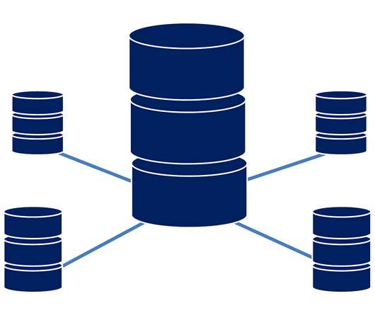
This article was published as a part of the Data Science Blogathon. Introduction One of the sources of Big Data is the traditional application management system or the interaction of applications with relational databases using RDBMS. Big Data storage and analysis […].
This article was published as a part of the Data Science Blogathon. Introduction In today’s world, we know that we interact greatly with our smart devices. Have you ever wondered how your Smartphones and your personal computers interact? That is where NLP comes into the picture.
The popularity of digital assistants such as Amazon’s Alexa or Apple’s Siri has shown how AI can improve interactions with users. Forecasts suggest that by 2025, the majority of customer interactions will be done with intelligent bots. AI is the Future of App Development.
This article was published as a part of the Data Science Blogathon. Introduction Jupyter Notebook is a web-based interactive computing platform that many data scientists use for data wrangling, data visualization, and prototyping of their Machine Learning models.
This article was published as a part of the Data Science Blogathon. Introduction Pandas’ Python profiling package produces an interactive set of tables and visualizations for exploratory data exploration (EDA). It can be difficult to understand pandas, associated data analysis tools (matplotlib, seaborn, etc.),
This article was published as a part of the Data Science Blogathon. Introduction A platform for augmented reality called Metaverse enables users to build interactive experiences that combine the virtual and real worlds. Additionally, it can be considered a virtual version of the concept or idea of cyberspace.
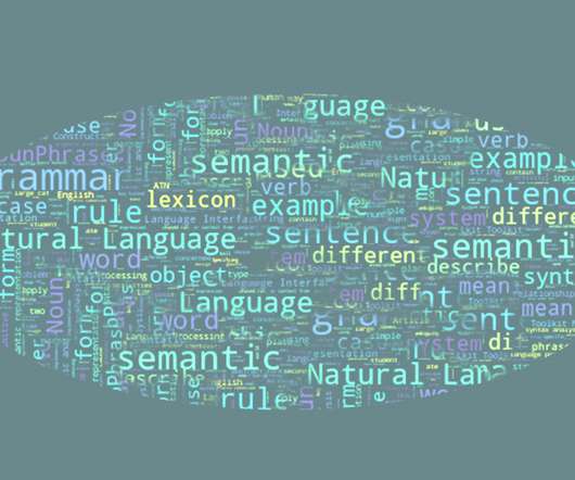
This article was published as a part of the Data Science Blogathon Introduction Pure Language Processing is an interdisciplinary concept that uses the fundamentals of computational linguistics and Synthetic Intelligence to understand how human languages interact with technology.
ArticleVideo Book This article was published as a part of the Data Science Blogathon Introduction Python is a general-purpose interpreted, interactive, object-oriented high-level programming language. The post Data Types in Python appeared first on Analytics Vidhya.
This article was published as a part of the Data Science Blogathon. It’s a programming language to interact/query and manage RDBMS (Relational Database Management Systems). Introduction SQL stands for Structured Query Language.
This article was published as a part of the Data Science Blogathon. It is used to interact with the database, and it is also used to perform specific tasks, functions, and data queries. Source: Freepik Introduction SQL(Structured Query Language) commands are instructions.
ArticleVideo Book This article was published as a part of the Data Science Blogathon Introduction A technology that makes the interaction between humans and machines. The post Let’s Understand How does a chatbot work ? appeared first on Analytics Vidhya.
This article was published as a part of the Data Science Blogathon. It is the foundation for comprehending and interacting with the scene. Introduction One of the most common jobs in computer vision is object detection.
This article was published as a part of the Data Science Blogathon. Introduction Amazon Athena is an interactive query service based on open-source Apache Presto that allows you to analyze data stored in Amazon S3 using ANSI SQL directly. The post How is AWS Athena Different from other Databases appeared first on Analytics Vidhya.
This article was published as a part of the Data Science Blogathon. Introduction to Text to Speech When it comes to our interactions with machines, things have gotten a lot more complicated. We’ve gone from large mechanical buttons to touchscreens. However, hardware isn’t the only thing that’s changing.
This article was published as a part of the Data Science Blogathon. Introduction A chatbot is a computer application that interacts with the user. The post A simple guide to RASA 3.x x appeared first on Analytics Vidhya.
In today’s digital landscape, safeguarding sensitive information has become a top priority, especially for media publishing companies where the protection of data and intellectual property is crucial. Let us know more about you and your role within Gulfnews, Al Nisr Publishing? What cyber threats can a media publishing company face?
This article was published as a part of the Data Science Blogathon Introduction Let’s look at a practical example of how to make SQL queries to a MySQL server from Python code: CREATE, SELECT, UPDATE, JOIN, etc. Most applications interact with data in some form. Therefore, programming languages ??(Python
This article was published as a part of the Data Science Blogathon. Introduction Have you ever wondered how websites track user interactions? Must be pretty hard, isn’t it? Well, yes and no. Simple tracking ? super easy but advanced level tracking can send your mind for a six if things don’t work as expected. In […].
This article was published as a part of the Data Science Blogathon. Introduction Apache Hadoop is an open-source framework designed to facilitate interaction with big data. Still, for those unfamiliar with this technology, one question arises, what is big data?
This article was published as a part of the Data Science Blogathon. Introduction Tableau is a data visualization tool created in Salesforce that allows users to connect to any database, like SQL or MongoDB, and interact freely. The post Most Frequently Asked Tableau Interview Questions appeared first on Analytics Vidhya.
This article was published as a part of the Data Science Blogathon. has introduced the concept of delivering user-centric interactive content. Implement Jinja in Flask, FastAPI, Django, and many more to come Web 2.0 In the very early stage of the internet, the content delivered had static files.
This article was published as a part of the Data Science Blogathon. DAX is the language developed by Microsoft to interact with data in a variety of their platforms, such as Power BI, PowerPivot, and SSAS tabular models. Introduction The following is an in-depth article explaining DAX which stands for Data Analysis Expression.
We organize all of the trending information in your field so you don't have to. Join 42,000+ users and stay up to date on the latest articles your peers are reading.
You know about us, now we want to get to know you!
Let's personalize your content
Let's get even more personalized
We recognize your account from another site in our network, please click 'Send Email' below to continue with verifying your account and setting a password.


Let's personalize your content