This site uses cookies to improve your experience. To help us insure we adhere to various privacy regulations, please select your country/region of residence. If you do not select a country, we will assume you are from the United States. Select your Cookie Settings or view our Privacy Policy and Terms of Use.
Cookie Settings
Cookies and similar technologies are used on this website for proper function of the website, for tracking performance analytics and for marketing purposes. We and some of our third-party providers may use cookie data for various purposes. Please review the cookie settings below and choose your preference.
Used for the proper function of the website
Used for monitoring website traffic and interactions
Cookie Settings
Cookies and similar technologies are used on this website for proper function of the website, for tracking performance analytics and for marketing purposes. We and some of our third-party providers may use cookie data for various purposes. Please review the cookie settings below and choose your preference.
Strictly Necessary: Used for the proper function of the website
Performance/Analytics: Used for monitoring website traffic and interactions
From Direct Interaction With Multiple End Users To Product Owners. With the traditional/waterfall methodology, BAs are expected and encouraged to interact with stakeholders from multiple domains. This may be in the form of weekly or monthly status reports depending on the organisation.
To optimize your CS offerings you need access to the right data, and this is where customer service reports come into play. In this article, we will explain all the necessary information you need to obtain about customer service reporting, and provide essential industry examples and templates. What Is A Customer Service Report?
By gaining the ability to gather, organize and analyze the metrics that are most important to your organization, you stand to make your business empire more intelligent than ever before – and executive reporting and business dashboards will help you do just that. Exclusive Bonus Content: Executive Dashboards & Reports: A Summary.
Furthermore, 53% of HR professionals report that good onboarding boosts employee engagement rates. According to a 2020 employee engagement report : 93% of highly engaged employees feel like they receive adequate feedback for their performance as opposed to 41% of disengaged employees. Highly engaged employees are 2.3x
I recently had the opportunity to be a guest on James Pann’s YouTube show to talk about reports. Here’s a recap of our conversation: My Introduction to Dusty Shelf Reports. Early on in my career, I was throwing all my effort into a report, staying late, working on the weekends, doing whatever it took to do my best work.
Soar Beyond the Dusty Shelf Report. Have a colleague who’s still writing lengthy technical reports? This four-course bundle teaches you to design static and interactive dashboards in Excel and Tableau. Submit your draft dashboards, slideshows, reports, and more, and get my feedback in a small group setting. Office Hours.
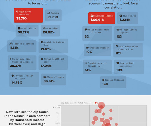
Example 1: The Hope Summit I recently attended a workshop put on by the Belmont Data Collaborative, part of a wider Belmont event focused on “ Data-Informed Social Innovation so Regions can Thrive ”. As part of the event, we created this interactivereport that lets you explore how socio-economic factors correlate with health conditions.
Enterprise data is brought into data lakes and data warehouses to carry out analytical, reporting, and data science use cases using AWS analytical services like Amazon Athena , Amazon Redshift , Amazon EMR , and so on. Amazon Athena provides interactive analytics service for analyzing the data in Amazon Simple Storage Service (Amazon S3).
There are many options for learning, including this list of best data storytelling workshops and absorbing the lessons of masters from 20 amazing data storytelling examples. The hands-on, interactive lessons are self-paced and take 5-10 minutes to complete. Are you looking to upgrade your Data Storytelling skills? Cost: Starts at $99.
Two years ago we wrote a research report about Federated Learning. We’re pleased to make the report available to everyone, for free. We explored a toy application of Federated Learning to predict industrial equipment failure in our interactive prototype Turbofan Tycoon. You can read it online here: Federated Learning.
I’m pleased to announce that I will be delivering a one day workshop as one of the two precons at SQL Saturday 382, Brisbane. Creating Interactive Visualisation for Actionable Analytics. Publishing and Administering Dashboards and Reports in Power BI for the Organisation. The details of the course are listed below.
I’m pleased to announce that I will be delivering a one day workshop as one of the two precons at SQL Saturday 382, Brisbane. Creating Interactive Visualisation for Actionable Analytics. Publishing and Administering Dashboards and Reports in Power BI for the Organisation. The details of the course are listed below.
Chalk talks Chalk talks are an hour-long, highly interactive content format with a small audience. WorkshopsWorkshops are 2-hour interactive sessions where you work in teams or individually to solve problems using AWS services. 4:30 PM – 5:30 PM (PDT) Wynn ANT207 | Understand your data with business context.
I’m pleased to announce that I will be delivering a one day workshop as one of the three precons at SQL Saturday 389, Huntington Beach, California. Creating Interactive Visualisation for Actionable Analytics. Publishing and Administering Dashboards and Reports in Power BI for the Organisation.
I’m pleased to announce that I will be delivering a one day workshop as one of the three precons at SQL Saturday 389, Huntington Beach, California. Creating Interactive Visualisation for Actionable Analytics. Publishing and Administering Dashboards and Reports in Power BI for the Organisation.
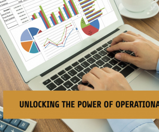
Operational reports have the potential to greatly enhance business performance through the utilization of data-driven insights. These reports offer a structured and comprehensible representation of data, enabling a clearer understanding of complex issues that might otherwise remain elusive. What Is An Operational Report?
Find out what is working, as you don’t want to totally scrap an already essential report or process. With all this information in hand, you can think about training opportunities such as workshops, seminars, and others. Rely on interactive data visualizations. On the flip side, document everything that isn’t working.
In our workshops on data storytelling, dashboard design, and data visualization, we are always emphasing the need to simplify. Instead of staring dejectedly into that mess of a closet, shift your gaze to that dashboard or report that you know needs some tough love. Reporting on data — even when it is un-useful — is a natural instinct.
IT leaders and CIOs have also long recognized the power of storytelling, but only recently has the phenomenon become formalized with many saying they’ve attended workshops or seminars on the topic with the express intention of improving their sense of narrative and power to communicate and persuade.
When it comes to pipeline health management, each service that your tasks are interacting with could be storing or publishing logs to different locations, such as an S3 bucket or Amazon CloudWatch logs. To run the scripts, refer to the Amazon MWAA analytics workshop.
It’s a fast growing and lucrative career path, with data scientists reporting an average salary of $122,550 per year , according to Glassdoor. The bootcamps are designed and taught by industry practitioners and cover Python, algorithms, linear regression, machine learning, NLP, databases, interactive data visualization, and more.
Lots of time and interest: Interactive charts. Consult a Chart Chooser My interactive Chart Chooser includes dozens of chart types, resources, tutorials, and templates. Put your easiest-to-follow chart in your final presentation or report. Consultants, this means the report will look like it came from the client.
Example 1: The Hope Summit I recently attended a workshop put on by the Belmont Data Collaborative, part of a wider Belmont event focused on “ Data-Informed Social Innovation so Regions can Thrive ”. As part of the event, we created this interactivereport that lets you explore how socio-economic factors correlate with health conditions.
Amazon Athena is a serverless, interactive analytics service built on the Trino, PrestoDB, and Apache Spark open-source frameworks. Recently, Athena added support for creating and querying views on federated data sources to bring greater flexibility and ease of use to use cases such as interactive analysis and business intelligence reporting.
SF Blockchain Week Insight is excited to host an open infrastructure party during SF Blockchain week on Wednesday October 30th with workshops and interactive festivities at our SF location. Brian is editing the video as we speak and will send an update as soon as it is ready. Stay tuned to our twitter and reddit to hear more details.
SIEM solutions help you implement real-time reporting by monitoring your environment for security threats and alerting on threats once detected. Develop log and trace analytics solutions with interactive queries and visualize results with high adaptability and speed.
Ten years ago, it was a really big deal to do anything besides a technical report. At a conferene, we stood up and said, “What if we have a technical report but we also have a one-pager for each of the 30 schools in this project? I like teaching more than I like writing the actual reports myself.”.
Moreover, it’s hard to right-size these settings for some use cases such as interactive analytics due to lack of visibility into future requirements. If not, refer to the Setting up Prometheus and Grafana for monitoring the cluster section of the Running batch workloads on Amazon EKS workshop to get them up and running on your cluster.
For example, the number of hyperscale centres is reported to have doubled between 2015 and 2020. However –and this is one of the challenges for businesses– there is an ongoing shift in the world from structured to unstructured data, as reported by IDC. The rate of data growth is reflected in the proliferation of storage centres.
At the same time, in the pattern of interactivity and data visualization, digital dashboard can realize its own in-depth exploration and analysis of data. Workshop application of FineReport’s digital dashboard. Dynamic update: FineReport’s digital dashboard is based on the reporting of the enterprise. Conclusion.
Originally scheduled for March 22 to 26 in California, NVIDIA’s GTC was transformed into a fully virtual convention — a series of tech talks, seminars, training sessions, and workshops. Similarly, partners and attendees are also learning how they work, and becoming more comfortable with online interactions. . Learn your tools! “I
360 Orlando and I’m presenting a workshop on From Business Intelligence to Business Analytics with the Microsoft Data Platform. Data becomes relevant for decision making when we start to use it properly, so this workshop will demonstrate the use of analytics for real-life use cases.
Gartner’s Value Pyramid and “linking data to outcome” is a very popular workshop tool to help business and non-business folks explore how a business outcome can be de-composed into real data. Value Pyramid Workshop resource: Toolkit: How to Connect Data to Business Outcomes. Here is another graphic from the workshop.
Classes are highly interactive. Report Redesign , our deep dive on creating reports that people actually read: October 7 – 10, 2024 from 1 – 4:30 pm Eastern each day. Dashboard Design , our deep dive on building static and interactive dashboards: December 9 – 12, 2024 from 1 – 4:30 pm Eastern each day.
Likewise, Milind Wagle, CIO at Equinix, notes that he makes deliberate efforts to visit each of the company’s global teams at least twice a year to alleviate “emotional” distance with his reports and ensure each location feels valued and connected to the organization. The same logic can be applied to measuring company cultural efforts.
In Cloudera’s recent report Limitless: The Positive Power of AI , we found that 87% of business decision makers are achieving success through existing ML programs. The project launches an interactive visualization for exploring the quality of representations extracted using multiple model architectures.
For instance, it is increasingly advisable to provide transparency to end users about the presence and use of any AI they are interacting with. Step 3: For six to eight weeks leading up to the presentation date, offer applied training to the teams on developing these artifacts through workshops on their specific use cases.
Technical skills empower data visualization specialists to transform raw data into interactive charts, graphs, and interactive dashboards that effectively communicate information. Learning best practices for designing interactive charts, graphs, and dashboards.
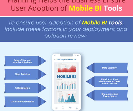
Planning Helps the Business Ensure User Adoption of Mobile BI Tools Today’s Mobile BI applications are more advanced, flexible and interactive and designed to respond to business user needs and expectations. Discover the features of Business Intelligence and Reporting , and download a free trial of Smarten Analytics software.
Data analysis activities – The SikSin Food Service team experienced difficulties in regards to report generation due to scattered data across multiple systems. The recommendation records are surfaced using interaction data, product data, and predictive models.
Host Jon Krohn asked me to summarize some of my favorite tips for data storytelling, spreadsheets, reports, and presentations. Take a peek and make sure you aren’t messing up your graph titles and legends. : I shared the recording and materials from my how-to workshop at the Good Tech Fest conference. Thanks, Barbara!
The market for Enterprise BI & Analytics has reached a significant level of maturity, with platforms that offer robust core functionalities, such as reporting and dashboards, delivered with high quality. It enables natural language interaction not just with the BI platform itself but also with the underlying data.
Manufacturing KPI dashboard Manufacturing Command Room Dashboard (by FineReport) Manufacturing KPI dashboard measures the performance of teams or workshops by focusing on indicators related to the production process. Sharing dashboards with stakeholders is also simple and efficient.
These individuals may already be ‘power users’ of business applications and may have developed and reported or presented data to others with an eye toward clarifying their decision-making. Citizen Data Scientist candidates may also be IT team members who are interested in data science.
We organize all of the trending information in your field so you don't have to. Join 42,000+ users and stay up to date on the latest articles your peers are reading.
You know about us, now we want to get to know you!
Let's personalize your content
Let's get even more personalized
We recognize your account from another site in our network, please click 'Send Email' below to continue with verifying your account and setting a password.


Let's personalize your content