This site uses cookies to improve your experience. To help us insure we adhere to various privacy regulations, please select your country/region of residence. If you do not select a country, we will assume you are from the United States. Select your Cookie Settings or view our Privacy Policy and Terms of Use.
Cookie Settings
Cookies and similar technologies are used on this website for proper function of the website, for tracking performance analytics and for marketing purposes. We and some of our third-party providers may use cookie data for various purposes. Please review the cookie settings below and choose your preference.
Used for the proper function of the website
Used for monitoring website traffic and interactions
Cookie Settings
Cookies and similar technologies are used on this website for proper function of the website, for tracking performance analytics and for marketing purposes. We and some of our third-party providers may use cookie data for various purposes. Please review the cookie settings below and choose your preference.
Strictly Necessary: Used for the proper function of the website
Performance/Analytics: Used for monitoring website traffic and interactions
Generative artificial intelligence ( genAI ) and in particular large language models ( LLMs ) are changing the way companies develop and deliver software. The future will be characterized by more in-depth AI capabilities that are seamlessly woven into software products without being apparent to end users. An overview.
Awesome Python: The Ultimate Python Resource List Link: vinta/awesome-python Here is a comprehensive list of Python frameworks, libraries, software, and resources that have been around for at least 10 years and are still actively maintained.
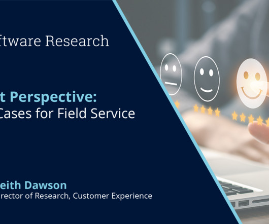
All interactions require significant amounts of process control and information and often begin with a customer connecting to a chatbot or automated agent to share information about a problem or need. Increasingly, AI is applied to the more complex problems of orchestrating the details of interactions.
In todays data-driven world, securely accessing, visualizing, and analyzing data is essential for making informed business decisions. For instance, a global sports gear company selling products across multiple regions needs to visualize its sales data, which includes country-level details.
Think your customers will pay more for data visualizations in your application? But today, dashboards and visualizations have become table stakes. Five years ago they may have. Discover which features will differentiate your application and maximize the ROI of your embedded analytics. Brought to you by Logi Analytics.
They promise to revolutionize how we interact with data, generating human-quality text, understanding natural language and transforming data in ways we never thought possible. Imagine generating complex narratives from data visualizations or using conversational BI tools that respond to your queries in real time.
Visualization. Visualization tools Visualization is a critical aspect of digital twins, enabling stakeholders to interact with and understand the digital representation. Advanced visualization tools, including 3D modeling and augmented reality, provide intuitive interfaces for monitoring and decision-making.
Amazon SageMaker has announced an integration with Amazon QuickSight , bringing together data in SageMaker seamlessly with QuickSight capabilities like interactive dashboards, pixel perfect reports and generative business intelligence (BI)—all in a governed and automated manner. Under Visuals , select Pie chart.
for compute runtime of unified notebooks and visual ETL flow editor. You can configure AWS Glue to automatically collect lineage information during Spark job runs and send the lineage events to be visualized in Amazon DataZone. on an AWS Glue Studio notebook or an interactive session through a Jupyter notebook, set 5.0
Speaker: Dean Yao, Sr. Director of Product Marketing, Logi Analytics
World-class software teams are embedding operational reports to empower end users with interactive data visualizations, detailed information, and highly precise formats that can be shared via email, PDF, print, or online. You’ll learn: Best practices for embedding operational reports in your application.
Scaling Data Reliability: The Definitive Guide to Test Coverage for Data Engineers The parallels between software development and data analytics have never been more apparent. Not Just Software, But You’re Also Running Data Manufacturing It’s not just software development that parallels data analytics, but manufacturing production.
Avoid frustration, create clear visuals, and customize like a pro. By Shittu Olumide , Technical Content Specialist on July 21, 2025 in Data Science Image by Editor | ChatGPT Visualizing data can feel like trying to sketch a masterpiece with a dull pencil. fig, axes = plt.subplots(nrows=2, ncols=1, figsize=(8, 6)) axes[0].plot(years,
For example, you can create jobs from extract, transform, and load (ETL) scripts coded in the Unified Studio code editor, code interactively in a Unified Studio Notebooks, or create jobs visually using the Unified Studio Visual ETL editor. Choose Create Visual ETL Job. This will start running your Visual ETL job.
An AI briefer could inform a sales pipeline review process, for instance, or an AI trainer could simulate customer interactions as part of an onboarding program, he adds. One area is personalizing on-page digital interactions. Another area is democratizing data analysis and reporting.
It might be for low-margin customer interactions, but for times when millions of dollars are on the line, the cost of invoking generative AI is a pittance, Gualtieri says. “If Tenjin is also being used for AI-assisted software development, data preparation and visualization, and content generation.
Knowing this,the Magic has signed a strategic agreement with multinational analytics and AI software developer SAS with the aim to maximize impact during games at the Kia Center in downtown Orlando. However, there are many other ways in which tech can interact and engage with fans.
Thus, mapping real-time interactions becomes easy. Several top HealthTech software development trends point to a future where graph databases will be used to retain data’s natural richness and complexity. For instance, these models can link the patient demographics with drug interactions to flag high-risk cohorts early.
Amazon Q Developer , the most capable generative AI assistant for software development, can be used within SageMaker Unified Studio to streamline tasks across the data and AI development lifecycle, including code authoring, SQL generation, data discovery, and troubleshooting.
Dynamic systems adapt prompts based on user context, previous interactions, and specific requirements through template systems that insert relevant information, conditional logic that adjusts prompting strategies, and feedback loops that improve prompts based on user satisfaction. Design workflows that combine text and image processing.
It allows organizations to secure data, perform searches, analyze logs, monitor applications in real time, and explore interactive log analytics. OpenSearch Service stores different types of stored objects, such as dashboards, visualizations, alerts, security roles, index templates, and more, within the domain.
SageMaker Studio provides a visual lineage graph that shows how a data asset has evolved from its source through transformations to its final state. The following screenshot shows how SageMaker Unified Studio visualizes data lineage, making it straightforward to trace data flow and understand dependencies.
Apparently, the CEO was not impressed and told him that he didnt want to see colors and pretty interactive charts, he just wanted a spreadsheet! Some of you may remember the BI visualization product Roambi created by the developers of the even more successful BI visualization tool Xcelsius.
is responsible for configuring the DbtCliResource , which is used to interact with the dbt CLI. defines how Dagster interacts with Airbyte and dbt. stream () By following this approach, the provided files configure the interactions between Dagster, dbt, and Airbyte. Integration of Airbyte and dbt assets into Dagster 1.
The vast majority of microservices interact with Kafka through the Kafka Streams framework. Nexthink gathers telemetry data from thousands of customers’ laptops covering CPU usage, memory, software versions, network performance, and more. Amazon MSK and ClickHouse serve as the backbone for this data pipeline.
By Nate Rosidi , KDnuggets Market Trends & SQL Content Specialist on July 9, 2025 in Artificial Intelligence Image by Author | Canva Do you think only mathematicians and software engineers can work in AI? Low-Code AI Builders KNIME Build ML workflows using visual nodes (low-code, good for tabular data). Well, you’re wrong if you do.
Through a visual designer, you can configure custom AI search flowsa series of AI-driven data enrichments performed during ingestion and search. Applications are increasingly using AI and search to reinvent and improve user interactions, content discovery, and automation to uplift business outcomes.
The data is visualized using matplotlib for interactive data analysis. Through this approach, the incoming room data to the data lake is evaluated for quality before being visualized, and you make sure that only qualified room data is used for further data analysis. additional_python_modules pandas==2.2
They also benchmark performance gains in software development, with AI tools showing 15% to 20% improvement. Trimble is investing in intelligent agents and multi-agent ecosystems, envisioning a future where software agents representing different business domains collaborate to optimize outcomes. Lenovo is watching a similar trend.
By leveraging natural language processing and visual analysis, these tools automate the whole data extraction process. AI web scrapers, on the other hand, can mimic human browsing, interact with dynamic elements, and adapt to layout changes on the fly. All Rights Reserved. You don’t need to know HTML, CSS, or even what a selector is.
It doesnt just work on static models; it adapts to your data and evolves with every user interaction. Continuous Learning: Improves over time by analyzing feedback and interactions For Product Managers, this means delivering standout features that users rely on. How Does It Work?
Reporting and Visualization When an analytical solution incorporates GenAI within its software or app, it can improve the clarity and precision of the data presented. Using training data, the GenAI model will produce contextual content specifically designed to target customers in a particular market niche.
Operational decisions become more precise, customer interactions more relevant, and forecasting models more accurate. This robust suite brings capabilities that span data replication, synchronization, data intelligence, and visualization, to name just a few. Thats what solutions like Rocket DataEdge , brings to IT teams.
On April 24, OReilly Media will be hosting Coding with AI: The End of Software Development as We Know It a live virtual tech conference spotlighting how AI is already supercharging developers, boosting productivity, and providing real value to their organizations.
Second, because data, code, and other development artifacts like machine learning (ML) models are stored within different services, it can be cumbersome for users to understand how they interact with each other and make changes. Next, coming back to the original query, and lets try a quick visualization to analyze the data distribution.
SquareX researchers Dakshitaa Babu, Arpit Gupta, Sunkugari Tejeswara Reddy and Pankaj Sharma debunked this belief by demonstrating how attackers can use malicious extensions to escalate privileges to conduct a full browser and device takeover, all with minimal user interaction.
Nadella isn’t the only software expert sounding the alarm about the future of the SaaS market in the age of AI agents. The expertise previously bundled with the software gets unbundled by agents.” Then, within three years, software becomes increasingly invisible, Isenberg adds.
Further patterns are emerging where AI can drive automation, data-driven decision-making, assist in software development and even execute end-to-end workflows. With genAI significantly lowering the adoption bar, vibe coding is fundamentally changing who can build software and how organizations can innovate.
The top three business intelligence trends are data visualization, data quality management, and self-service business intelligence (BI). For out-of-the-box reporting and flexible, interactive formats, explore our full suite of reporting tools: Pixel Perfect Print Reports , Business Intelligence Reporting.
According to Fortune Business Insights approximately 67% of the global workforce has access to business intelligence (BI) tools, and 75% has access to data analytics software. These conversational systems of interaction with data provide the context to answer questions based not only on what is being asked but by whom.
Foundational, comprehensive visualization techniques are not only meaningful, they are mandatory. These foundational analytical visualization techniques are easy to understand and use and are suitable for business users and all team members.
Figure 4: Near real-time baggage analytics architecture on AWS The solution can support the following analytics: Interactive and investigative analytics which can produce charts and graphs and discover patterns and anomalies in the baggage data used by product owners. Subhash Sharma is Sr. Partner Solutions Architect at AWS.
Coined by AI luminary Andrej Karpathy, the term perfectly captures the feeling of a new programming paradigm: one where developers can simply express an idea, a "vibe," and watch as an AI translates it into functional software. Your AI coding partner is not an oracle; its an interactive tool. This is a powerful and exciting prospect.
You can study previous interactions, style preferences, and purchase histories to recommend ideas that are more likely to convert into sales. You can use AI tools not just to craft visual plans, but to study the deeper behaviors behind clients’ decisions. All Rights Reserved. Keep reading to learn more.
At its core, MCP follows a clientserver architecture , with a twist tailored for AI-to-software communication. This consistency is why an AI can switch from one MCP server to another without custom codingthe grammar of interaction remains the same. Finally, consider the efficiency and capability boost for AI agents.
We organize all of the trending information in your field so you don't have to. Join 42,000+ users and stay up to date on the latest articles your peers are reading.
You know about us, now we want to get to know you!
Let's personalize your content
Let's get even more personalized
We recognize your account from another site in our network, please click 'Send Email' below to continue with verifying your account and setting a password.


Let's personalize your content