This site uses cookies to improve your experience. To help us insure we adhere to various privacy regulations, please select your country/region of residence. If you do not select a country, we will assume you are from the United States. Select your Cookie Settings or view our Privacy Policy and Terms of Use.
Cookie Settings
Cookies and similar technologies are used on this website for proper function of the website, for tracking performance analytics and for marketing purposes. We and some of our third-party providers may use cookie data for various purposes. Please review the cookie settings below and choose your preference.
Used for the proper function of the website
Used for monitoring website traffic and interactions
Cookie Settings
Cookies and similar technologies are used on this website for proper function of the website, for tracking performance analytics and for marketing purposes. We and some of our third-party providers may use cookie data for various purposes. Please review the cookie settings below and choose your preference.
Strictly Necessary: Used for the proper function of the website
Performance/Analytics: Used for monitoring website traffic and interactions
Seaborn makes it simple to build and modify lineplots, which are helpful for displaying data trends over time. This tutorial goes over how to set up your environment, make both simple and personalized lineplots, and customize your plots with different […] The post LinePlot with Seaborn appeared first on Analytics Vidhya.
Introduction This post provides a thorough tutorial on using Matplotlib, a potent Python data visualization tool, to create and modify lineplots. Additional modification methods covered in the guide include altering line styles, plotting multiple lines, adding markers, and adding annotations.
Introduction This article delves into the intricate art of data visualization and demystifies the process of creating, customizing, and interpreting timeseries lineplots.
It covers setting up an environment, generating sample data, and creating basic lineplots. It also discusses advanced customization options like line styles, colors, and markers for visually appealing visualizations.
Overview of Parallel Coordinates Plot While using visualizations, one compact visualization showing the relation between multiple variables has an upper hand over multiple visualizations – one for each variable. When you are trying to visualize high dimensional numerical data instead of multiple bar/line […].
It covers various techniques like importing Matplotlib, creating simple plots, customizing line styles, adding annotations, and mastering complex visualizations like 3D and polar plots.
For visualizing any form of data, we all might have used pivot tables and charts like bar charts, histograms, pie charts, scatter plots, line charts, […]. The post Exploring Data Visualization in Altair: An Interesting Alternative to Seaborn appeared first on Analytics Vidhya.
Table of Contents 1) What Is A Line Graph? 2) Line Graphs Benefits & Limitations 3) When To Use A Line Graph 4) Types Of Line Charts 5) Tips To Make A Line Graph 6) Line Chart Examples Graphs and charts have been a part of our lives for many years now. What Is A Line Graph?
An area chart, also known as a mountain chart, is a data visualization type that combines the appearance of a line chart and a bar chart. Area chart vs. line chart Now, you might wonder how an area graph differs from a line graph? Let’s get started with the area chart definition! What Is An Area Chart?
The values from each spoke are connected using a line with the end result resembling a spider web or a star. Well, the most important differentiation is the fact that they use a distinct method to plot the data, and we’ll dive into this topic below. How do you plot a spider chart? Hence, why they are also known as star charts.
It uses different symbols such as bars, lines, columns, tables, box plots, maps, and more, to give meaning to the information, making it easier to understand than raw data. For instance, percentages are better viewed through a pie or bar chart while data that is changing over time is better viewed over a line chart.
Line charts. Scatter plots. In these instances, incredibly effective due to their logical, data-centric designs, functionality and features are: Dynamic line charts. 2) Line Chart. When to Use Line Charts. The purpose of a line charts is to show trends, accelerations (or decelerations), and volatility.
Clustered Bars Clustered Columns Columns Combo Charts Data Bars Diverging Stacked Bars Donuts Dot Plots Heat Maps Heat Tables Histograms Interactive Dashboards Lines Lollipops Network Maps One-Pagers Made entirely within Excel and saved as a PDF (not pasted into Word). Create one template and let Excel handle the rest.
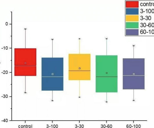
We felt we were overdue for another article on this topic, so we wanted to talk about a particular type of technology that can be beneficial – box plots. Data visualization techniques like the box plot are instrumental in modern data analysis. Another notable attribute of box plots is their efficiency in identifying outliers.
1] This includes C-suite executives, front-line data scientists, and risk, legal, and compliance personnel. Partial dependence, accumulated local effect (ALE), and individual conditional expectation (ICE) plots : this involves systematically visualizing the effects of changing one or more variables in your model.
This means that you can utilize PyCaret to go from raw data through training, tuning, interpretability analysis, to model selection and experiment logging, all with just a few lines of code. Training and comparing models in just a few lines of code. Analyze Models with Plots. interpret_model(best, plot = 'correlation').
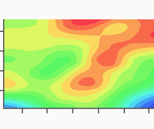
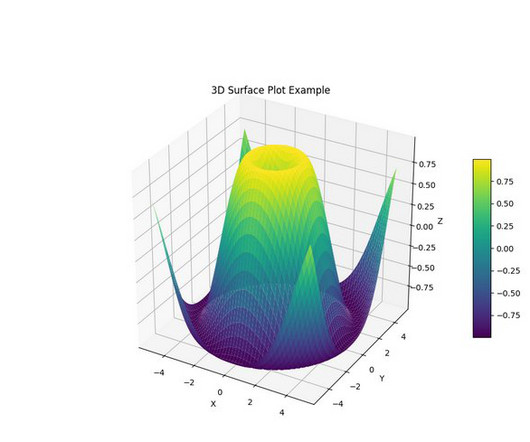
A Contour Plot is a visualisation method used to represent a 3D plotted surface onto a 2D graph. On a Contour Plot, the X and Y variables are plotted on the horizontal and vertical axes, while the Z variable is represented by contour lines or coloured bands. SAS/STAT(R) 9.2
A Functional Box Plot is a visualisation used to explore and analyse functional data , which are data that can be represented as curves or surfaces. The key features of a Functional Box Plot includes: Data Ordering: The functional data (e.g. IQR rule for traditional Box Plots. and Genton, M.G.,
The Box-Percentile Plot was developed by Warren W. Banfield in their 2003 paper The Box-Percentile Plot. It is considered an improvement over the traditional Box Plot as it provides a more informative display of the data distribution shape, especially for skewed or multimodal data, while still being a compact visualisation.
They help users explore data through visual elements like charts, graphs, plots, maps, and other visualizations. There are a variety of data visualization techniques for univariate analysis, including Box Plot, Histogram, PDF, CDF. Data visualization techniques for bivariate analysis are Scatter Plot and Heatmap. value_counts().plot.pie(explode=[0.05,0.05,0.05],autopct='%1.1f%%',shadow=True,figsize=(8,8))
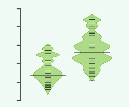
The Beanplot integrates elements of Barcode Plots , Density Plots , and Rug Plots, resulting in a rich depiction of the data. In a Beanplot, individual observations are represented as small lines in a one-dimensional plot. Long, bold lines correspond to mean of each group.
Solution overview You can quickly provision new interactive sessions directly from your notebook without needing to interact with the AWS Command Line Interface (AWS CLI) or the console. You can use magic commands to provide configuration options for your session and install any additional Python modules that are needed.
To get a view of how these rankings have changed over the past five years, let’s look at the data through a Bump Chart: Straight away we can see that the Box & Whisker Plot page has remained in first place for four years in a row now. The Bubble Chart page has remained strong and the Error Bars page continues to grow in strength.
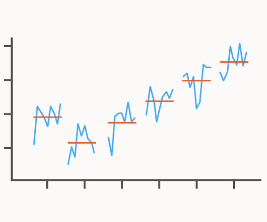
Also known as a Seasonal Subseries Plot or Monthplot. A Cycle Plot is used to visualise and analyse seasonal patterns within time series data. Cycle Plots are constructed by first specifying the length of the seasonal pattern intended to be analysed. The Y-axis has the value scale used to plot the response variable.
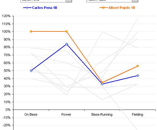
Parallel coordinates is a visualization technique used to plot individual data elements across many performance measures. Each line corresponds to a player with performance plotted across four characteristics. I couldn’t imagine how anyone could make sense of the dense clutter caused by hundreds of overlapping lines.
Also known as an Instance Chart, Strip Plot, Stripe Plot. A Barcode Plot is a chart used to visualise the data distribution across multiple categories by plotting short stripes along an axis. The other kind is an “Instance Chart” that plots stripes along a time axis to show the occurrence of various categories over time.
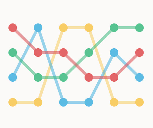
Also known as an Arrow Plot, Arrow Chart, Change Graph, Difference Graph , or Arrow Bar Chart. This type of graph plots a pair of values and connects them for each factor at the start or end time points or between conditions with a bar or line.
Other names: Bar Graph, Bar Plot. A graph that displays a series of bars plotted on a common axis, whose lengths are proportional to the values they each represent. Bar charts and box plots. Bars and lines: A study of graphic communication. Functions: Comparisons, Rankings Encodings: Length. Description.
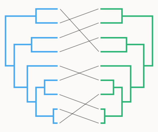
Also known as a Cophylo Plot or Co-phylogeny Plot. Connection lines are drawn between these leaves to show the matches between the two trees. Colored lines connect common branches between the two dendrograms. plantations in the Eastern Brazilian Amazon.
Plotting the result of K-means clustering can be difficult because of the high dimensional nature of the data. > library(useful) > plot(wineK3, data=wineTrain). > plot(wineK3, data=wine, class="Cultivar"). The results are plotted in Figure 25.3. > shows a silhouette plot of the results. > wineK3.
Joshua Poduska provides a distilled overview of Ludwig including when to use Ludwig’s command-line syntax and when to use its Python API. This blog post considers Ludwig, offering a brief overview of the package and providing tips for practitioners such as when to use Ludwig’s command-line syntax and when to use its Python API.
A slope chart is just a fancy name for a line chart that has exactly two points in time.). Data Storytelling in a Scatter Plot. We didn’t have time to discuss scatter plots at the DATAcated Expo, but I’d still like to share this example with you. Here’s how data storytelling would be applied to a scatter plot.
We have more than 10 kinds of visualization views commonly used, including text tables, maps, pie charts, horizontal bars, stacked bars, tree views, scatter plots, histograms, Gantt charts, scatter charts, bubble charts, etc. If you want to see the correlation and distribution between the two variables, you can use a scatter plot.
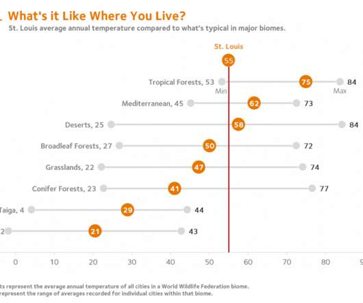
A simple table or a scatter plot serves the purpose quite well. Taking the data visualizations further has pushed me to walk a fine line between interesting visualizations and the developmental capacities pre-teen students bring to the task. Louis reference line to one appropriate for any student’s home city. Refinements.
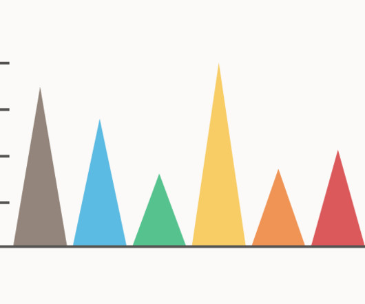
These triangles can be plotted either vertically or horizontally. Another potential issue is that the plotted triangles can sometimes create an optical illusion that makes the triangles appear to be moving slightly. Instead of using bars to represent discreet data, triangles are used as a more novel aesthetic.
Also known as a Jittered Strip Plot. A Jitter Plot is a Strip Plot / Dot Distribution Plot variation that provides a better view of any overlapping data points by adding a small amount of random shifting to the position of plotted dots. A Jitter Plot can be displayed either horizontally or vertically.
You might be thinking that I’m ignoring a visual attribute that could easily be added to this bubble plot: positions along the Z axis. Line length (e.g., Line width (e.g., the width of a line in a line graph). Line orientation (e.g., the slope of a line in a line graph). Attributes of Size.
Well, a scatter plot could be the basis of that but you would need to build the whole map somehow. They hacked Excel by using a standard feature such as the scatter plot. It was done by understanding how scatter plots are built. Scatter plots place your data in certain positions, based on the x,y coordinates provided.
Each category or entity is represented by a connected line that “bump” up or down as their rankings change over time. The connecting lines are usually straight, but curved line interpolation may be used to highlight a general trend rather than focusing on precise readings. 1st, 2nd, 3rd…).
The boxplot, also known as a box-and-whisker plot, is a commonly used chart type in daily work and research. While most are familiar with bar charts, line graphs, pie charts, scatter plots, and Gantt charts , creating professional reports often requires utilizing more specialized and practical chart types like the boxplot.
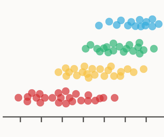
Plot the Data To start, just plot the data against a scale. Barcode Chart or Rug Plot. Just a simple lineplotted for every point, usually with some transparency or a colour scale to deal with multiple points of the same value. Much like the Rug Plot but with circles or dots instead of lines.
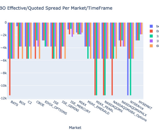
This enhancement aims to optimize symbol distribution and line capacity utilization in response to escalating trading activity and volatility in the US options market. On February 5, 2024, the Securities Industry Automation Corporation (SIAC) is set to upgrade the OPRA feed from 48 to 96 multicast channels. GBits per second.
Line Chart. . Advantages: Line charts are used to reflect trends over time. Line charts are great for data comparing. Fill the shadow below the line chart to form an area chart. Fill the shadow below the line chart to form an area chart. Scatter Plot. The data of the scatter plot is three-dimensional data.
We organize all of the trending information in your field so you don't have to. Join 42,000+ users and stay up to date on the latest articles your peers are reading.
You know about us, now we want to get to know you!
Let's personalize your content
Let's get even more personalized
We recognize your account from another site in our network, please click 'Send Email' below to continue with verifying your account and setting a password.


Let's personalize your content