This site uses cookies to improve your experience. To help us insure we adhere to various privacy regulations, please select your country/region of residence. If you do not select a country, we will assume you are from the United States. Select your Cookie Settings or view our Privacy Policy and Terms of Use.
Cookie Settings
Cookies and similar technologies are used on this website for proper function of the website, for tracking performance analytics and for marketing purposes. We and some of our third-party providers may use cookie data for various purposes. Please review the cookie settings below and choose your preference.
Used for the proper function of the website
Used for monitoring website traffic and interactions
Cookie Settings
Cookies and similar technologies are used on this website for proper function of the website, for tracking performance analytics and for marketing purposes. We and some of our third-party providers may use cookie data for various purposes. Please review the cookie settings below and choose your preference.
Strictly Necessary: Used for the proper function of the website
Performance/Analytics: Used for monitoring website traffic and interactions
The post Visualizing Sounds Using Librosa MachineLearning Library! ArticleVideo Book This article was published as a part of the Data Science Blogathon Introduction Sounds can become wrangled within the data science field through. appeared first on Analytics Vidhya.
ArticleVideo Book This article was published as a part of the Data Science Blogathon Introduction In applied Statistics and MachineLearning, Data Visualization is one. The post Must Known Data Visualization Techniques for Data Science appeared first on Analytics Vidhya.
Learn how to build a model for cross-sell prediction. Introduction If you are a Machinelearning enthusiast or a data science beginner, it’s important to have a guided journey and also exposure to a good set of projects.In this article, We will walk through a beginner […].
Overview In this article, we will be analyzing the flight fare prediction using MachineLearning dataset using essential exploratory data analysis techniques then will draw some predictions about the price of the flight based on some features such as what type of airline it […].
Among the myriad of tools available for EDA, pair plots stand out as a fundamental visualization technique that offers a multi-faceted […] The post Pair Plots in MachineLearning appeared first on Analytics Vidhya. This process is pivotal for recognizing patterns, identifying anomalies, and establishing hypotheses.
Introduction The MachineLearning life cycle or MachineLearning Development Life Cycle to be precise can be said as a set of guidelines which need to be followed when we build machinelearning-based projects. The post Get to Know About MachineLearning Life Cycle appeared first on Analytics Vidhya.
The post Forest Fire prediction using MachineLearning appeared first on Analytics Vidhya. Forest, bush, or vegetarian fire, can be described as any uncontrolled and non-prescribed combustion or burning of plants in a natural setting such as a forest, grassland, etc. In this article we are not determining if a forest […].
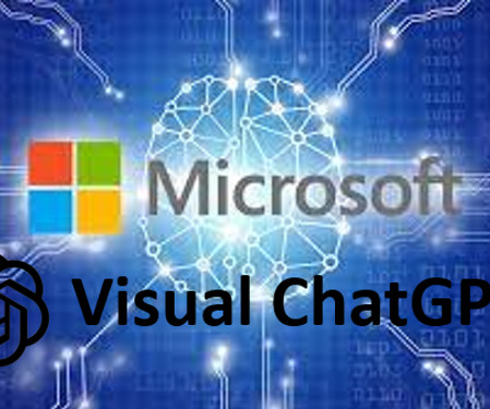
These models use machinelearning algorithms to understand and generate human language, making it easier for humans to interact with machines. This AI model incorporates Visual […] The post Microsoft Releases VisualGPT: Combines Language and Visuals appeared first on Analytics Vidhya.
Overview PyCaret is a super useful and low-code Python library for performing multiple machinelearning tasks in double-quick time Learn how to rely on. Use PyCaret to Build your MachineLearning Model in Seconds appeared first on Analytics Vidhya. The post Running Low on Time?
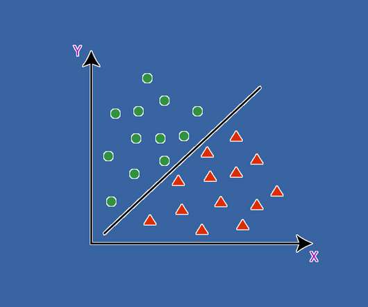
Overview MachineLearning algorithms for classification involve learning how to assign classes to observations. The post Plotting Decision Surface for Classification MachineLearning Algorithms appeared first on Analytics Vidhya. There are nuances to every algorithm. Each algorithm differs in.
This article was published as a part of the Data Science Blogathon Image 1 Introduction I am sure many of you have read several articles around the world stating the buzz around “MachineLearning, “Data Scientist”, “Data Visualization” and so on. A report […].
Introduction This article explores violin plots, a powerful visualization tool that combines box plots with density plots. It explains how these plots can reveal patterns in data, making them useful for data scientists and machinelearning practitioners.
Stress can be triggered by a variety of factors, such as work-related pressure, financial difficulties, relationship problems, health issues, or major life events. […] The post MachineLearning Unlocks Insights For Stress Detection appeared first on Analytics Vidhya.
Introduction If you want to know – How to use MACHINELEARNING. ows) Visual Programming Software appeared first on Analytics Vidhya. This article was published as a part of the Data Science Blogathon. The post Predicting Employee Attrition using Orange(.ows)
Futuristic scenarios, jaw-dropping visuals, a tight storyline knitting it all together – that’s a recipe for a. The post 10 Under-the-Radar Movies that Show the Power of MachineLearning appeared first on Analytics Vidhya. Introduction I love the sci-fi movie genre.
Image Source: Author Introduction Deep learning, a subset of machinelearning, is undoubtedly gaining popularity due to big data. Startups and commercial organizations alike are competing to use their valuable data for business growth and customer satisfaction with the help of deep learning […].
Introduction on Classification In this article of Iris Flowers Classification, we will be dealing with Logistic Regression MachineLearning Algorithm. The post IRIS Flowers Classification Using MachineLearning appeared first on Analytics Vidhya. We all […].
The post Build Web App instantly for MachineLearning using Streamlit appeared first on Analytics Vidhya. ArticleVideo Book This article was published as a part of the Data Science Blogathon What is Streamlit? Streamlit is an open-source python framework for building.
The Case for Building Trust in MachineLearning Models There are approximately 1.2 The post 6 Python Libraries to Interpret MachineLearning Models and Build Trust appeared first on Analytics Vidhya. billion vehicles on the roads around the world. Here’s a bamboozling.
Introduction Pandas’ Python profiling package produces an interactive set of tables and visualizations for exploratory data exploration (EDA). The post Pandas Profiling – A Visual Analytics Wonder appeared first on Analytics Vidhya. and all the coding techniques and properties. This is particularly crucial […].
ArticleVideo Book This article was published as a part of the Data Science Blogathon Introduction Data Visualization helps to bridge the gap between numbers and. The post Plotly and cufflinks : Advanced Python Data Visualization Libraries appeared first on Analytics Vidhya.
The post Understand MachineLearning Easily Using Python Shapash Library appeared first on Analytics Vidhya. ArticleVideo Book This article was published as a part of the Data Science Blogathon. Topics to be covered What is Shapash library The objective.
For all the excitement about machinelearning (ML), there are serious impediments to its widespread adoption. If you’re using Python and deep learning libraries, the CleverHans and Foolbox packages can also help you debug models and find adversarial examples. 2] The Security of MachineLearning. [3]
Introduction In today’s evolving landscape, organizations are rapidly scaling their teams to harness the potential of AI, deep learning, and ML. What started as a modest concept, machinelearning, has now become indispensable across industries, enabling businesses to tap into unprecedented opportunities.
The post Visualizing PCA in R-Programming with Factoshiny appeared first on Analytics Vidhya. ArticleVideos This article was published as a part of the Data Science Blogathon. Introduction Transforming a data set with Principal Component Analysis (PCA) is.
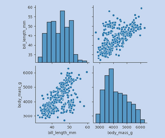
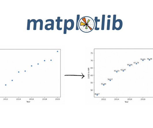
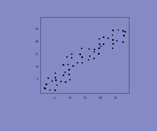
Introduction Scatter plots are a powerful tool in a data scientist’s arsenal, allowing us to visualize the relationship between two variables. This blog will explore the ins and outs of creating stunning scatter Plot Visualization in Python using matplotlib.
However, ChatGPT is limited in processing visual information since it’s trained with a single language modality. Visual Foundation Models […] The post Power of Visual ChatGPT : Conversations with AI and Images! appeared first on Analytics Vidhya.
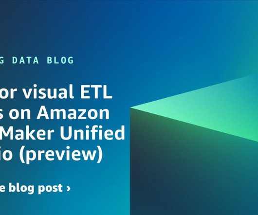
This experience includes visual ETL, a new visual interface that makes it simple for data engineers to author, run, and monitor extract, transform, load (ETL) data integration flow. You can use a simple visual interface to compose flows that move and transform data and run them on serverless compute. Now you can publish it.
Introduction In data analysis, creating visual representations is key to understanding and communicating insights effectively. This article will dive into ggplot’s features and why it’s such a valuable tool for visualizing data […] The post ggplot in Python: A Data Visualization Guide appeared first on Analytics Vidhya.
Introduction Making MachineLearning models these days is turning out. The post Create Interface For Your MachineLearning Models Using Gradio Python Library appeared first on Analytics Vidhya. ArticleVideo Book This article was published as a part of the Data Science Blogathon.
The post The Clever Ingredient that decides the rise and the fall of your MachineLearning Model- Exploratory Data Analysis appeared first on Analytics Vidhya. This article was published as a part of the Data Science Blogathon. Introduction Well! We all love cakes. If you take a deeper look.
These courses cover everything from basic programming to advanced machinelearning. To break into this field, you need the right skills. Fortunately, top institutions like Harvard and IBM offer free online courses.
The post Programming in R – From Variables to Visualizations appeared first on Analytics Vidhya. Even though it might not hold much popularity among the newcomers in the field, many veterans and seasoned data scientists favour […].
The post Geospatial visualization via Folium Library appeared first on Analytics Vidhya. ArticleVideo Book This article was published as a part of the Data Science Blogathon Overview Nowadays, there are multiple data science projects requiring the use.
Introduction Gradient-weighted Class Activation Mapping is a technique used in deep learning to visualize and understand the decisions made by a CNN. This groundbreaking technique unveils the hidden decisions made by CNNs, transforming them from opaque models into transparent storytellers.
The post Yellowbrick : Visualization for model predictions appeared first on Analytics Vidhya. ArticleVideo Book This article was published as a part of the Data Science Blogathon Introduction Have you ever been in a scenario where you’ve created.
Introduction DreamFusion, the revolutionary AI-driven technology capable of converting text into 3D visuals using 2D diffusion techniques, has recently been honored with the prestigious Best Paper Award at ICLR-2023.
Introduction Have you ever been tasked with visualizing the relationship between each. The post Creating Linear Model, It’s Equation and Visualization for Analysis appeared first on Analytics Vidhya. This article was published as a part of the Data Science Blogathon.
The post A Hands-On Guide to Building a Visual Similarity-Based Recommendation System using Python appeared first on Analytics Vidhya. This article was published as a part of the Data Science Blogathon. Introduction In today’s competitive world of technology, it is very crucial for.
Introduction Jupyter Notebook is a web-based interactive computing platform that many data scientists use for data wrangling, data visualization, and prototyping of their MachineLearning models. This article was published as a part of the Data Science Blogathon. The post How to Convert Jupyter Notebook into ML Web App?
Rapidminer is a visual enterprise data science platform that includes data extraction, data mining, deep learning, artificial intelligence and machinelearning (AI/ML) and predictive analytics. It can support AI/ML processes with data preparation, model validation, results visualization and model optimization.
Introduction Data visualization (DV) plays a crucial role in analyzing and interpreting data. With the growing importance of data science and machinelearning, data analysis holds a special place in […] The post Creating Interactive and Animated Charts with ipyvizzu appeared first on Analytics Vidhya.
Introduction Embark on a thrilling journey into the domain of Convolutional Neural Networks (CNNs) and Skorch, a revolutionary fusion of PyTorch’s deep learning prowess and the simplicity of scikit-learn. Join us […] The post Train PyTorch Models Scikit-learn Style with Skorch appeared first on Analytics Vidhya.
The foundational data management, analysis, and visualization tool, Microsoft Excel, has taken a significant step forward in its analytical capabilities by incorporating Python functionality. Introduction Microsoft announced the integration of Python programming language into Excel, marking a significant advancement in the field.
We organize all of the trending information in your field so you don't have to. Join 42,000+ users and stay up to date on the latest articles your peers are reading.
You know about us, now we want to get to know you!
Let's personalize your content
Let's get even more personalized
We recognize your account from another site in our network, please click 'Send Email' below to continue with verifying your account and setting a password.


Let's personalize your content