This site uses cookies to improve your experience. To help us insure we adhere to various privacy regulations, please select your country/region of residence. If you do not select a country, we will assume you are from the United States. Select your Cookie Settings or view our Privacy Policy and Terms of Use.
Cookie Settings
Cookies and similar technologies are used on this website for proper function of the website, for tracking performance analytics and for marketing purposes. We and some of our third-party providers may use cookie data for various purposes. Please review the cookie settings below and choose your preference.
Used for the proper function of the website
Used for monitoring website traffic and interactions
Cookie Settings
Cookies and similar technologies are used on this website for proper function of the website, for tracking performance analytics and for marketing purposes. We and some of our third-party providers may use cookie data for various purposes. Please review the cookie settings below and choose your preference.
Strictly Necessary: Used for the proper function of the website
Performance/Analytics: Used for monitoring website traffic and interactions
Kinesis Data Analytics for SQL has been denoted a legacy offering since 2021 on our marketing pages, the AWS Management Console , and public documentation. Amazon Managed Service for Apache Flink is a serverless, low-latency, highly scalable, and highly available real-time stream processing service.
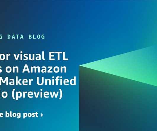
This experience includes visual ETL, a new visual interface that makes it simple for data engineers to author, run, and monitor extract, transform, load (ETL) data integration flow. You can use a simple visual interface to compose flows that move and transform data and run them on serverless compute. Now you can publish it.
Talend is a data integration and management software company that offers applications for cloud computing, big data integration, application integration, data quality and master data management. Its code generation architecture uses a visual interface to create Java or SQL code.
Introduction Are you ready to unlock the hidden key to success in product management? Transform the way you approach product management and unlock unprecedented success. Amplitude Maps are visual representations […] The post Unleashing the Power of Amplitude Maps in Product Management appeared first on Analytics Vidhya.
Speaker: Dean Yao, Sr. Director of Product Marketing, Logi Analytics
World-class software teams are embedding operational reports to empower end users with interactive data visualizations, detailed information, and highly precise formats that can be shared via email, PDF, print, or online. You’ll learn: Best practices for embedding operational reports in your application.
Now that you’re sold on the power of data analytics in addition to data-driven BI, it’s time to take your journey a step further by exploring how to effectively communicate vital metrics and insights in a concise, inspiring, and accessible format through the power of visualization. That’s a colossal number of books on visualization.
“By visualizing information, we turn it into a landscape that you can explore with your eyes. 90% of the information transmitted to the brain is visual. Data visualization methods refer to the creation of graphical representations of information. That’s where data visualization comes in. A sort of information map.
Amazon OpenSearch Service is a fully managed service for search and analytics. AWS handles the heavy lifting of managing the underlying infrastructure, including service installation, configuration, replication, and backups, so you can focus on the business side of your application. Make sure the Python version is later than 2.7.0:
Ali Tore, Senior Vice President of Advanced Analytics at Salesforce, highlighting the value of this integration, says “We’re excited to partner with Amazon to bring Tableau’s powerful data exploration and AI-driven analytics capabilities to customers managing data across organizational boundaries with Amazon DataZone.
Speaker: John Mecke, Managing Director of DevelopmentCorporate, Jon Gatrell, Principal Partner at Market Driven Business
The role of a product manager has evolved significantly over the past 20 years. In today’s Agile world, product managers are expected to be leaders in market knowledge, strategy, organizational enablement, etc. Numerical literacy is a key skill for effective product managers. Specific techniques for analyzing SaaS products.
Management reporting is a source of business intelligence that helps business leaders make more accurate, data-driven decisions. In this blog post, we’re going to give a bit of background and context about management reports, and then we’re going to outline 10 essential best practices you can use to make sure your reports are effective.
This organism is the cornerstone of a companys competitive advantage, necessitating careful and responsible nurturing and management. This article proposes a methodology for organizations to implement a modern data management function that can be tailored to meet their unique needs.
Introduction Effective data management is crucial for organizations of all sizes and in all industries because it helps ensure the accuracy, security, and accessibility of data, which is essential for making good decisions and operating efficiently. This is important […] The post How is AI Improving the Data Management Systems?
5) The Role Of Visuals In Accountant Reports. On the basis of every company’s competent management, we can find accounting reports. But they also reduce the risk of reporting inconsistencies to investors, financial managers, or worse, tax authorities. Table of Contents. 1) What Are Accounting Reports?
In the rapidly evolving healthcare industry, delivering data insights to end users or customers can be a significant challenge for product managers, product owners, and application team developers. The complexity of healthcare data, the need for real-time analytics, and the demand for user-friendly interfaces can often seem overwhelming.
This is no different in the logistics industry, where warehouse managers track a range of KPIs that help them efficiently manage inventory, transportation, employee safety, and order fulfillment, among others. Your Chance: Want to visualize & track warehouse KPIs with ease? Let’s dive in with the definition.
In todays data-driven world, securely accessing, visualizing, and analyzing data is essential for making informed business decisions. The Amazon Redshift Data API simplifies access to your Amazon Redshift data warehouse by removing the need to manage database drivers, connections, network configurations, data buffering, and more.
Table of Contents 1) What Is KPI Management? 4) How to Select Your KPIs 5) Avoid These KPI Mistakes 6) How To Choose A KPI Management Solution 7) KPI Management Examples Fact: 100% of statistics strategically placed at the top of blog posts are a direct result of people studying the dynamics of Key Performance Indicators, or KPIs.
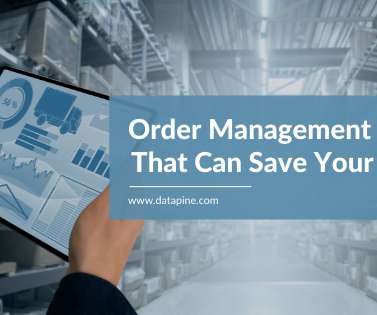
Like mitochondria and the cell, the order management system is the powerhouse of the warehouse. To help you reach that robust state, let’s look at a few top order management system tweaks designed to improve success rates and reduce error rates, which can save you significantly. Increase scans and verification. Automate simple steps.
Why and how to use visuals when collaborating. Use Product Management Today’s webinars to earn professional development hours! Use Product Management Today’s webinars to earn professional development hours! Why and how to enable first-hand understanding of customer needs. You won't want to miss this!
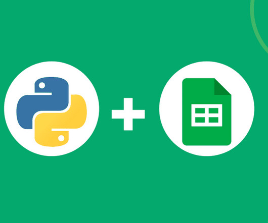
The foundational data management, analysis, and visualization tool, Microsoft Excel, has taken a significant step forward in its analytical capabilities by incorporating Python functionality. Introduction Microsoft announced the integration of Python programming language into Excel, marking a significant advancement in the field.
These updates are set to revolutionize how organizations create and managevisual content. At the event, the company unveiled a suite of innovative features and tools designed to enhance productivity and collaboration across various teams. From […] The post 30 Exciting New Features by Canva appeared first on Analytics Vidhya.
In your daily business, many different aspects and ‘activities’ are constantly changing – sales trends and volume, marketing performance metrics, warehouse operational shifts, or inventory management changes. Now that we know what they are let’s go over some concrete, real-world examples of visuals you will need to include in your reports.
1) What Is Data Quality Management? However, with all good things comes many challenges and businesses often struggle with managing their information in the correct way. Enters data quality management. What Is Data Quality Management (DQM)? Why Do You Need Data Quality Management? Table of Contents.
Data dashboards provide a centralized, interactive means of monitoring, measuring, analyzing, and extracting a wealth of business insights from relevant datasets in several key areas while displaying aggregated information in a way that is both intuitive and visual. Lack of different data visualization types. Average order size.
To ensure that your customer-facing communications and efforts are constantly improving and evolving, investing in customer relationship management (CRM) is vital. Finally, we will show you a real-life example so you can get a visual overview and a clearer picture of the points discussed in this article. Let’s begin.
Spreadsheets finally took a backseat to actionable and insightful data visualizations and interactive business dashboards. Companies are no longer wondering if data visualizations improve analyses but what is the best way to tell each data-story. 1) Data Quality Management (DQM). Data exploded and became big.
Amazon DataZone is a data management service that makes it faster and easier for customers to catalog, discover, share, and govern data stored across AWS, on premises, and from third-party sources. When you’re connected, you can query, visualize, and share data—governed by Amazon DataZone—within Tableau.
Identifying what is working and what is not is one of the invaluable management practices that can decrease costs, determine the progress a business is making, and compare it to organizational goals. Your Chance: Want to visualize & track operational metrics with ease? What Are Metrics And Why Are They Important?
At the same time, inventory metrics are needed to help managers and professionals in reaching established goals, optimizing processes, and increasing business value. Collecting big amounts of data is not the only thing to do; knowing how to process, analyze, and visualize the insights you gain from it is key.
With automatic scorecards generated for your table groups, you can visualize data hygiene instantly. Better Metadata Management Add Descriptions and Data Product tags to tables and columns in the Data Catalog for improved governance. This game-changing capability brings more profound insights and greater control over your data health.
With the help of online data analysis tools , these kinds of projects have become easy to manage and agile in performance. Is it intended for analysts, C-level executives or department’s managers? Availability to all managers. Involve relevant stakeholders and answer questions such as who will work with the BI?
A dashboard in business is a tool used to manage all the business information from a single point of access. It helps managers and employees to keep track of the company’s KPIs and utilizes business intelligence to help companies make data-driven decisions. Managers can also see if the team as a whole is reaching its goals.
These improvements are available through the Amazon Q chat experience on the AWS Management Console , and the Amazon SageMaker Unified Studio (preview) visual ETL and notebook interfaces. After you configure an AWS Identity and Access Management (IAM) role on the job, save and run the job.
Operational: A business intelligence tool that exists to monitor, measure and manage processes or operations with a shorter or more immediate time scale. Your KPIs will help to shape the direction of your dashboards as these metrics will display visual representations of relevant insights based on specific areas of the business.
While sometimes it’s okay to follow your instincts, the vast majority of your business-based decisions should be backed by metrics, facts, or figures related to your aims, goals, or initiatives that can ensure a stable backbone to your management reports and business operations. Data driven business decisions make or break companies.
Your Chance: Want to visualize & track supply chain metrics with ease? The cost distribution and the management of the time and space of your inventory are critical in establishing a healthy supply chain. Your Chance: Want to visualize & track supply chain metrics with ease? What Are Supply Chain Metrics?
Data visualization is a fundamental step for successful data analysis. By giving your information a visual context, you make it more understandable and prepared to identify trends, patterns, or problems. In this post, we will introduce you to one of the most straightforward types of data visualizations, the gauge chart.
Features that are generally available now include Einstein Studio and Fleet Management, according to a Salesforce announcement Tuesday. The Fleet Management tools also will provide insights into completed trips and driver behavior, among other things, to enable future fleet planning and improve performance, the company said.
Managers, employees, and important stakeholders often can be stuck by waiting for a comprehensive BI report from the IT department or SQL developers. The data-driven world doesn’t have to be overwhelming, and with the right BI tools , the entire process can be easily managed with a few clicks. Increasing the workflow speed.
We are excited to announce the preview of API-driven, OpenLineage-compatible data lineage in Amazon DataZone to help you capture, store, and visualize lineage of data movement and transformations of data assets on Amazon DataZone. The lineage visualized includes activities inside the Amazon DataZone business data catalog.
Visualizing the data and interacting on a single screen is no longer a luxury but a business necessity. Business dashboards aren’t just for management, they can be easily capitalized on by all teams across a company. They enable you to easily visualize your data, filter on-demand, and slice and dice your data to dig deeper.
We’re doing KPI visualization and trend analysis, and highlighting variances over time. But more than anything, the data platform is putting decision-making tools in the hands of our business so people can better manage their operations. In terms of business change management, the company recognized the need to solve its data problems.
We organize all of the trending information in your field so you don't have to. Join 42,000+ users and stay up to date on the latest articles your peers are reading.
You know about us, now we want to get to know you!
Let's personalize your content
Let's get even more personalized
We recognize your account from another site in our network, please click 'Send Email' below to continue with verifying your account and setting a password.


Let's personalize your content