This site uses cookies to improve your experience. To help us insure we adhere to various privacy regulations, please select your country/region of residence. If you do not select a country, we will assume you are from the United States. Select your Cookie Settings or view our Privacy Policy and Terms of Use.
Cookie Settings
Cookies and similar technologies are used on this website for proper function of the website, for tracking performance analytics and for marketing purposes. We and some of our third-party providers may use cookie data for various purposes. Please review the cookie settings below and choose your preference.
Used for the proper function of the website
Used for monitoring website traffic and interactions
Cookie Settings
Cookies and similar technologies are used on this website for proper function of the website, for tracking performance analytics and for marketing purposes. We and some of our third-party providers may use cookie data for various purposes. Please review the cookie settings below and choose your preference.
Strictly Necessary: Used for the proper function of the website
Performance/Analytics: Used for monitoring website traffic and interactions
Bria AI is a generative AI platform for the production of professional-grade visual content, mainly for enterprises. Established in 2020, they have the tools there, including text-to-image generation, editing with inpainting, background removal, and more.
Rapidminer is a visual enterprise data science platform that includes data extraction, data mining, deep learning, artificial intelligence and machine learning (AI/ML) and predictive analytics. It can support AI/ML processes with data preparation, model validation, results visualization and model optimization.
This article was published as a part of the Data Science Blogathon Overview Tableau is a well-known data visualization tool widely used in the industry and adopted by major firms like Nike, Coca-Cola, Skype, TCS, Accenture, and various other plethoras of companies both large and small.
Introduction Jupyter Notebook is a web-based interactive computing platform that many data scientists use for data wrangling, data visualization, and prototyping of their Machine Learning models. It is easy to use the platform, and we can do programming in many languages like Python, Julia, R, etc. […].
Our platform empowers you to seamlessly integrate advanced data analytics, generative AI, data visualization, and pixel-perfect reporting into your applications, transforming raw data into actionable insights. But with Logi Symphony, these challenges become opportunities.
Introduction QlikView is a popular enterprise discovery platform that enables all users in an organization to perform self-service BI. With QlikView, you can analyze and visualize data and their relationships and use these analyzes to make decisions. This article was published as a part of the Data Science Blogathon.
Data from many sources are combined into a single dataset in this cloud-based platform. These data sets create shareable reports, dashboards, and apps for data visualization, evaluation, […]. Introduction BI tools, including software services, apps, and data connectors, make up the Microsoft Power BI portfolio.
Introduction Tableau is a powerful data visualization tool that is crucial in Data Science. Its significance lies in its ability to transform complex data into easily understandable visualizations, aiding in better decision-making processes.
In today’s data-driven world, BI platforms like Metabase are essential for extracting insights and facilitating informed decision-making. Learning […] The post Open-Source BI Tool Metabase for Data Visualization and Analytics appeared first on Analytics Vidhya.
Think your customers will pay more for data visualizations in your application? But today, dashboards and visualizations have become table stakes. Five years ago they may have. Discover which features will differentiate your application and maximize the ROI of your embedded analytics. Brought to you by Logi Analytics.
Introduction Creating logos and posters has evolved significantly with the advent of artificial intelligence (AI), offering ease and creativity in visual design, like never before. This guide explains the process of crafting […] The post How to Create Logos and Posters Using Ideogram?
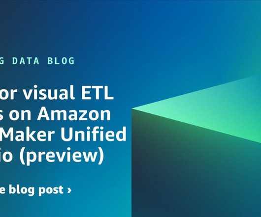
This experience includes visual ETL, a new visual interface that makes it simple for data engineers to author, run, and monitor extract, transform, load (ETL) data integration flow. You can use a simple visual interface to compose flows that move and transform data and run them on serverless compute. Now you can publish it.
This sophisticated AI model has been integrated into various platforms to enhance their capabilities and expand industry applications. Did you know that it can even help to improve the coding process in Visual Studio Code (VS Code)? Introduction You’ve probably heard all the hype around Meta‘s latest release, Llama 3.
In an innovative leap for visual content creation, Getty Images and Nvidia have joined forces to introduce Generative AI by iStock, an innovative text-to-image platform. This collaborative effort seeks to empower both individuals and businesses with an affordable and commercially safe solution for generating unique stock photos.
The complexity of financial data, the need for real-time insight, and the demand for user-friendly visualizations can seem daunting when it comes to analytics - but there is an easier way. With Logi Symphony, we aim to turn these challenges into opportunities.
The platform enables personnel to work with relational databases, Apache Hadoop, Spark and NoSQL databases for cloud or on-premises jobs. Its code generation architecture uses a visual interface to create Java or SQL code.
Visualization has become a necessary skill that eases the process of communicating with people outside your domain. And if you are a person struggling to get the right platform to start learning about visualization, this […]. This article was published as a part of the Data Science Blogathon.
Amazon DataZone recently announced the expansion of data analysis and visualization options for your project-subscribed data within Amazon DataZone using the Amazon Athena JDBC driver. Using Amazon DataZone lets us avoid building and maintaining an in-house platform, allowing our developers to focus on tailored solutions.
Power BI is an influential tool, shaping raw data into informative visuals and reports. With a user-friendly interface and formidable functionalities, Power BI is an invaluable platform for individuals to refine their skills through hands-on projects.
Speaker: Anthony Roach, Director of Product Management at Tableau Software, and Jeremiah Morrow, Partner Solution Marketing Director at Dremio
A self-service platform for data exploration and visualization that broadens access to analytic insights. As a result, these two solutions come together to deliver: Lightning-fast BI and interactive analytics directly on data wherever it is stored. A seamless and efficient customer experience.
Domo is best known as a business intelligence (BI) and analytics software provider, thanks to its functionality for visualization, reporting, data science and embedded analytics. Domos platform addresses the full breadth of an enterprises analytics needs. Workspaces is in alpha testing. Regards, Matt Aslett
You ’re building an enterprise data platform for the first time in Sevita’s history. We knew we had to bring the data together in an enterprise data platform. How is the new platform helping? We’re doing KPI visualization and trend analysis, and highlighting variances over time. What’s driving this investment?
Introduction Imagine a world where the creation of video content transcends current limitations, letting anybody create any type of visual content. This has been made possible by Higgsfield, a new artificial intelligence (AI) video generation platform.
Boosting image search capabilities has become a critical focus in the realm of digital asset management, e-commerce, and social media platforms. With the ever-increasing volume of visual content generated daily, the need for efficient and accurate image retrieval systems is more pressing than ever.
DataOps needs a directed graph-based workflow that contains all the data access, integration, model and visualization steps in the data analytic production process. 100% of your DataOps needs in one end-to-end platform. Airflow — An open-source platform to programmatically author, schedule, and monitor data pipelines.
The proposed model illustrates the data management practice through five functional pillars: Data platform; data engineering; analytics and reporting; data science and AI; and data governance. Similarly, there is a case for Snowflake, Cloudera or other platforms, depending on the companys overarching technology strategy.
CIOs feeling the pressure will likely seek more pragmatic AI applications, platform simplifications, and risk management practices that have short-term benefits while becoming force multipliers to longer-term financial returns. Many organizations are shifting to platform engineering to improve developer experience and productivity.
This integration enables our customers to seamlessly explore data with AI in Tableau, build visualizations, and uncover insights hidden in their governed data, all while leveraging Amazon DataZone to catalog, discover, share, and govern data across AWS, on premises, and from third-party sources—enhancing both governance and decision-making.”
While these reports are typically developed using SQL (structured query language) by an IT department which can take several days, there are tools and platforms that allow non-technical business users access to these most precious insights, simply using a SQL report generator. What Is Ad Hoc Analysis? Easy to use: .
Solution overview In this scenario, an e-commerce company sells products on their online platform. You can navigate to the projects Data page to visually verify the existence of the newly created table. Additionally, the notebook provides a chart view to visualize query results as graphs. Under Create job , choose Visual ETL.
By taking an online data visualization approach to handling your company’s strategic activities, big or small, you will make your business more cohesive, collaborative, intelligent and profitable – and project management dashboards will help you do just that. Armed with this knowledge, you can gain a significant edge on the competition.
In addition to real-time analytics and visualization, the data needs to be shared for long-term data analytics and machine learning applications. In this use case, EUROGATE implemented a hybrid data mesh architecture using Amazon Redshift as a centralized data platform. This led to a complex and slow computations.
Your KPIs will help to shape the direction of your dashboards as these metrics will display visual representations of relevant insights based on specific areas of the business. To help you with your decision, we have selected over 250 KPI examples in our rich library for the most important functions within a business, industry, and platform.
At the core of this ecosystem lies the enterprise data platform. It provides data catalog, automated crawlers, and visual job creation to streamline data integration across various data sources and targets. It also provides a platform through which a data producer can make their data available for consumption for subscribers.
Imagine generating complex narratives from data visualizations or using conversational BI tools that respond to your queries in real time. Tableau, Qlik and Power BI can handle interactive dashboards and visualizations. In analytics, LLMs can create natural language query interfaces, allowing us to ask questions in plain English.
Current signals from usage on the O’Reilly online learning platform reveal: Python is preeminent. Up until 2017, the ML+AI topic had been amongst the fastest growing topics on the platform. Strong usage in cloud platforms (+16%) accounted for most cloud-specific growth. Still cloud-y, but with a possibility of migration.
In todays digital-first economy, enterprise architecture must also evolve from a control function to an enablement platform. By offering higher-level abstractions platforms, patterns, shared-services and guardrails enterprise architects reduce toil, preserve quality and accelerate product delivery. The stakes have never been higher.
Accessibility: With SaaS, businesses have the mobility of accessing applications from any digital device and location, making it especially convenient for mobile platforms. Platform unbundling. Additionally, it boasts ease-of-use and is user-friendly. A Betterbuys report reveals that the specific expenditure in the U.S. Vertical SaaS.
Collecting big amounts of data is not the only thing to do; knowing how to process, analyze, and visualize the insights you gain from it is key. Your Chance: Want to visualize & track inventory KPIs with ease? Your Chance: Want to visualize & track inventory KPIs with ease? But let’s get back to our visual example.
Exciting and futuristic, the concept of computer vision is based on computing devices or programs gaining the ability to extract detailed information from visual images. Visual analytics: Around three million images are uploaded to social media every single day. Artificial Intelligence (AI).
Armed with powerful visualizations and real-time data, modern weekly summary reports enable businesses to closely monitor their performance and the progress of their strategies to extract relevant insights and optimize their processes to ensure constant growth. Try our professional reporting software for 14 days, completely free!
A typical R&D organization has many independent teams, and each team chooses a different technology platform. Figure 2 illustrates a self-service DataOps Platform for scientists engaged in pharmaceutical R&D. Each platform has its own set of database , ETL, visualization and other tools.
Gen AI for just-in-time decisions One company has rolled out a corporatewide gen AI platform intended for specific cases where it can speed workflows. Tenjin is also being used for AI-assisted software development, data preparation and visualization, and content generation. SAIC offers it to SAIC customers as well.
Through the art of streamlined visual communication, data dashboards permit businesses to engage in real-time and informed decision-making and are key instruments in data interpretation. Typically, quantitative data is measured by visually presenting correlation tests between two or more variables of significance.
We organize all of the trending information in your field so you don't have to. Join 42,000+ users and stay up to date on the latest articles your peers are reading.
You know about us, now we want to get to know you!
Let's personalize your content
Let's get even more personalized
We recognize your account from another site in our network, please click 'Send Email' below to continue with verifying your account and setting a password.


Let's personalize your content