This site uses cookies to improve your experience. To help us insure we adhere to various privacy regulations, please select your country/region of residence. If you do not select a country, we will assume you are from the United States. Select your Cookie Settings or view our Privacy Policy and Terms of Use.
Cookie Settings
Cookies and similar technologies are used on this website for proper function of the website, for tracking performance analytics and for marketing purposes. We and some of our third-party providers may use cookie data for various purposes. Please review the cookie settings below and choose your preference.
Used for the proper function of the website
Used for monitoring website traffic and interactions
Cookie Settings
Cookies and similar technologies are used on this website for proper function of the website, for tracking performance analytics and for marketing purposes. We and some of our third-party providers may use cookie data for various purposes. Please review the cookie settings below and choose your preference.
Strictly Necessary: Used for the proper function of the website
Performance/Analytics: Used for monitoring website traffic and interactions
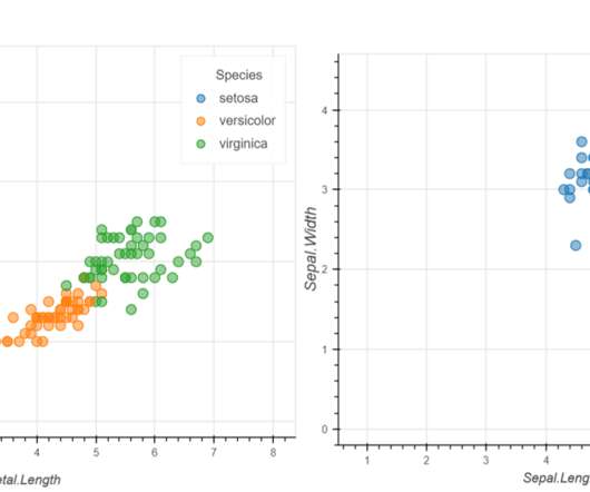
Introduction Data Visualization is used to present the insights in a given dataset. Several charts are available for specific purposes, like bar charts to present categorical distribution, line charts to […]. The post Interactive Data Visualization using rbokeh appeared first on Analytics Vidhya.
Introduction Visualpresentations are indispensable for effective communication. Whether you’re a student, professional, or entrepreneur, mastering the art of crafting engaging and informative presentations is vital.
Introduction PowerPoint has long been the reigning champion in creating presentations for clients or other important meetings. It is a web-based presentation builder that utilizes AI to help you create compelling and visually engaging presentations in minutes.
Introduction Strong libraries like Matplotlib, Seaborn, Plotly, and Bokeh serve as the foundation of Python’s data visualization ecosystem. Together, they provide a wide range of tools for trend analysis, results presentation, and the creation of dynamic dashboards.
Organizations look to embedded analytics to provide greater self-service for users, introduce AI capabilities, offer better insight into data, and provide customizable dashboards that present data in a visually pleasing, easy-to-access format.
With enhanced capabilities and a refined architecture, Idefics2 promises to reshape how we interact with visual and textual data. Also Read: Meta Releases Much-Awaited Llama 3 Model The Evolution of Idefics […] The post Hugging Face Presents Idefics2: An 8B Vision-Language Model Revolution appeared first on Analytics Vidhya.
But often that’s how we present statistics: we just show the notes, we don’t play the music.” – Hans Rosling, Swedish statistician. Data visualization, or ‘data viz’ as it’s commonly known, is the graphic presentation of data. That’s a colossal number of books on visualization. Not sure where to start?
Creating publication-ready figures and tables is essential for academic research and data presentation. Python, with its robust ecosystem of libraries, offers a wide range of tools to help you generate high-quality, aesthetically pleasing, and customizable visuals for your research papers.
Speaker: Marius Moscovici, CEO Metric Insights & Mike Smitheman, VP Metric Insights
To be effective, Business Intelligence (BI) governance must cover both data and visualizations. This presentation will provide a practical step-by-step guide for implementing effective BI governance and a toolkit for addressing the three critical aspects of any program: People - Roles and responsibility in the governance process.
Data visualization in infographics is a dynamic way to do so. This article delves into data visualization within infographics and showcases ways to present information both aesthetically and comprehensively. What is Data Visualization?
Data in itself is not useful unless we present it in a meaningful way and derive insights that help in making key business decisions. The post Visualize Your Data With Google Looker Studio appeared first on Analytics Vidhya. Source: [link] Introduction In today’s digital world, data is generated at a swift pace.
However, today’s business world still lacks a way to present market-based research results in an efficient manner – the static, antiquated nature of PowerPoint makes it a bad choice in the matter, yet it is still widely used to present results. How To Present Your Results: 3 Market Research Example Dashboards.
“By visualizing information, we turn it into a landscape that you can explore with your eyes. 90% of the information transmitted to the brain is visual. Data visualization methods refer to the creation of graphical representations of information. That’s where data visualization comes in. A sort of information map.
This article discusses the psychology of data visualization, including the principles and techniques that underpin the creation of persuasive and effective visuals.
Introduction Tableau is a powerful and advanced visualization tool. It covers the whole visual development lifecycle. Tableau Desktop then presents this data to tell a story, while Tableau Server allows you to share these visuals with the intended audience. […] The post How to Integrate Google Gemini into Tableau Dashboards?
Introduction Tableau is a powerful data visualization tool that allows users to analyze and present data interactively and meaningfully. It helps businesses make data-driven decisions by providing easy-to-understand insights and visualizations.
Whether you are a consultant, marketer, researcher, or financial analyst…a big part of your job is presenting data. It takes a special combination of skills to articulate your insights and support them with effectively visualized data. We’ve collected 11 of the most useful tips and resources to help you improve how you present data.
5) The Role Of Visuals In Accountant Reports. In this article, we will go over the different types of basic accounting reports, why you need them and how you can present them – this last point is crucial in the communication of your financial story, especially when we consider all that is at stake with accountancy. Table of Contents.
We have talked in the past about the importance of data visualization in business. One study by Robert Horn at Stanford found that 64% of participants made a decision immediately after watching a presentation with an overview map. However, many companies are struggling to figure out how to use data visualization effectively.
This article was published as a part of the Data Science Blogathon Introduction to Data Visualization Plotting and data representation is an important part of the data-driven decision-making process and the whole data science roadmap. Data Visualization is the process of presenting data in pictorial and graphical format.
Introduction Within the domain of data visualization, heatmaps distinguish themselves for their adeptness in portraying intricate data sets in a visually intuitive manner.
Introduction In the field of data science, how you present the data is perhaps more important than data collection and analysis. This is where data visualization techniques such as flowcharts and mind maps come to help. […] The post How to Create Mind Maps and Flowcharts Using ChatGPT appeared first on Analytics Vidhya.
Introduction In the world of data processing and analysis, the way information is presented can be just as crucial as the data itself. Python’s Tabulate library serves as a powerful tool for creating visually appealing and well-formatted tables.
Here we take the time to define business report, explore visual report examples, and look at how to write one for various needs, goals, and objectives. In the process, we will use an online data visualization software that lets us interact with, and drill deeper into bits and pieces of relevant data. Let’s get started.
Introduction In a world where presentations rely more on appealing graphics than extensive text, using a multimodal approach makes summarizing or preparing presentation notes simple.
Introduction Segmind AI has proudly presented SSD-1B (Segmind Stable Diffusion 1B), a groundbreaking open-source text-to-image revolution of generative model. This lightning-fast model sets unprecedented speed, compact design, and high-quality visual outputs.
Introduction Tableau is considered one of the most robust data visualization tools currently in use by companies and individuals globally for efficient data analysis and presentation.
There are a lot of articles on making presentations about AI technology , such as this article from Medium. However, AI can also be used to create powerful presentations on just about any topic. What Are the Best AI Tools for Making Quality Business Presentations? Keep reading to learn more. Enter dynamic infographics creators.
Have you nailed all the data visualization basics? But what does it take to get your visualizations to the next level? I want to share a collection of tips and tricks that differentiate a competently designed chart from a pro-level visualization. Stuff like… ?You You can spot chartjunk from a mile away; ?You Labeling; ?legends;
Thus the visualization maps are very important as they provide insight to data even for the non-technical person. To create a good chart there are many libraries present. This article was published as a part of the Data Science Blogathon. A picture speaks thousands of words. I have used the plotly library for this article. I […].
Introduction The ever-evolving landscape of artificial intelligence has presented an intersection of visual and linguistic data through large vision-language models (LVLMs). MoE-LLaVA is one of these models which stands at the forefront of revolutionizing how machines interpret and understand the world, mirroring human-like perception.
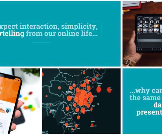
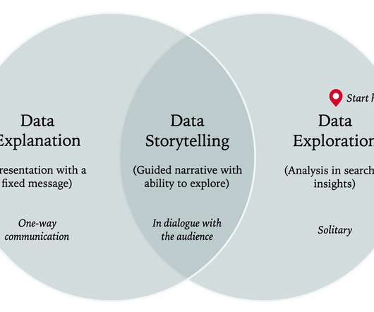
Explanatory data presentation is.the "herding cows" ?? Using the selections and visualizations below, explore relationships between measures and look for patterns and outliers. Without exploring and understanding your data, you cannot move on to explaining it to others. ?? stage of working with data.
OpenSearch Service stores different types of stored objects, such as dashboards, visualizations, alerts, security roles, index templates, and more, within the domain. In this post, we present a solution to deploy stored objects using GitHub and Jenkins while preventing users making direct changes into OpenSearch Service domain.
Introduction The advent of AI has sparked a transformative revolution across industries, from crafting visuals to shaping presentations. You might be living under a rock if you haven’t heard about ChatGPT, the leading AI chatbot transforming the world.
Learn how DirectX visualization can improve your study and assessment of different trading instruments for maximum productivity and profitability. Let’s dive right into how DirectX visualization can boost analytics and facilitate testing for you as an Algo-trader, quant fund manager, etc. But first, What is DirectX Anyway?
Will dashboard be viewed on-the-go, in silence at the office desk or will it be displayed as a presentation in front of a large audience? If your dashboard will be displayed as a presentation or printed, make sure it’s possible to contain all key information within one page. Next step is the placement of charts on a dashboard.
Data dashboards provide a centralized, interactive means of monitoring, measuring, analyzing, and extracting a wealth of business insights from relevant datasets in several key areas while displaying aggregated information in a way that is both intuitive and visual. Lack of different data visualization types.
We have written about management reporting methods that can be utilized in the modern practice of creating powerful analysis, bringing complex data into simple visuals, and employ them to make actionable decisions. Your Chance: Want to visualize & track operational metrics with ease? How To Select Operational Metrics And KPIs?
The analytics and business intelligence market landscape continues to grow as more organizations seek robust tools and capabilities to visualize and better understand data. They can collect and combine data from internal and external systems to present a holistic view.
Spreadsheets finally took a backseat to actionable and insightful data visualizations and interactive business dashboards. The trends we presented last year will continue to play out through 2020. Companies are no longer wondering if data visualizations improve analyses but what is the best way to tell each data-story.
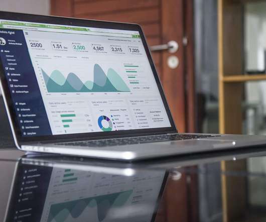
Visualizing the data and interacting on a single screen is no longer a luxury but a business necessity. Gone are the days of static presentations, stagnate reports, and waiting on analysts to pull reports and then having out-of-date data. That’s why we welcome you to the world of interactive dashboards.
Today agencies should focus on driving valuable insights from their data and presenting them in an understandable way for stakeholders to see; in other words, crowded excel sheets or infinite PowerPoint presentations are no longer enough. This is where modern agency reports come into the picture. Social media agency dashboard.
We organize all of the trending information in your field so you don't have to. Join 42,000+ users and stay up to date on the latest articles your peers are reading.
You know about us, now we want to get to know you!
Let's personalize your content
Let's get even more personalized
We recognize your account from another site in our network, please click 'Send Email' below to continue with verifying your account and setting a password.


Let's personalize your content