This site uses cookies to improve your experience. To help us insure we adhere to various privacy regulations, please select your country/region of residence. If you do not select a country, we will assume you are from the United States. Select your Cookie Settings or view our Privacy Policy and Terms of Use.
Cookie Settings
Cookies and similar technologies are used on this website for proper function of the website, for tracking performance analytics and for marketing purposes. We and some of our third-party providers may use cookie data for various purposes. Please review the cookie settings below and choose your preference.
Used for the proper function of the website
Used for monitoring website traffic and interactions
Cookie Settings
Cookies and similar technologies are used on this website for proper function of the website, for tracking performance analytics and for marketing purposes. We and some of our third-party providers may use cookie data for various purposes. Please review the cookie settings below and choose your preference.
Strictly Necessary: Used for the proper function of the website
Performance/Analytics: Used for monitoring website traffic and interactions
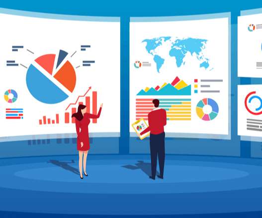
ArticleVideo Book This article was published as a part of the Data Science Blogathon Introduction In applied Statistics and Machine Learning, Data Visualization is one. The post Must Known Data Visualization Techniques for Data Science appeared first on Analytics Vidhya.
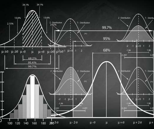
ArticleVideo Book This article was published as a part of the Data Science Blogathon Let us see a short intro about this blog, Descriptive Statistics. The post Descriptive statistics | A Beginners Guide! appeared first on Analytics Vidhya.
This article was published as a part of the Data Science Blogathon R programing language was developed for statistical computing and graphics which makes it one of the desired candidates for Data Science and Analysis. The post Programming in R – From Variables to Visualizations appeared first on Analytics Vidhya.
But often that’s how we present statistics: we just show the notes, we don’t play the music.” – Hans Rosling, Swedish statistician. Data visualization, or ‘data viz’ as it’s commonly known, is the graphic presentation of data. That’s a colossal number of books on visualization. Data visualization: What You Need To Know.
This article was published as a part of the Data Science Blogathon. The post Interpreting P-Value and R Squared Score on Real-Time Data – Statistical Data Exploration appeared first on Analytics Vidhya. Overview In this article, I will share my thoughts on the below.
This article was published as a part of the Data Science Blogathon. Introduction Have you ever been tasked with visualizing the relationship between each. The post Creating Linear Model, It’s Equation and Visualization for Analysis appeared first on Analytics Vidhya.
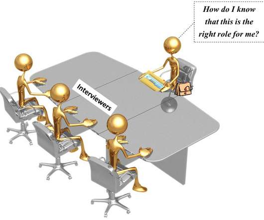
This article was published as a part of the Data Science Blogathon. These include statistics, machine learning, probability, data visualization, data analysis, and behavioral questions. Introduction You may be asked questions on various topics in a data science interview.
Table of Contents 1) The Benefits Of Data Visualization 2) Our Top 27 Best Data Visualizations 3) Interactive Data Visualization: What’s In It For Me? 4) Static vs. Animated Data Visualization Data is the new oil? ” – David McCandless Humans are visual creatures. This very notion is the core of visualization.
This article was published as a part of the Data Science Blogathon. We use summary statistics and graphical tools to get to know our data and understand what we may deduce from them during EDA. […].
ArticleVideo Book This article was published as a part of the Data Science Blogathon Introduction Many engineers have never worked in statistics or data science. The post Know the basics of Exploratory Data Analysis appeared first on Analytics Vidhya.
ArticleVideo Book This article was published as a part of the Data Science Blogathon Introduction In the last blog we looked at a test to. Use, Implementation and Visualization appeared first on Analytics Vidhya. The post Decoding the Chi-Square Test?-?Use,
This article was published as a part of the Data Science Blogathon. These graphs project the statistical information about the distribution using the rectangle blocks that, in turn, will launch […]. Introduction Histograms are one of the best plots which can iterate through the distribution of the dataset.
Data visualization definition. Data visualization is the presentation of data in a graphical format such as a plot, graph, or map to make it easier for decision makers to see and understand trends, outliers, and patterns in data. Maps and charts were among the earliest forms of data visualization.
What’s amazing is that Marvel characters are developed through the influence of other Marvel heroes through data visualization. For instance, when Spider-Man appears in a comic book with Captain America, these are all visualized through data graphics. and using the networkx package, we came up with the first graphic visualization.
Publishers (including The New York Times itself, which has sued OpenAI for copyright violation ) argue that works such as generative art and texts compete with the creators whose work the AI was trained on. Copyright reserves to the creator(s) the exclusive right to publish and to profit from their work. We need to achieve both goals.
In a world increasingly dominated by data, users of all kinds are gathering, managing, visualizing, and analyzing data in a wide variety of ways. Data visualization and visual analytics are two terms that come up a lot when new and experienced analytics users alike delve into the world of data in their quest to make smarter decisions.
After you create a connection once, you can choose to use the same connection across various AWS Glue components including Glue ETL, Glue Visual ETL and zero-ETL. For each table ingested by the zero-ETL integration, two groups of logs are created: status and statistics. Check CloudWatch log events for the SEED Load.
Each of the classroom’s library books has a color coded sticker on its spine reflecting its Lexile score—a visual announcement of its official complexity level, and thus of which students might be officially ready to read it. There are about 150 cardiac surgeons in New York State, for instance.
This article was published as a part of the Data Science Blogathon. Introduction: Probabilistic Graphical Models (PGM) capture the complex relationships between random variables. The post Complete R Tutorial To Build Probabilistic Graphical Models! appeared first on Analytics Vidhya.
ArticleVideo Book This article was published as a part of the Data Science Blogathon. When we learn Data Science as beginners we came across. The post 3 Central Tendency Measures – Mean, Mode, Median appeared first on Analytics Vidhya.
Forrester relates that out of 25,000 reports published by the firm last year, the report on data fabrics and DataOps ranked in the top ten for downloads in 2020. Data fabrics provide reusable services that span data integration, access, transformation, modeling, visualization, governance, and delivery.
DataBrew is a visual data preparation tool that enables you to clean and normalize data without writing any code. The over 200 transformations it provides are now available to be used in an AWS Glue Studio visual job. Now that you have addressed all data quality issues identified on the sample, publish the project as a recipe.
They are Statistical infographics, Informational infographics, Timeline infographics, Process infographics, Geographic infographics, Comparison infographics, Hierarchical infographics, List infographics, and Resume infographics. Most Popular Data Visualization Examples of Infographics. Early Infographics. Pic Source from DOMO.
Data science needs knowledge from a variety of fields including statistics, mathematics, programming, and transforming data. Mathematics, statistics, and programming are pillars of data science. In data science, use linear algebra for understanding the statistical graphs. It is the building block of statistics.
Existing Redshift data warehouses can be made available through SageMaker Lakehouse in just a simple publish step, opening up all your data warehouse data with Iceberg REST API. SageMaker Lakehouse offers integrated access controls and fine-grained permissions that are consistently applied across all analytics engines and AI models and tools.
ArticleVideo Book This article was published as a part of the Data Science Blogathon Introduction Exploratory data analysis is an approach to analyzing data sets. The post Exploratory Data Analysis : A Beginners Guide To Perform EDA appeared first on Analytics Vidhya.
We have already given you our top data visualization books , top business intelligence books , and best data analytics books. Recently published in 2021, “SQL for Data Scientists” by author and experienced data scientist, Rénee Teate, teaches its readers all the skills that data scientists use the most in their daily work.
Editors note: This blog was originally published in October 2013, and has been completely revamped and updated for accuracy, relevancy, and comprehensiveness in September 2019 Prior to the 17th century, data visualization existed mainly in the realm of maps, displaying land markers, cities, roads, and resources.
Smarten is pleased to announce that its Smarten Augmented Analytics solution is included as a Representative Vendor in the Market Guide for Augmented Analytics Published October 2, 2023 (ID G00780764). The Smarten solution requires no data science skills, knowledge of statistical analysis or BI expertise.
The Bureau of Labor Statistics estimates that the number of data scientists will increase from 32,700 to 37,700 between 2019 and 2029. Previously, such problems were dealt with by specialists in mathematics and statistics. Statistics, mathematics, linear algebra. Data Mining Techniques and Data Visualization. Use Kaggle.
In the future of business intelligence, eliminating waste will be easier thanks to better statistics, timely reporting on defects and improved forecasts. Today, Microsoft’s Power BI leads the market of BI-a-a-S, being an excellent tool for data collection, analyzing and visualization. Advantage: unpaired control over data. .
Others aim simply to manage the collection and integration of data, leaving the analysis and presentation work to other tools that specialize in data science and statistics. Its platform supports both publishers and advertisers so both can understand which creative work delivers the best results. Roku OneView.
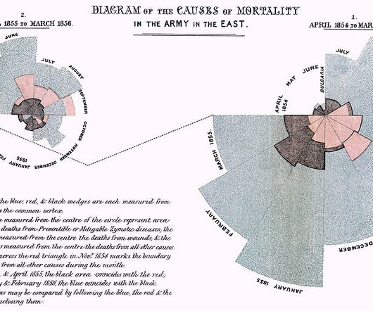
Rectangular Statistical Cartograms of the World — Erwin Raisz POPULATION 1930 census. Cartogram in one of the school atlases published by the Westermann firm in 1996. Draw your own Rectangular Statistical Cartogram with recmap — Christian Panse Trainspotting: Europe’s railway lines. Tools to generate this chart with: D3.js
Amazon SageMaker Unified Studio brings together functionality and tools from the range of standalone studios, query editors, and visual tools available today in Amazon EMR , AWS Glue , Amazon Redshift , Amazon Bedrock , and the existing Amazon SageMaker Studio.
“One look is worth a Thousand Words” This phrase was used in 1913 to convey that graphics had a place in newspaper publishing. The dataset also provides centralized and windowed statistics features. Please refer to our other blog on using DataRobot Visual AI on multi-modal datasets, which also includes text features. .
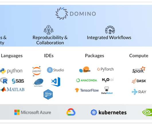
RStudio is an IDE for the R language used primarily for statistical analysis as well as data visualization. Jupyter Notebook is a Python IDE that allows data scientists to create and share code, equations, visualizations and narrative text. Launchpad: Allows you to publish your deployed models in different formats.
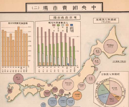
published the Tokyo Shisei Zuhyo, a statistical atlas of the city of Tokyo at the time. However, some have argued otherwise and have presented the argument that Juran wasn’t the first to publish the Bar Chart and cumulative line graph combination that we know today as the ‘Pareto Chart’.
Besides strong technical skills (for instance, use of Hadoop, programming in R and Python , math, statistics), data scientists should also be able to tackle open-ended questions and undirected research in ways that bring measurable business benefits to their organization. See an example: Explore Dashboard.
Visual social media networks are becoming increasingly popular. Marketers can significantly benefit from using big data to optimize their strategies on visual social networks. The problem is not that big data can’t help marketers optimize their strategies on these visual social media platforms.
4) How to Select Your KPIs 5) Avoid These KPI Mistakes 6) How To Choose A KPI Management Solution 7) KPI Management Examples Fact: 100% of statistics strategically placed at the top of blog posts are a direct result of people studying the dynamics of Key Performance Indicators, or KPIs. 3) What Are KPI Best Practices?
Business Intelligence describes the process of using modern data warehouse technology, data analysis and processing technology, data mining, and data display technology for visualizing, analyzing data, and delivering insightful information. It helps executives, managers, and employees make informed business decisions. . Free Download.
As quality issues are often highlighted with the use of dashboard software , the change manager plays an important role in the visualization of data quality. It involves: Reviewing data in detail Comparing and contrasting the data to its own metadata Running statistical models Data quality reports. 2 – Data profiling. million a year.
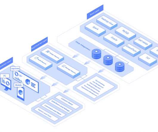
It uses enterprise reporting tools to organize data into charts, tables, widgets, or other visualizations. Then the reporting engine publishes these reports to the reporting portal to allow non-technical end-users access. The central one is the data visualization technology at the display level. FineReport Architecture.
2020 is finally over, so as per tradition the publishing of the website statistics on the most popular chart reference pages is to be obliged. So let’s explore the website statistics from the recent past year with a series of tables and visualizations.
We organize all of the trending information in your field so you don't have to. Join 42,000+ users and stay up to date on the latest articles your peers are reading.
You know about us, now we want to get to know you!
Let's personalize your content
Let's get even more personalized
We recognize your account from another site in our network, please click 'Send Email' below to continue with verifying your account and setting a password.


Let's personalize your content