This site uses cookies to improve your experience. To help us insure we adhere to various privacy regulations, please select your country/region of residence. If you do not select a country, we will assume you are from the United States. Select your Cookie Settings or view our Privacy Policy and Terms of Use.
Cookie Settings
Cookies and similar technologies are used on this website for proper function of the website, for tracking performance analytics and for marketing purposes. We and some of our third-party providers may use cookie data for various purposes. Please review the cookie settings below and choose your preference.
Used for the proper function of the website
Used for monitoring website traffic and interactions
Cookie Settings
Cookies and similar technologies are used on this website for proper function of the website, for tracking performance analytics and for marketing purposes. We and some of our third-party providers may use cookie data for various purposes. Please review the cookie settings below and choose your preference.
Strictly Necessary: Used for the proper function of the website
Performance/Analytics: Used for monitoring website traffic and interactions
In fact, data has become the raw material that every business decision is based on while reporting tools create the environment to act on generated information swiftly and accurately. Tracking the success metrics based on your needs, and the time frame you select while comparing your values can be done with simple yet effective scorecards.
As important parts of business intelligence, scorecard and dashboard can both play an obvious role in promoting enterprise development. However, limited by factors such as cost and corporate strategies, sometimes companies need to make a choice between scorecard vs dashboard. Definition of scorecard and dashboard.
Table of Contents 1) What Is The Report Definition? 2) Top 14 Types Of Reports 3) What Does A Report Look Like? Businesses have been producing reports since, forever. This presents a problem for many modern organizations today as building reports can take from hours to days. What Is The Report Definition?
As important parts of business intelligence, scorecards and dashboards can both play an obvious role in promoting enterprise performance management. However, many users are confused with the difference between scorecard vs. dashboard. Definition of scorecard and dashboard. What is a scorecard? What is a dashboard?
A social media dashboard is an invaluable management tool that is used by professionals, managers, and companies to gather, optimize, and visualize important metrics and data from social channels such as Facebook, Twitter, LinkedIn, Instagram, YouTube, etc. Social media KPI scorecard. What Is A Social Media Dashboard?
Collecting big amounts of data is not the only thing to do; knowing how to process, analyze, and visualize the insights you gain from it is key. Your Chance: Want to visualize & track inventory KPIs with ease? Explore our modern reporting software for 14 days, completely free! But let’s get back to our visual example.
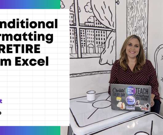
I’m normally very zen about data visualization. But with some behind-the-scenes editing, we can still make powerful visualizations inside Excel.”. I started to teach the Baruch College students about exploratory data visualization with conditional formatting. Conditional Formatting is a fancy way of saying “if-then visuals.”.
Power BI is Microsoft’s interactive data visualization and analytics tool for business intelligence (BI). You can drill into data, create a variety of visualizations, and (literally) ask questions about it using AI. Power BI’s rich reports or dashboards can be embedded into reporting portals you already use.
An accounting department may consider leveraging electronic contracts, data collecting, and reporting as a part of the digital transition. Several marketing dashboard tools allow you to generate automated online dashboards and reports to track your most relevant KPIs in one place. The value of this tool lies in its visual nature.
User interfaces for ERP reporting tools are most often built with IT staff in mind, not the end user. Such is the case with Oracle Discoverer, one of the primary reporting tools in the Oracle ecosystem. Real-Time Reporting Solutions for Oracle EBS. Oracle’s 2014 Statement of Direction laid out its support strategy.
Corporate (or enterprise) dashboards are dynamic digital and visual tools that offer a comprehensive working insight into a wide range of corporate or company’s metrics and data, focused on monitoring, optimization, and achievement of strategic goals. Humans are visual creatures. What Is A Corporate Dashboard?
One way to do it is for me to just tell you what my top ten Google Analytics reports are that you could familiarize yourself with. report in Google Analytics below includes a small brain dump of quick insights I seek when I'm looking at that report. Sources Overview report. Landing Pages report.
An extraordinary amount of time, effort, $$$ are spent on building dashboards/scorecards for CMOs… Yet, the end result, nearly always, is a useless data puke. Personal Bias: I prefer the word Scorecard over Dashboard. In my writing, in my keynotes, you’ll hear Scorecard. Application #1: Paid Media CMO Scorecard Module.
Produce built-in visualization magic. with the reports and features you can already access. Custom Report Filters, Tabs: Bring Deeper Relevance To Your Custom Reports. #8. My preferred path is to leverage the tool's built-in features for filtering/visualizing the data. I mean really use the tools.
Moreover, BI platform allows users to customize dashboards, create beautiful data visualizations, build scorecards, and compare them with key performance indicators (KPIs). The examples of BI reports in this article are all built-in templates made by FineReport. Free Download. BI platform for Sales.
Real-time OLAP Traditionally, OLAP datastores were designed for batch processing to serve internal business reports. These users often prefer to have direct access to the data and the ability to analyze it independently, without relying solely on scheduled updates or reports provided at fixed intervals.
Or compressing my experience into custom reports and advanced segments I've shared. This gives Earth's residents almost all the reports we would like to look at, and hence do almost all the analysis you might want to do in your quest to become an Analysis Ninja. Play with Enhanced Ecommerce Reports. Another tip.
With the help of KPI reports , all of these targets can be visualized together to get a complete picture across departments. Continuing on the line of targets, a KPI scorecard like the one below is the perfect tool to put together an efficient picture of progress and the latest developments regarding your most relevant indicators.
As the data visualization, big data, Hadoop, Spark and self-service hype gives way to IoT, AI and Machine Learning, I dug up an old parody post on the business intelligence market circa 2007-2009 when cloud analytics was just a disruptive idea. Thanks to The OLAP Report for lots of great market materials. We Couldn’t Get the Answers”.
” This type of Analytics includes traditional query and reporting settings with scorecards and dashboards. Having visually appealing graphics can also increase user adoption. FineReport FineReport is a powerful reporting and big data tool that adopts popular 3-tier architecture. Top 10 Big Data Tools 1.
The platform then automatically finds, visualizes and narrates important findings or the story in the data such as correlations, exceptions, clusters, links and predictions that are relevant to them without requiring them to build models, or write algorithms. The user explores data via visualizations and natural language generated narration.
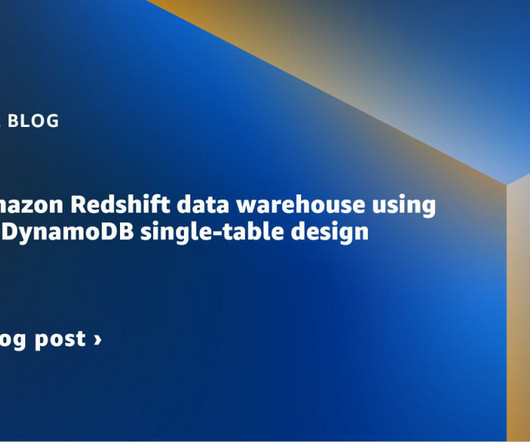
Typical use cases for DynamoDB are an ecommerce application handling a high volume of transactions, or a gaming application that needs to maintain scorecards for players and games. We can use AWS Glue Studio to visually create the jobs needed to extract the data from DynamoDB and load into our Amazon Redshift data warehouse.
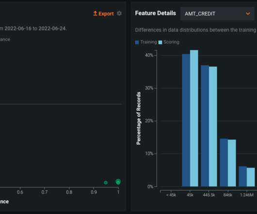
Within the data drift tab of a DataRobot deployment, users are able to both quantify the amount of shift that has occurred in the distribution, as well as visualize it. Figure 5: The time series visualization above depicts the number of times a humility rule has been triggered. BARC INDUSTRY ANALYST REPORT. Download now.
Paired to that, the lack of users with technical skills has delayed the generation of reports to even weeks. By the time a report is ready, the data has already lost its value due to the fast-paced nature of today’s context. With monitoring reports, this is not an issue. Choose the right type of visual.
With the introduction of Artificial Intelligence and Machine Learning, as well as data visualization tools, designed for charting, dashboards and performance scorecards. Discover the features of Business Intelligence and Reporting , and download a free trial of Smarten Analytics software.
These tools allowed users to monitor key performance indicators (KPIs), reports and other metrics in a dashboard environment using many of the same features and tools they enjoyed in a desktop based application. Users can report income, expenses, budgets, etc. so it is easy to manage financial results on the road or in the office.
We’ve made a big impact with QuickSight because it doesn’t require in-depth knowledge about data visualizations to build dashboards and provide insights, empowering our users to build what they need. This empowers EMs to avoid building disparate local reporting that creates logic inconsistencies and data security issues.
Only need basic reporting tools and a UI with limited functionality when analytics is part of the core competency. Your content creators can customize even the tiniest details of the dashboards, data visualizations, interactions, scorecards, labels, and more that they use.
Visualizations in business intelligence software are often dismissed as a commodity interchangeable and easy to overlook. Visualizations are the gateway to understanding; theyre how users interact with and interpret the insights derived from all the data gathering, preparation, and analysis. But this perspective misses the mark.
We organize all of the trending information in your field so you don't have to. Join 42,000+ users and stay up to date on the latest articles your peers are reading.
You know about us, now we want to get to know you!
Let's personalize your content
Let's get even more personalized
We recognize your account from another site in our network, please click 'Send Email' below to continue with verifying your account and setting a password.


Let's personalize your content