This site uses cookies to improve your experience. To help us insure we adhere to various privacy regulations, please select your country/region of residence. If you do not select a country, we will assume you are from the United States. Select your Cookie Settings or view our Privacy Policy and Terms of Use.
Cookie Settings
Cookies and similar technologies are used on this website for proper function of the website, for tracking performance analytics and for marketing purposes. We and some of our third-party providers may use cookie data for various purposes. Please review the cookie settings below and choose your preference.
Used for the proper function of the website
Used for monitoring website traffic and interactions
Cookie Settings
Cookies and similar technologies are used on this website for proper function of the website, for tracking performance analytics and for marketing purposes. We and some of our third-party providers may use cookie data for various purposes. Please review the cookie settings below and choose your preference.
Strictly Necessary: Used for the proper function of the website
Performance/Analytics: Used for monitoring website traffic and interactions
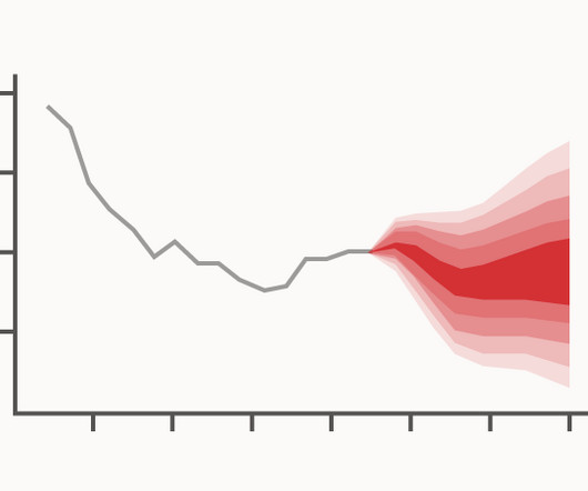
A Fan Chart is a visualisation tool used in time series analysis to display forecasts and associated uncertainties. Each shaded area shows the range of possible future outcomes and represents different levels of uncertainty with the darker shades indicating higher levels of probability.
Viole Kastrati: Without systematic and continuous reporting, it is almost impossible to get a complete picture of the personnel situation and make informed decisions based on it. This is due, on the one hand, to the uncertainty associated with handling confidential, sensitive data and, on the other hand, to a number of structural problems.
Single source of truth reporting is exactly what it sounds like: reporting based on a shared repository of facts that includes all information relevant to every user. It’s the ideal approach to reporting, but it’s rarer than people realize. PeopleSoft users are an excellent example. Here’s how.
Although Microsoft’s rollout of its two ERP cloud products (D365 F&SCM, and for smaller businesses, D365 Business Central) has been going on for some time, the current climate of economic uncertainty has prompted a lot of companies to hit the pause button on migration, choosing instead to stay the course with their existing Dynamics AX systems.
Turning raw data into actionable or strategic insights typically involves putting it through a financial reporting process based around the ERP and an army of static Excel spreadsheets. Capable as these programs may be, neither was designed specifically for financial reporting. A New Roadmap for Financial Reporting.
Bridging the Gap: How ‘Data in Place’ and ‘Data in Use’ Define Complete Data Observability In a world where 97% of data engineers report burnout and crisis mode seems to be the default setting for data teams, a Zen-like calm feels like an unattainable dream. One of the primary sources of tension? What is Data in Use?
A DSS supports the management, operations, and planning levels of an organization in making better decisions by assessing the significance of uncertainties and the tradeoffs involved in making one decision over another. It features support for creating and visualizing decision tree–driven customer interaction flows. Data-driven DSS.
The Art Of Communication: More Than Just Reports First and foremost, the ability to communicate effectively is your Excalibur in the world of business analysis. You’re the translator of complex jargon into the common tongue, ensuring clarity is achieved in every meeting, email, and report. Where you can, try to predict change.
With advanced analytics, flexible dashboarding and effective data visualization, FP&A storytelling has become both an art and science. First, because uncertainty exploded. I’ve worked with hundreds of dashboard and data visualization projects over the years. Dashboards and analytics have been around for a long, long time.
Without visualized analytics, it was difficult to bridge the void between expectation and accurate analysis. The objectives were lofty: integrated, scalable, and replicable enterprise management; streamlined business processes; and visualized risk control, among other aims, all fully integrating finance, logistics, production, and sales.
We wanted to include interactive, real-time visualizations to support recruiters from one of our government clients. Our previous solution offered visualization of key metrics, but point-in-time snapshots produced only in PDF format. With AWS, we aren’t forced to pay for a bundle with services that we don’t use.
Recognizing a need for better operational analytics, insightsoftware leveraged award-winning technology from Logi Analytics to provide Oracle ERP Cloud users the ability to customize, create, and share interactive dashboards and reports across all departments of a business.
SAP reporting works like a map through the forest. When companies have an overwhelming amount of data with which to contend, moving quickly in all directions, reporting offers a kind of guidance. That makes it an invaluable asset for preparing insightful reports driven by the best data available.
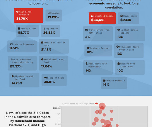
As part of the event, we created this interactive report that lets you explore how socio-economic factors correlate with health conditions. Do we all share the same doubts and uncertainties about life decisions? This is data analysis as a way to highlight health disparities. Am I making the most of my life? We are all a Steve.
Be it in the form of online BI tools , or an online data visualization system, a company must address where and how to store its data. To mitigate the various risks and uncertainties in transitioning to the cloud, IT must adapt its traditional IT control processes to include the cloud. It’s completely free!
This certainly applies to data visualization, which unfortunately lends itself to a great deal of noise if we’re not careful and skilled. Every choice that we make when creating a data visualization seeks to optimize the signal-to-noise ratio. No accurate item of data, in and of itself, always qualifies either as a signal or noise.
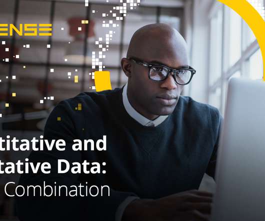
It’s analyzed through numerical comparisons and statistical inferences and is reported through statistical analyses. As quantitative data is always numeric, it’s relatively straightforward to put it in order, manage it, analyze it, visualize it, and do calculations with it. Why is quantitative data important?
I started out as an accountant, but I decided that I wanted to go beyond financial reports and auditing accounts to use my skills in business. Robotic process automation is one example in which money may be wasted when the company could have gotten the same results using Visual Basic and Excel macros, to be quite honest.
In a world marked by volatility, uncertainty, complexity, and ambiguity (VUCA) building a holistic planning environment is inevitable for successful steering.” They pinpointed ten distinct use cases, like sales planning , financial planning and reporting.
In a research brief defining “5 trends for 2023,” the IBM Institute for Business Value reports, “In 2023, rapid response is the new baseline. Uncertainty is expected and complexity is compounding. As threats materialize on multiple fronts, organizations must reduce the time from insight to action.”
With the volatility of the market and increasing uncertainties that arise within your business, you need actionable insights to contend with competitors buoyed by digital transformation efforts. It sure isn’t happening in the visualization layer! Unlock insights from ERP Data to Deliver Actionable Insights Let’s face it.
Therefore, bootstrapping has been promoted as an easy way of modelling uncertainty to hackers who don’t have much statistical knowledge. Don’t compare confidence intervals visually. Confidence intervals are a common way of quantifying the uncertainty in an estimate of a population parameter.
But without establishing a centralised rapid reporting rhythm, fed by real-time data and supported by automated reporting processes, finance runs the risk of things dropping off into silos. And that’s the last thing you want during in periods of uncertainty where things are changing on a daily basis.
Nearly half (49%) of IT leaders participating in this year’s research report directly to the CEO, and CIOs themselves have retained oversight of some of the newer C-level positions. Chief security officers and chief analytics officers are also more likely to report into IT leadership.
Traditionally, this meant tracking a small set of numbers at occasional intervals, such as in the month-end close or the quarterly financial report. That includes things like reading financial statements, balance sheets, and cash flow reports. Your Reporting Lags Because You Lack Real-Time Capabilities. Your Reports Are Static.
Typically, causal inference in data science is framed in probabilistic terms, where there is statistical uncertainty in the outcomes as well as model uncertainty about the true causal mechanism connecting inputs and outputs. Our code has details (there are probably other reasonable visualization approaches that work just as well).
As part of the event, we created this interactive report that lets you explore how socio-economic factors correlate with health conditions. Do we all share the same doubts and uncertainties about life decisions? This is data analysis as a way to highlight health disparities. Am I making the most of my life? We are all a Steve.
Forecasting acts as a planning tool to help enterprises prepare for the uncertainty that can occur in the future. to create forecast tables and visualize the data. Time series data is plottable on a line graph and such time series graphs are valuable tools for visualizing the data.
And we could easily visualize how a fix could impact our warranty claim forecast. Here at Skullcandy, we’re happy to report that “dropping in” to the predictive and sentiment analytics game was worth the initial uncertainty. Full circle data experience: achieved. Lessons Learned.
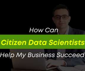
The path to Citizen Data Scientist does not have to be fraught with uncertainty.’. These individuals may already be ‘power users’ of business applications and may have developed and reported or presented data to others with an eye toward clarifying their decision-making. Training is a key component of this success.
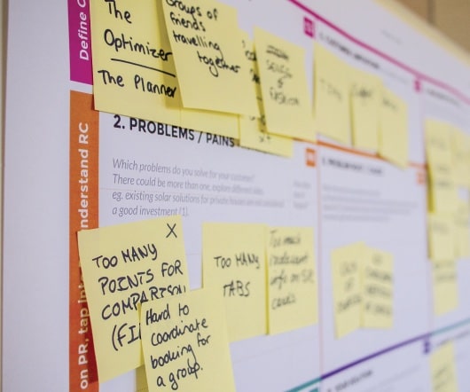
Government executives face several uncertainties as they embark on their journeys of modernization. Throughout the visual representation of the journey, pain points are plotted accordingly.
Here’s a common data visualization challenge: Slides with some, but not all, of the chronological data included. . Using Dotted Lines to Show Uncertainty. Dotted lines are great for visualizing estimates or uncertainty. The Challenge. What type of graph should it be? How should it be formatted? Here’s the edited version.
Nearly all respondents reported promising early results from gen AI experiments and planned to increase their spending in 2024 to support production workloads. Here are some areas where organizations are seeing a ROI: Text (83%) : Gen AI assists with automating tasks like report writing, document summarization and marketing copy generation.
Crucially, it takes into account the uncertainty inherent in our experiments. Figure 4: Visualization of a central composite design. In this section we’ll discuss how we approach these two kinds of uncertainty with QCQP. It is a big picture approach, worthy of your consideration. production, default) values.
Among several services my organization provides; we help individuals, enterprises, and public agencies plan, prepare, and manage through the uncertainty, demands, and challenges of the future. They range from automating repeatable processes to improved analytics and reporting, to better integration with other organizational functions.
Even in this case, however, I would not ordinarily report to others what I’d discovered about rates of change using a graph with a logarithmic scale, for all but a few people would misunderstand it. This works because units along a logarithmic scale increase by rate (e.g., There are many different ways to estimate and compare income.
Without robust in-house expertise and support to build the necessary dashboards and run queries, many institutions are instead forced to rely on canned reports that can’t be customized. This insight can inform future partnerships, and reduce uncertainty about which services will be most relevant and useful.
You have devised a number of time-tested shortcuts to deal with uncertainty. But he has a hard time explaining why it says so.When you question him about the data quality, he waves it away and mumbles something about sample size.Whenever he submits a report, it reminds you of that 4th year econ course you almost failed.
The data consist of the weekly initial claims for unemployment insurance in the US, as reported by the US Federal Reserve. There are also plotting functions that you can use to visualize the regression coefficients. Figure 1 shows the motivating data set from Scott and Varian (2014), which is also included with the bsts package.
Yardi offers a variety of different tools for reporting; unfortunately, each has its own unique shortcomings. Reporting in Yardi: the Default Options. There are no options for modifying the format of these reports, and in many cases, they may only provide a subset of results.
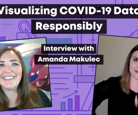
As I was listening to a Data Visualization Society round table discussion about the responsible use of COVID-19 data (properly distanced and webinar-ed, of course), a few thoughts seemed most relevant. And in this particular case, the uncertainty bands are huge, because there’s just so much about this virus that we just don’t understand.
In April, I sat down with Amanda Makulec, one of my longtime data and evaluation friends, to learn about visualizing COVID-19 responsibly. Amanda is the Data Visualization Capability Lead at Excella; a co-organizer for Dataviz DC; and the Operations Director for the Data Visualization Society (DVS). Data Visualization Society.
Our call for speakers for Strata NY 2019 solicited contributions on the themes of data science and ML; data engineering and architecture; streaming and the Internet of Things (IoT); business analytics and data visualization; and automation, security, and data privacy. ML and AI topics claim top spots.
He also really informed a lot of the early thinking about data visualization. It involved a lot of work with applied math, some depth in statistics and visualization, and also a lot of communication skills. If you look into the middle bucket, they have three things that they report in common. What do they report in common?
We organize all of the trending information in your field so you don't have to. Join 42,000+ users and stay up to date on the latest articles your peers are reading.
You know about us, now we want to get to know you!
Let's personalize your content
Let's get even more personalized
We recognize your account from another site in our network, please click 'Send Email' below to continue with verifying your account and setting a password.


Let's personalize your content