This site uses cookies to improve your experience. To help us insure we adhere to various privacy regulations, please select your country/region of residence. If you do not select a country, we will assume you are from the United States. Select your Cookie Settings or view our Privacy Policy and Terms of Use.
Cookie Settings
Cookies and similar technologies are used on this website for proper function of the website, for tracking performance analytics and for marketing purposes. We and some of our third-party providers may use cookie data for various purposes. Please review the cookie settings below and choose your preference.
Used for the proper function of the website
Used for monitoring website traffic and interactions
Cookie Settings
Cookies and similar technologies are used on this website for proper function of the website, for tracking performance analytics and for marketing purposes. We and some of our third-party providers may use cookie data for various purposes. Please review the cookie settings below and choose your preference.
Strictly Necessary: Used for the proper function of the website
Performance/Analytics: Used for monitoring website traffic and interactions
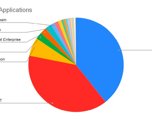
Visualizing data in charts, graphs, dashboards, and infographics is one of the most powerful strategies for getting your numbers out of your spreadsheets and into real-world conversations. But it can be overwhelming to get started with data visualization. If so, this step-by-step data visualization guide is for you!
We’ve all been on the receiving end of a long, boring, text-heavy report. Well… I used to be an author of reports like that. The Everything Report. At the start of my career, I thought the most important thing a report could convey was… well… everything. Introduction to Data Visualization.
I recently had the opportunity to be a guest on James Pann’s YouTube show to talk about reports. Here’s a recap of our conversation: My Introduction to Dusty Shelf Reports. Early on in my career, I was throwing all my effort into a report, staying late, working on the weekends, doing whatever it took to do my best work.
And in this article, I will show you 13 data visualization tools that can help you make infographics in just 30 minutes. Most Popular Data Visualization Examples of Infographics. Many courses that teach students to make infographics by some data visualization tools. 7 Data Visualization Tools that You Need to Know ….
Speaker: Dean Yao, Sr. Director of Product Marketing, Logi Analytics
Operational reports help get information to the people who need it most, in formats they understand, and in a timeframe that matters. Join the webinar to learn how embedding operational reports can give your users a precisely formatted, ready-to-analyze view of their operational activities.
Businesses that rely on SAP reporting to track their key performance indicators also typically rely on their IT department to facilitate initial report creation. Creating reports inside the SAP ecosystem involves the careful collection and integration of data in ways that only IT knows how to connect.
Not only will you be able to design your own reports and dashboards that will show exactly how your cash flow is at that point in time, but you will also be able to drill down for easy data validation. To learn more join us on June 17 for this free 20 minute webinar,“ Cash Flow Analysis: Cash Management Has Never Been So Critical.”
COVID-19 brought a new urgency to financial reporting, with businesses needing to have an accurate view of their cash flow in order to inform future planning. These enable them to have a visual view of what’s going on, for quicker understanding. Watch now to see how you too can streamline your reporting process.
As one of the most widely used data visualization tools in the world, Power BI has made some huge improvements to creating custom visualizations that we want to share with you. When creating or editing a Power BI dashboard, you have access to a ton of different types of visuals. Custom Visuals for Power BI.
Since the release of Cloudera Data Visualization (DV) back in Oct 2020 , our primary mission has been to expand access to data analytics and predictive insights across enterprise businesses. Figure 1: Example menu-driven application within Cloudera Data Visualization, left panel menu allows navigation across multiple dashboards.
This is an unfortunate reality that many tax technologists and strategists report. Primer Video: Tax reporting in a changing world. During a recent webinar held by insightsoftware, we heard this general sentiment reported once more. Read how top tax teams are responding to the latest global disruptions.
Webinar Date: 16 September, 2020 1PM – 1:45 PM across various time zones. Hubble integrates all your critical business systems so that users at all levels have access to live data and automated reporting, planning, and budgeting. Web based dashboards for visual analytics. Register Now. Register Now. Register Now.
BCBS 239 is a document published by that committee entitled, Principles for Effective Risk Data Aggregation and Risk Reporting. The document, first published in 2013, outlines best practices for global and domestic banks to identify, manage, and report risks, including credit, market, liquidity, and operational risks.
Learn Data Visualization Understanding the Importance of Visualizing Data Data visualization is a powerful tool for conveying complex information in a clear and impactful manner. Whether it’s through charts, graphs, maps, or other visual formats, mastering data visualization is crucial for anyone working with data.
Dusty Shelf Reports Aren’t Inevitable. With intentional editing, you can design visualizations that inform and inspire. ” But the general public is craving clear, reliable visuals. Media outlets are reporting that their COVID-19 data visualizations are their most viewed pages. Pause the videos.
With advanced analytics, flexible dashboarding and effective data visualization, FP&A storytelling has become both an art and science. You can watch the webinar here (registration required) to learn how to conduct FP&A storytelling in order to enhance fact-based decision making. What typically goes wrong?
I used to write hundred-page reports… I was trained to write lengthy reports filled with statistical jargon. Now, I design reports that people actually want to read. Reports aren’t supposed to feel daunting. Reports aren’t supposed to feel daunting. Fewer paragraphs. More graphs.
You might recognize Jon from our earlier interview about tips for doing and teaching data visualization in cultures other than your own. Which Data Visualization Trends Are Here to Stay? We can’t just write reports and make pretty slides. Reports and slides aren’t enough anymore… and have never been enough. Keep reading!
Visualizing data from anywhere defined by its context and definition in a central model repository, as well as the rules for governing the use of those data elements, unifies enterprise data management. Provide metadata and schema visualization regardless of where data is stored. Create database designs from visual models.
The ecosystem around Microsoft Power BI is growing fast – consultancies and software vendors are adopting the platform to offer added value in visuals, apps, connectors and data management tools. Within the questionnaire, you will find a form to add and promote your webinars and success stories. Your entry is free of charge!
I first came across Ann’s work when our company signed a few of us up for a dashboard webinar. There just was so little to keep it visually interesting. Additionally, when I reported the stats for this project, I had them all on one slide with some grainy photos off the internet. It wasn’t horrible, but it wasn’t great either.
Dundas BI platform will be integrated with insightsoftware’s Logi solutions, strengthening self-service data analytics and visualization. August 11, 2022 – insightsoftware , a global provider of reporting, analytics, and performance management solutions, today announced it has acquired Dundas Data Visualization, Inc. ,
On January 4th I had the pleasure of hosting a webinar. What is unique about the D&A Leadership Vision is that it crossed over into business since for many organizations, the CDO reports into the CEO or COO (as examples). The fill report is here: Leadership Vision for 2021: Data and Analytics.
For example, NetSuite makes it possible to generate reports on enterprise performance, but it doesn’t necessarily optimize the reporting process. It offers a suite of financial and operational reporting tools that run inside the familiar ecosystem of Excel and fully integrate with NetSuite. Spreadsheet Server does.
Are you an aspiring data scientist , or just want to understand the benefits of integrating data catalogs with visualization tools? By combining the power of two solutions — data catalogs and data visualization tools — you can get a deeper understanding of your information landscape and create meaningful insights faster.
I’ve taken the journey from her webinars to her great resources on chart choosing to the Great Graphs class. While I’ll never reach her level of data visualization wizardry, I’ve learned a few things. Data visualization and chart selection was a huge challenge. There’s nothing cooler than sharing your talents the way she does.
Blogs Podcasts Whitepapers and Guides Tools and Calculators Webinars Sample Reports The Evolution of the CFO into the Chief Data Storyteller View Insight Now Our Favorite CFO Blogs The Venture CFO Blog Link: [link] Are you looking for blog posts for CFOs by CFOs? Check out a sample report from our dynamic dashboard solution.
much the same way that AI can help discover and classify data, we predict enterprises will use AI to visualize and quantify risk across their entire footprint. Deliver top-down visualization and reporting. Tune in to our webinar, AI vs. AI: Harnessing AI Defenses Against AI-Powered Risks. Drive prioritized remediation.
Recognizing a need for better operational analytics, insightsoftware leveraged award-winning technology from Logi Analytics to provide Oracle ERP Cloud users the ability to customize, create, and share interactive dashboards and reports across all departments of a business.
In my sixth year of self-employment, the demand for data visualization skills is stronger than ever. Then, join me and your fellow students live webinars twice each month. This training program is about classic data visualization principles? Course 1: Data Visualization Design Principles . What’s Included. We’ll go broad?
LiveHire and Sisense recently held a webinar on using data to adapt your workforce, and it became abundantly clear data, diversity, and technology will be vital for the workforce of the future. Once data is un-siloed, combined data sources can give a rich visualization around recruitment efforts, beyond the simple cost-to-hire numbers.
To tackle this last-mile issue, we released CDP Data Visualization — An easy to use, self-service dashboarding and intelligent reporting tool included with CDP Machine Learning out of the box. . Explainable, predictive reporting with CDP Data Visualization.
However, only 4% of enterprise executives today report seeing success from their ML investment. They need strong data exploration and visualization skills, as well as sufficient data engineering chops to fix the gaps they find in their initial study. The implications of ML on the future of business are clear. Stay tuned!
A recent Fortune special report on Artificial Intelligence (AI) pointed to the recent developments in the field of Natural Language Processing (NLP) over the last 18 months as “revolutionary” for better search engines, smarter chatbots, and digital assistants. A look under the hood.
He has recently attended a Cloudera Fast Forward webinar where the latest trends and production-proven ML algorithms have been highlighted and exemplified. He downloads the Cloudera Fast Forward report about modeling Telco Churn and after reading it, his interest is piqued. The Data Analyst. Therefore, it has dynamically scaled down.
Over a third of respondents to our State of Analytics and BI survey reported that they are currently focused on growing their use of analytics across their businesses. Explore these and other capabilities on the release page and join our webinar on July 28th at 10:30 am Eastern Time to learn more. Additional capabilities.
Throughout each episode, hosts Shane and Nigel discuss how to incorporate agile techniques when teams deliver analytics, data, and visualizations. We have had the pleasure of partnering with him for webinars and he always brings a new perspective and interesting insights. Another podcast we think is worth a listen is Agile Data.
Limited real-time analytics and visuals. Limited self-service reporting across the enterprise. The goal in addressing these pain points is to empower your stakeholders (both within Finance/FP&A and your business partners) to be able to deliver: Consistent reporting and dashboards. Self-service reporting.
Are you an aspiring data scientist , or just want to understand the benefits of integrating data catalogs with visualization tools? By combining the power of two solutions — data catalogs and data visualization tools — you can get a deeper understanding of your information landscape and create meaningful insights faster.
We spoke with Lutz Jannausch , Head of Business Applications at Microsoft Germany, about developments in business intelligence, data visualization and integrated planning solutions. They provide the tools to easily prepare data and make it accessible at a glance through visualizations even for users who aren’t numbers-nerds.
The built-in reports that come with most ERP software packages are notoriously deficient from the standpoint of finance and accounting professionals. Native reporting tools are difficult to use, require specialized expertise, and are often inaccessible to front-line finance and accounting personnel. Making Reporting and Analysis Easy.
AI, colloquially, is used to refer to a number of computer-powered business decision drivers, including automation (not AI), data modeling (not AI), and reporting and analytics (also not AI). Vision systems: Vision systems are capable of analyzing and interpreting visual images, such as aerial photographs, medical imaging, or product labels.
With the help of visually appealing dashboards and reports, evaluating the actuals is simple and straightforward. In sales, the quality and frequency of forecasts can be increased and the effort required for planning, budgeting, and reporting is often reduced. But placing strategic and financial guidance is still a pain.
Raleigh, N.C – August 31, 2022 – insightsoftware , a global provider of reporting, analytics, and performance management solutions, today announced the integration of its CXO EPM reporting solution and the suite of Longview solutions. insightsoftware is a leading provider of reporting, analytics, and performance management solutions.
We organize all of the trending information in your field so you don't have to. Join 42,000+ users and stay up to date on the latest articles your peers are reading.
You know about us, now we want to get to know you!
Let's personalize your content
Let's get even more personalized
We recognize your account from another site in our network, please click 'Send Email' below to continue with verifying your account and setting a password.
Let's personalize your content