This site uses cookies to improve your experience. To help us insure we adhere to various privacy regulations, please select your country/region of residence. If you do not select a country, we will assume you are from the United States. Select your Cookie Settings or view our Privacy Policy and Terms of Use.
Cookie Settings
Cookies and similar technologies are used on this website for proper function of the website, for tracking performance analytics and for marketing purposes. We and some of our third-party providers may use cookie data for various purposes. Please review the cookie settings below and choose your preference.
Used for the proper function of the website
Used for monitoring website traffic and interactions
Cookie Settings
Cookies and similar technologies are used on this website for proper function of the website, for tracking performance analytics and for marketing purposes. We and some of our third-party providers may use cookie data for various purposes. Please review the cookie settings below and choose your preference.
Strictly Necessary: Used for the proper function of the website
Performance/Analytics: Used for monitoring website traffic and interactions
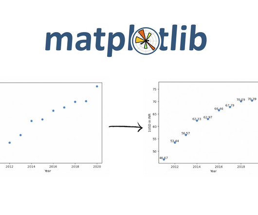
Introduction Scatterplots are a powerful tool in a data scientist’s arsenal, allowing us to visualize the relationship between two variables. This blog will explore the ins and outs of creating stunning scatterPlot Visualization in Python using matplotlib.
One of the most commonly used plots in Seaborn is the scatterplot, which allows us to visualize the relationship between two variables. Understanding ScatterPlots A scatter […] The post How to Create ScatterPlots with Seaborn in Python? appeared first on Analytics Vidhya.
While basic plots like bar charts and scatterplots are essential, delving into advanced visualizations can unlock deeper insights and enhance your storytelling. Introduction Matplotlib is a fundamental Python library, empowers you to create various visualizations to explore and communicate your data effectively.
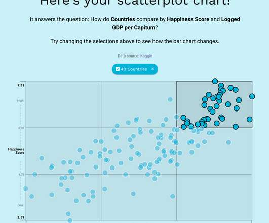
Scatterplots are a powerful visual type that allow you to identify patterns, outliers, and strength of relationships between variables. In this post, we walk you through the newly launched scatterplot features in Amazon QuickSight , which will help you take your correlation analysis to the next level.
For visualizing any form of data, we all might have used pivot tables and charts like bar charts, histograms, pie charts, scatterplots, line charts, […]. The post Exploring Data Visualization in Altair: An Interesting Alternative to Seaborn appeared first on Analytics Vidhya.
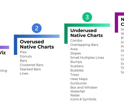
Clustered Bars Clustered Columns Columns Combo Charts Data Bars Diverging Stacked Bars Donuts Dot Plots Heat Maps Heat Tables Histograms Interactive Dashboards Lines Lollipops Network Maps One-Pagers Made entirely within Excel and saved as a PDF (not pasted into Word).
It uses different symbols such as bars, lines, columns, tables, box plots, maps, and more, to give meaning to the information, making it easier to understand than raw data. Scatterplots are valuable when you want to represent smaller data sets of two variables while bubble graphs are best for larger information with three or more variables.
Scatterplots. Also, showing the relationship between selected multiple variables is not optimal for waterfall charts (also known as Cascade charts), as bubble plots or scatterplots would be a more effective solution. 8) ScatterPlot. When to use ScatterPlots. Spider charts.
We all know how to make Bar-Plots, ScatterPlots, and Histograms, yet we don’t pay much attention to beautify them. However, a good visualization is annoyingly hard to make. Moreover, it takes time and effort when it comes to present these visualizations to a bigger audience. This hurts us?-?our
Data Storytelling in a ScatterPlot. We didn’t have time to discuss scatterplots at the DATAcated Expo, but I’d still like to share this example with you. Here’s how data storytelling would be applied to a scatterplot. Never keep the default settings!!!!!!!!!!
Well, a scatterplot could be the basis of that but you would need to build the whole map somehow. They hacked Excel by using a standard feature such as the scatterplot. It was done by understanding how scatterplots are built. Well, it looks like it’s organized in rows and columns.
We have more than 10 kinds of visualization views commonly used, including text tables, maps, pie charts, horizontal bars, stacked bars, tree views, scatterplots, histograms, Gantt charts, scatter charts, bubble charts, etc. The plotting style is similar to MATLAB, so it is called Matplotlib. From Google.
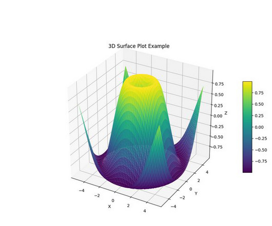
aspect=10) # Set labels and title ax.set_xlabel('X') ax.set_ylabel('Y') ax.set_zlabel('Z') ax.set_title('3D Surface Plot Example') %matplot plt As illustrated by the preceding examples, you can use any compatible visualization library by installing the required modules and then using the %matplot magic command.
They help users explore data through visual elements like charts, graphs, plots, maps, and other visualizations. There are a variety of data visualization techniques for univariate analysis, including Box Plot, Histogram, PDF, CDF. Data visualization techniques for bivariate analysis are ScatterPlot and Heatmap.
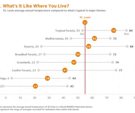
A simple table or a scatterplot serves the purpose quite well. By combining a single point scatterplot and error bars, a reference line can be inserted to mark local conditions. Is it warmer or cooler, wetter or drier? For this, I’m indebted to Jon Schwabish of the Urban Institute and PolicyViz.
ScatterPlot. The data of the scatterplot is three-dimensional data. The series can be distinguished by color, or the third dimension can be determined by the size of the scatter point, which leads to the bubble chart. The bubble chart is a derivative of the scatter chart. Free Trial. Free Trial.
Utilize root cause analysis tools such as Pareto Charts, The 5 Whys, ScatterPlot Diagram, Fishbone Diagram, or others to pinpoint the source. Maybe, a project is off track because of resourcing problems due to limited staffing — again another concern for many businesses during the pandemic.
You might be thinking that I’m ignoring a visual attribute that could easily be added to this bubble plot: positions along the Z axis. the direction in which bubbles move in an animated bubble plot). varying speeds in the movement of bubbles in an animated bubble plot). Actually, I’m avoiding the Z axis for a good reason.
Untuk para profesional yang ingin membuat plot yang melibatkan data yang sangat banyak, ggplot2 adalah pilihan terbaik. Sangatlah mudah dan cepat untuk membuat plot dalam layer untuk menampilkan cerita yang kompleks. Excel menawarkan grafik standar, dari peta unit heat sampai scatterplot. Harga: Gratis. Harga: Gratis.
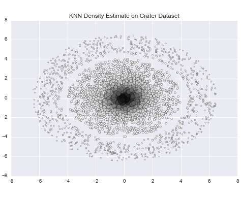
I have scattered 100 data points in the interval [1,3]X[2,4]. Since I scattered 100 data points and 31 are in the neighborhood, this means that a little under one-third of the data points are contained within the neighborhood of p with radius 0.5. Next, we can extract our cluster labels and outliers to plot our results.
matplotlib – The Most Popular Python Library for Data Visualization and Exploration I love working with matplotlib in Python. It was the first visualization. The post A Beginner’s Guide to matplotlib for Data Visualization and Exploration in Python appeared first on Analytics Vidhya.
Another three types of charts used for visual representation of data are Histogram, Cross Tables, and ScatterPlots. Whenever you need to plot data, there are multiple variables that must be considered for an effective visualization and interpretation of data. The Bottom-line.
The boxplot, also known as a box-and-whisker plot, is a commonly used chart type in daily work and research. While most are familiar with bar charts, line graphs, pie charts, scatterplots, and Gantt charts , creating professional reports often requires utilizing more specialized and practical chart types like the boxplot.
Regional Scatterplots We also drew some scatterplots of case counts against temperature and humidity. within the temperature and relative humidity ranges above): It’s tempting to draw a regression line on this plot, but we should remember that regional scatterplots like this one can be misleading ?—?in
Categories and values (see below) are plotted on axes. Throughout I use the word “category” to refer to something discrete that is plotted on an axis, for example France, Germany, Italy and The UK, or 2016, 2017, 2018 and 2019. With a few exceptions, the Charts described below plot values against categories.
The first plot shows the incoming time series data, the second plot shows the matrix profile, and the third plot shows which data points have been classified as anomalies. Visualize data on Kinesis Data Analytics Studio Kinesis Data Analytics Studio provides the perfect setup for observing data in real time.
Scatter diagrams: A scatter diagram plots data on a chart with an x and y axis. Pareto charts: A Pareto chart is a simple bar chart that maps out related events and problems in order of how often they occur. This helps identify which problems are more significant than others and where to focus process improvement efforts.
Formatting Needed Scatterplots are easy to make. With behind-the-scenes elbow grease, you can make: Stream Graphs Waffles B’Arcs Small Multiples Bars Population Pyramids Diverging Stacked Bars Lollipops Dots Swarm Plots Tile Grid Maps Sankey Diagrams What are Non-Native Charts? Excel can make: Combo charts (e.g.,
people, places, user segments) compare to each other when plotted by two measures. The items are positioned (or scattered) on a two-dimensional plot to reveal patterns such as: Outliers with unusual combinations of values; Clusters of items that share similar combinations of values; Overall relationships between the two measures (e.g.
With exploratory data analysis (EDA), we gain insights into the hidden trends and patterns in a dataset that are useful for decision-making. Several popular open-source Python libraries like Matplotlib, seaborn, Altair, Bokeh, Plotly, etc. are […]. The post Interactive Data Visualization Using Bqplot appeared first on Analytics Vidhya.
Branch Out and Try Other Chart Types Once you’ve mastered the classic chart types, you can play around with less-familiar chart types like bubble charts , bullet charts , dot plots , heat maps , scatterplots , slope graphs , social network maps , tree maps , waterfall charts , and more.
Basic Data Visualization Techniques Line Plots Line plots are a foundational technique in data visualization, commonly used to display trends over time or relationships between variables. By plotting data points on a line, individuals can visualize patterns and changes with ease.
ScatterPlot. The scatterplot is a common visualization for data exploration. This breaks some data visualization rules, but is helpful for exploring hierarchy and avoiding too much overlap. Like a bubble chart it uses size and color to convey information.
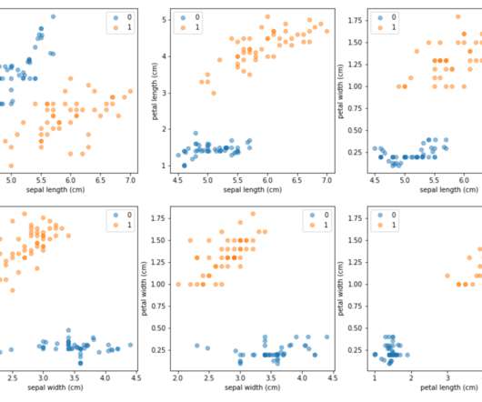
Inspecting the plot reveals that all synthetic observations lie along a line connecting two minority samples. The synthetic observations have been merged with the six original minority samples, and the new up-sampled dataset is plotted using pairwise scatterplots for each possible combination of the four original Iris attributes.
ScatterPlot. The data of the scatterplot is three-dimensional data. The series can be distinguished by color, or the third dimension can be determined by the size of the scatter point, which leads to the bubble chart. The bubble chart is a derivative of the scatter chart. Free Trial. Free Trial.
Terdapat 19 kategori dan lebih dari 50 gaya grafik termasuk grafik umum seperti grafik kolom, grafik garis, grafik pie, dan juga jenis grafik canggih seperti grafik radar, scatterplot, dll. Selain itu, FineReport menyediakan banyak jenis peta dan efek yang keren. Unduh template.
ScatterPlot: A scatterplot is created when you are looking for the correlations between two variables, for example, the relationship between a human’s height and weight. A scatterplot requires a large amount of statistical data to achieve the goal of obviously showing the trends. Pie chart by FineReport.
The analytics dashboards can also be understood as interactive chart components, such as common bar charts, line charts, scatterplots, etc., Create highly interactive dashboards and content with visual exploration operations and embedded advanced geospatial analysis.
It covers questions to consider as well as collecting, prepping and plotting data. The excerpt dives into techniques for collecting, prepping, and plotting data. In looking at the plots there appears to be a relationship between attendance, either average or total, and the valuation of the team. Introduction. In Figure 6.3,
Scatter charts, like in the example below, are useful for showing correlation and distribution. Donut charts , also shown in the example below, are helpful when your data adds up to a meaningful whole, you have less than seven categories in your data series, and you’d like to plot more than one series of data. Go Forth and Design!
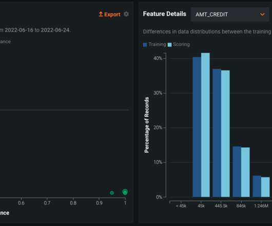
On the left-hand side, we have a chart that depicts a scatterplot of the feature importance of a model input against drift. Combined with the Feature Drift plot on the left, these metrics are able to inform the modeler if there are any significant changes in the distribution of values in a live setting. .
Imagine yourself in the midst of a 3-D scatterplot, with data points all around you. around a bubble in a 3-D bubble plot) that varies in brightness. VR does offer one other navigational possibility. While wearing a VR headset, we could virtually position ourselves within the chart, among the data. Quite the opposite, actually.
Instead of seeing rows upon rows of data and trying to discern a meaning, visualizations display essential information in the form of charts, graphs, line plots, scatterplots, word clouds, infographics — anything that visually tells the story of your data. Data visualizations are graphic representations of data.
We organize all of the trending information in your field so you don't have to. Join 42,000+ users and stay up to date on the latest articles your peers are reading.
You know about us, now we want to get to know you!
Let's personalize your content
Let's get even more personalized
We recognize your account from another site in our network, please click 'Send Email' below to continue with verifying your account and setting a password.


Let's personalize your content