This site uses cookies to improve your experience. To help us insure we adhere to various privacy regulations, please select your country/region of residence. If you do not select a country, we will assume you are from the United States. Select your Cookie Settings or view our Privacy Policy and Terms of Use.
Cookie Settings
Cookies and similar technologies are used on this website for proper function of the website, for tracking performance analytics and for marketing purposes. We and some of our third-party providers may use cookie data for various purposes. Please review the cookie settings below and choose your preference.
Used for the proper function of the website
Used for monitoring website traffic and interactions
Cookie Settings
Cookies and similar technologies are used on this website for proper function of the website, for tracking performance analytics and for marketing purposes. We and some of our third-party providers may use cookie data for various purposes. Please review the cookie settings below and choose your preference.
Strictly Necessary: Used for the proper function of the website
Performance/Analytics: Used for monitoring website traffic and interactions
ArticleVideo Book This article was published as a part of the Data Science Blogathon Introduction In applied Statistics and Machine Learning, Data Visualization is one. The post Must Known Data Visualization Techniques for Data Science appeared first on Analytics Vidhya.
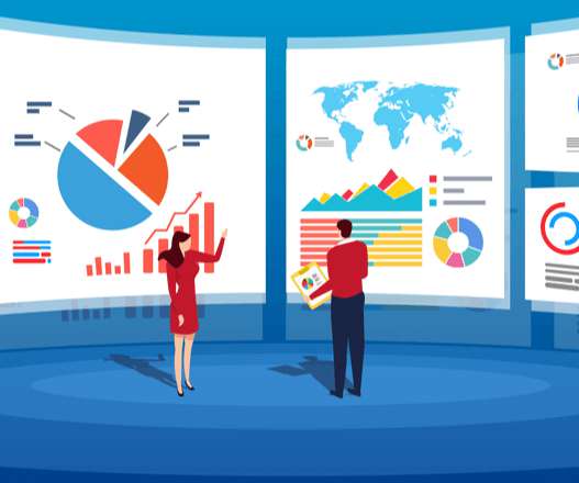
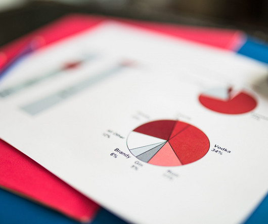
Data visualization is an art that goes beyond numbers and statistics, […] The post Top 20 Data Visualization Examples appeared first on Analytics Vidhya. It is because they say a lot without actually saying anything. In today’s data-driven world, the quote holds more value than ever.
ArticleVideo Book This article was published as a part of the Data Science Blogathon Let us see a short intro about this blog, Descriptive Statistics. The post Descriptive statistics | A Beginners Guide! appeared first on Analytics Vidhya.
While Pandas’ describe() function has been a go-to tool for many, its functionality is limited to numeric data and provides only basic statistics. Enter Skimpy, a Python library designed to offer detailed, visually appealing, and comprehensive data summaries for all column types.
Speaker: John Mecke, Managing Director of DevelopmentCorporate, Jon Gatrell, Principal Partner at Market Driven Business
The ability to express complex concepts in numerical, financial, or statistical terms is critical, but it is often an overlooked discipline. Executives, Board Members, and Customer economic buyers see the world through numbers and visualizations. Numerical literacy is a key skill for effective product managers.
R, an open-source tool, empowers data enthusiasts to explore, analyze, and visualize data with precision. Whether you’re delving into descriptive statistics, probability distributions, or sophisticated regression models, R’s versatility and extensive packages facilitate seamless statistical exploration.
This article was published as a part of the Data Science Blogathon R programing language was developed for statistical computing and graphics which makes it one of the desired candidates for Data Science and Analysis. The post Programming in R – From Variables to Visualizations appeared first on Analytics Vidhya.
Introduction Statistics is not limited to academic or specific profession. No matter whether you need to study data sciexnce, do some research or just try to handle the information about yourself, you need to understand statistics.
But often that’s how we present statistics: we just show the notes, we don’t play the music.” – Hans Rosling, Swedish statistician. Data visualization, or ‘data viz’ as it’s commonly known, is the graphic presentation of data. That’s a colossal number of books on visualization. Data visualization: What You Need To Know.
Introduction This article explores violin plots, a powerful visualization tool that combines box plots with density plots. It explains how these plots can reveal patterns in data, making them useful for data scientists and machine learning practitioners.
The post Interpreting P-Value and R Squared Score on Real-Time Data – Statistical Data Exploration appeared first on Analytics Vidhya. This article was published as a part of the Data Science Blogathon. Overview In this article, I will share my thoughts on the below.
Data visualization in infographics is a dynamic way to do so. This article delves into data visualization within infographics and showcases ways to present information both aesthetically and comprehensively. What is Data Visualization?
Introduction Have you ever been tasked with visualizing the relationship between each. The post Creating Linear Model, It’s Equation and Visualization for Analysis appeared first on Analytics Vidhya. This article was published as a part of the Data Science Blogathon.
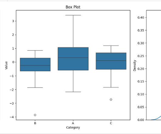
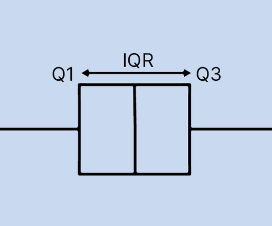
Introduction In the world of data analysis and statistics, visualizations play a crucial role in understanding the underlying patterns and outliers within datasets. One such powerful visualization tool is the boxplot, a box-and-whisker plot.
Introduction In the field of analytics and statistics where figures dominate, there is an important need to provide the way in how best to pass information to the larger community.
Introduction R is a powerful and versatile programming language used for statistical analysis, data visualization, and machine learning. The success of a data analysis project relies on properly importing the data into R.
These include statistics, machine learning, probability, data visualization, data analysis, and behavioral questions. This article was published as a part of the Data Science Blogathon. Introduction You may be asked questions on various topics in a data science interview.
Introduction Tableau has emerged as a popular data visualization tool in companies, making it one of the hottest trends in Business Intelligence. In India, people are curious about the Tableau developer salary statistics.
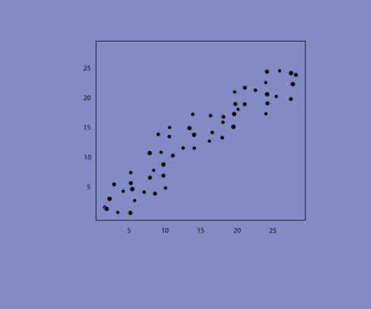
Introduction Seaborn is a Python data visualization library that is built on top of Matplotlib. It provides a high-level interface for creating informative and attractive statistical graphics. One of the most commonly used plots in Seaborn is the scatter plot, which allows us to visualize the relationship between two variables.
Introduction Within the domain of data visualization, heatmaps distinguish themselves for their adeptness in portraying intricate data sets in a visually intuitive manner. This article discusses the nuances of crafting and tailoring […] The post How to Plot Heatmaps in Seaborn?
Introduction Exploratory Data Analysis (EDA) is a process of describing the data by means of statistical and visualization techniques in order to bring important aspects of that data into focus for further analysis.
Introduction For creating eye-catching and educational statisticsvisuals, Seaborn provides a high-level interface. Seaborn makes it simple to build and modify line plots, which are helpful for displaying data trends over time.
Introduction In data analysis, the ability to visually represent complex datasets is invaluable. Python, with its rich ecosystem of libraries, stands at the forefront of data visualization, offering tools that range from simple plots to advanced interactive diagrams.
Introduction I love descriptive statistics. Visualizing data and analyzing trends is one of the most exciting aspects of any data science project. The post Extracting and Analyzing 1000 Basketball Games using Pandas and Chartify appeared first on Analytics Vidhya.
ArticleVideos Image by Author In statistics, correlation or dependence is any statistical relationship, whether causal or not, between two random variables or bivariate data. The post Using Predictive Power Score to Pinpoint Non-linear Correlations appeared first on Analytics Vidhya.
Overview A demonstration of statistical analytics by Integrating Python within Power BI Share the findings using dashboards and reports Introduction Power BI is. The post Integrating Python in Power BI: Get the best of both worlds appeared first on Analytics Vidhya.
Modern dashboard software makes it simpler than ever to merge and visualize data in a way that’s as inspiring as it is accessible. Knowing what story you want to tell (analyzing the data) tells you which data visualization type to use. Let’s assume you have the right data and the right data visualization software. Distribution.
Data visualization has become a major part of life for those looking to make use of the large swathes of data available in the modern world. That’s where data visualization comes in. Data visualization is, to put it simply, converting hard data and lists of numbers or facts, into an easier to comprehend form.
Given the escalation of the use of statistical data in organizations […] The post How to Become a Statistician? Introduction Think of it as the ability to be the person that gets to make informed decisions for you and for your company in the fields such as healthcare or finance or the sports industry among others.
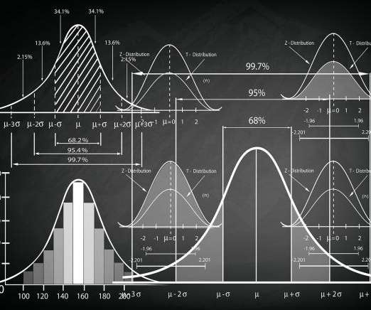
You’ll want to be mindful of the level of measurement for your different variables, as this will affect the statistical techniques you will be able to apply in your analysis. There are basically 4 types of scales: *Statistics Level Measurement Table*. 5) Which statistical analysis techniques do you want to apply?
What’s amazing is that Marvel characters are developed through the influence of other Marvel heroes through data visualization. For instance, when Spider-Man appears in a comic book with Captain America, these are all visualized through data graphics. and using the networkx package, we came up with the first graphic visualization.
5 SQL Visualization Tools for Data Engineers • Free TensorFlow 2.0 Complete Course • The Importance of Probability in Data Science • 4 Ways to Rename Pandas Columns • 5 Statistical Paradoxes Data Scientists Should Know
While the collection and processing of data involves a lot of technology and expertise, creating a visual representation of the data, which can be read and understood by one and all, also requires an intuitive excellence. Such excellence predominantly is needed to select visualization formats for a specific set of sample data.
According to the Bureau of Labor Statistics (BLS), the employment of research analysts, including data analysts, is projected to increase by 23% from 2021 to 2031. This significant growth in data analysis careers presents promising prospects for aspiring candidates. It profoundly impacts the services and products provided to the public.
Use, Implementation and Visualization appeared first on Analytics Vidhya. ArticleVideo Book This article was published as a part of the Data Science Blogathon Introduction In the last blog we looked at a test to. The post Decoding the Chi-Square Test?-?Use,
Conduct statistical analysis. One of the most pivotal types of data analysis methods is statistical analysis. Regression: A definitive set of statistical processes centered on estimating the relationships among particular variables to gain a deeper understanding of particular trends or patterns. Visualize your data.
To fully leverage the power of data science, scientists often need to obtain skills in databases, statistical programming tools, and data visualizations. It helps to automate and makes the usage of the R programming statistical language easier and much more effective. perfect for statistical computing and design.
Imagine generating complex narratives from data visualizations or using conversational BI tools that respond to your queries in real time. Tableau, Qlik and Power BI can handle interactive dashboards and visualizations. In life sciences, simple statistical software can analyze patient data.
But instead of fingers and feet, the clues are subtle and they are embedded in rows and columns of statistical figures. Introduction Think of yourself standing in an examination hall writing an exam paper the topic of which is a complicated mystery that requires investigation. An Introductory Guide appeared first on Analytics Vidhya.
I have relied on it since my days of learning statistics back in. Introduction I’m a big fan of R – it’s no secret. The post 8 Useful R Packages for Data Science You Aren’t Using (But Should!) appeared first on Analytics Vidhya.
We use summary statistics and graphical tools to get to know our data and understand what we may deduce from them during EDA. […]. Introduction Exploratory Data Analysis, or EDA, examines the data and identifies potential relationships between variables using numerical summaries and visualisations.
According to the US Bureau of Labor Statistics, demand for qualified business intelligence analysts and managers is expected to soar to 14% by 2026, with the overall need for data professionals to climb to 28% by the same year. The Bureau of Labor Statistics also states that in 2015, the annual median salary for BI analysts was $81,320.
— Thank you to Ann Emery, Depict Data Studio, and her Simple Spreadsheets class for inviting us to talk to them about the use of statistics in nonprofit program evaluation! But then we realized that much of the time, statistics just don’t have much of a role in nonprofit work. Why Nonprofits Shouldn’t Use Statistics.
ArticleVideo Book This article was published as a part of the Data Science Blogathon Introduction Many engineers have never worked in statistics or data science. The post Know the basics of Exploratory Data Analysis appeared first on Analytics Vidhya.
We organize all of the trending information in your field so you don't have to. Join 42,000+ users and stay up to date on the latest articles your peers are reading.
You know about us, now we want to get to know you!
Let's personalize your content
Let's get even more personalized
We recognize your account from another site in our network, please click 'Send Email' below to continue with verifying your account and setting a password.


Let's personalize your content