KitikiPlot: Your New Go-To for Time-Series Data Visualization
Analytics Vidhya
DECEMBER 11, 2024
Introducing KitikiPlot, a Python library designed for visualizing sequential and time-series categorical “Sliding Window” patterns.
 Visualization Related Topics
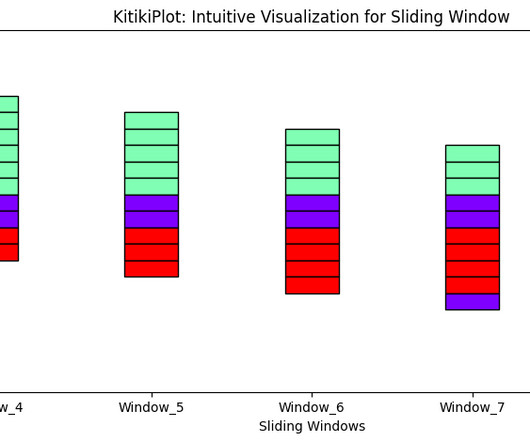
Analytics Vidhya
DECEMBER 11, 2024
Introducing KitikiPlot, a Python library designed for visualizing sequential and time-series categorical “Sliding Window” patterns.
AWS Big Data
DECEMBER 4, 2024
This experience includes visual ETL, a new visual interface that makes it simple for data engineers to author, run, and monitor extract, transform, load (ETL) data integration flow. You can use a simple visual interface to compose flows that move and transform data and run them on serverless compute. Now you can publish it.
This site is protected by reCAPTCHA and the Google Privacy Policy and Terms of Service apply.

Analytics Vidhya
JUNE 21, 2025
This supports the fact […] The post Visual Proof of Bayes’ Theorem appeared first on Analytics Vidhya. Imagine a picture where a canvas of shapes and colours is showing Bayesian reasoning with no equations involved. Now, you will be able to demystify Bayes’ Theorem with intuitive shapes and areas.

Analytics Vidhya
MARCH 19, 2025
yFiles is a powerful SDK designed to simplify the visualization of complex networks and data relationships. When combined with LlamaIndex, it becomes a powerful tool for visualizing and interacting with knowledge graphs in real time. appeared first on Analytics Vidhya.

Advertisement
Think your customers will pay more for data visualizations in your application? But today, dashboards and visualizations have become commonplace. Which analytics features are replacing visualizations as “the next big thing”. Five years ago they may have. You’ll learn: The 3 benefits of deeply embedding BI.

Analytics Vidhya
DECEMBER 10, 2024
That intelligent alternative is called visual AI agent. Visual […] The post From Watchful Eyes to Active Minds: The Rise of Visual AI Agents appeared first on Analytics Vidhya. But what if there was a smarter, more efficient solution to streamline this process and eliminate the hassle?

AWS Big Data
JULY 15, 2025
SageMaker Unified Studio offers multiple ways to integrate with data through the Visual ETL, Query Editor, and JupyterLab builders. Today, we are excited to launch a new visual workflows builder in SageMaker Unified Studio. Today, we are excited to launch a new visual workflows builder in SageMaker Unified Studio.

Advertisement
Think your customers will pay more for data visualizations in your application? But today, dashboards and visualizations have become table stakes. Five years ago, they may have. Turning analytics into a source of revenue means integrating advanced features in unique, hard-to-steal ways.

Advertisement
The complexity of financial data, the need for real-time insight, and the demand for user-friendly visualizations can seem daunting when it comes to analytics - but there is an easier way. With Logi Symphony, we aim to turn these challenges into opportunities.

Advertisement
Our platform empowers you to seamlessly integrate advanced data analytics, generative AI, data visualization, and pixel-perfect reporting into your applications, transforming raw data into actionable insights. But with Logi Symphony, these challenges become opportunities.

Advertisement
Logi Symphony offers a powerful and user-friendly solution, allowing you to seamlessly embed self-service analytics, generative AI, data visualization, and pixel-perfect reporting directly into your applications. Traditional BI tools can be cumbersome and difficult to integrate - but it doesn't have to be this way.

Advertisement
Organizations look to embedded analytics to provide greater self-service for users, introduce AI capabilities, offer better insight into data, and provide customizable dashboards that present data in a visually pleasing, easy-to-access format.

Speaker: Dr. Joe Perez, Senior Systems Analyst at NC Dept. of Health & Human Services, and Chief Technology Officer at SolonTek
In this webinar, you will learn how to: Identify and recognize the five stages of the visualization spectrum. Determine how to leverage these steps into a cohesive visualization strategy. Differentiate between impact/influence and how that plays into making data actionable.

Advertisement
Entity Resolution Sometimes referred to as data matching or fuzzy matching, entity resolution, is critical for data quality, analytics, graph visualization and AI. Learn what entity resolution is, why it matters, how it works and its benefits.
Advertisement
That’s one of the many reasons we wrote The Definitive Guide to Dashboard Design—to help you avoid common pitfalls, including… Cramming too much onto one screen and expecting the user to figure out what’s interesting and relevant on their own Getting carried away with fonts and colors so the user is distracted by formatting instead of focusing on the (..)

Expert insights. Personalized for you.


Let's personalize your content